I created two charts, one on income, the other on wealth. And I've included two essays, both rather basic.
Basic to a modern economy are the distribution profiles of income and wealth. I've fashioned two home-made colored-pencil charts in this posting, one displays wealth distribution and the other income distribution. And below them I've included two recent short essays that are introductory in nature, all the same they are crucial for understanding the needs we face. In short, the lower-earning and -saving majority are being left out, and a social disaster is in the making. ___________________________________ But first I'm including an Introduction to the overall blog, you can skip it, or read it, here it is: A reader stumbling on to this blog might wonder what to read. The essay below is easy and basic, "America's Economic Decline Simply Explained" (click here). The next about Stark Inequality is a little harder, but full of basic info. The Solutions essay breaks a lot of assumptions about how to solve economic problems, and the Full Employment is good, also bursting with unconventional ideas; and last of all the Radical Populist Budget is one of my favorites. The most popular essay is "The 1950s and Today." I have few readers, but few is better than none. This is my public record book where I store thoughts. I also enjoy constructing the photos and making detailed and very involved searches -- Growth and the Federal Budget is such a long-winded and overly detailed screed. Often I'll come back and realize that I've forgotten the content of an essay. That's because they are too dense, but, then, also I repeat a lot. The graph from Olivier Giovannoni on the decline of income share for the lower-earning 90%, from 1980 to the present, is the most important thing a reader should learn. Most of the above articles I recommended contain this graph. The Radical Populist essay has it, and in several more it appears. Even this present essay could use, so here it is, again.
What does the graph show? The deep blue area represents the "labor share" to the lower-earning 90%. Note that in 1980 it begins to decline, from 55% to 38%. Here's what Giovannoni states at the Levy Institute: "This amounts to a transfer of $1.8 trillion from labor to capital in 2012 alone and brings the US labor share to its 1920s level."In 2018 the share decline, of 17%, represents $2.75 trillion. Without this drop the incomes of the lower-paid workers would be about $19,000 higher per worker among each one of the 144 million workers whose income is below $90,000 a year. So this is a major shift in income distribution, and if we could ever regain the "labor share" of 1945 to 1980 we would be living in a much improved society. Not perfect, by any means, but improved. That's why the graph is so important. (Continued at -- the most recent essay of May, 2018.)
It's a common sense Keynesian idea that aggregate demand is necessary for efficient, mass production. Mass production exists only with mass consumption which is also called purchasing demand. Therefore a relative equality is needed. The worker-majority must be able to purchase what they produce. Wages and wealth must keep pace. A too equal distribution would be unfair, but a too unequal distribution will be a drag on output -- not enough purchasers. What corporation will produce goods that are not purchased? Why is India so poor?
From two reports I've reproduced two charts, on income and wealth distribution. And I've included two recent essays, one 1,200 words, the other 900. Similar in focus.
Wealth today:
Source, Edward N. Wolff
YouTube has a video on "Wealth Inequality in America". By July, 2018, some 21 million had viewed the video. It is amazing, check it out here.
Income today:
Hope you can read the small print.
Source: here, here and here.
Post-tax income growth of 21% between 1980 and 2014 shows a slight improvement for the lower 50%, but that's in light of an overall growth rate of 61%.
Share This:
_________________________________________________________________________ This following is a letter to the editor, so it's general info and simple:
The Trump/Republican Budget and
America’s Poorest 40%
In April, 2018, the Congressional Budget Office scored the Trump/Republican tax bill passed in December, 2017, and said it would increase the public debt from 76% to 96% of GDP by 2028. This is an increase of $4.6 trillion. Mr. McClintock voted for this bill stating that economic growth would increase the tax revenues offsetting the decline created by the tax cuts. In 1980, running against Ronald Reagan, George H. W. Bush called this “voodoo economics”. Reagan and Bush I increased the national debt from 25% of GDP to over 50%. Bush was correct. And in 10 years we will see approximately the same increase in the national debt. A report from ITEP states: "The national debt today [April 9, 2018] stands at $15.7 trillion.[3] Two decisions made since 2000 — tax cuts and America’s wars since September 11, 2001 — together account for roughly two-thirds of that amount.[4]"
Due to the fact that about 60% of the county voted for Mr. McClintock, and he and Mr. Trump see eye to eye, I don’t know how to approach the readers of the Mariposa Gazette. It will be an uphill battle. In my opinion, the Republicans, nationally, are making life worse for most Americans.
Approximately 43% of Americans live with incomes that fall below 200% of the official poverty level. They are either poor or “low income" in this very wealthy nation, according to the Supplemental Poverty Measure, U. S. Census, page 7. This is after paying taxes and receiving government transfers. Many scholars claim the poverty line is artificially low, and 140% of poverty is where it should be set. These 43% are our neighbors, and they make up the majority in some cities and neighborhoods. As a nation we are so rich that poverty could be eliminated. How much income does our economy generate? It created over $15 trillion in 2017 (see page 34), and evenly divided among 163 million workers, that’s an income of $92,067 per worker. But over half of all workers earned less than $30,553 in 2016 (last year for available statistics), and the average annual income for the lower half was below $13,000 a year. These facts come from the Social Security Administration’s annual report on wage income. An income of $13,000 a year is also 11% of the average of $92,067, and a minimum wage worker working full-time year-round would earn more. I repeat, we are very prosperous, but we have polarized income and wealth distribution.
Between 1980 and 2014 the economy grew by 60%, according to two reputable reports. The income of the lower-earning half increased from $16,000 to $16,200, while the income of the top 1% increased from $420,000 to $1,300,000. The top 1% received 36% of all growth, the next 9% received 32%, and the percentiles 50 to 90 received 32%. The lower half received zero percent.
On June 7, 2018, the Federal Reserve released its quarterly Flow of Funds report, (see page 2) and the private “household net worth” is over $100 trillion. That’s trillion, not billion. It stood at $100.768 trillion — the first time surpassing $100 trillion. The federal government will spend $4.1 trillion in 2018 in comparison. And still we have a $500 billion deficit. We could easily tax that $100 Trillion and balance the budget. A financial transaction tax would be enough. Household net worth stood at $48 trillion just 9 years ago, so there has been a boom in the value of paper assets, as many stock watchers know. Wage income did not double, it increased by 5%. The nation’s average wealth, per adult over 20 years-old, stands above $400,000. We are wealthy. Yet the median wealth — the middle rung — per adult is about $40,000. The lower-saving 40% of U.S. households has a negative net worth, they owe on average $9,860, according to a study by Edward N. Wolff, a scholar with abundant credentials in wealth studies. The wealthiest one percent own nearly 40% of all wealth, on average about $15 million per adult, or $31,300,000 per household, according to E. Wolff. Eighty percent of U.S. households own only 10.1% of all wealth.
This is not the profile of a nation that should massively cut taxes to the wealthiest. The Trump tax cut and the following budget are twin policies. Mr. McClintock railed for years against the Obama era deficits, and now he supports deficits. Obama’s high spending was directly related to the worst recession in 75 years; they included unemployment insurance payouts, food, housing, and medical services to the nearly 9 million families who lost employment, and often their homes. The first 14 months of the recession were under George Bush’s term of office, the last 4 months were under Obama’s term. Deregulation of the financial sector resulted in the approximate evaporation of 25% of the private savings of America’s households, 70% of which were financial savings. It was a financial sector crisis.
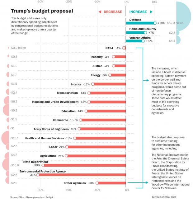
The Trump budget will slash funding to programs that provide “social benefits” to the lower-earning 40% of America. These “non-defense discretionary” programs will lose 60% of their funding by 2028, it’s clearly stated in the 2019 budget proposal. Robert Greenstein at the Center for Budget and Policy Priorities states these are “massive cuts in . . . education, health care, assistance to low-income children and families, job training, environmental protection, and scientific research.” In light of these facts, I can’t understand how intelligent adults can vote in support of the present government. And a last graph originating from the Office of Management of Budget: How to absorb all this? The largest cuts occur to which agencies? $15 bn to HHS, $11 bn to State, $9 bn to Education. The EPA and State are the big losers, HHS is second biggest loser. But what is the average cut in one percentage? Maybe it's 14%. These are discretionary non-defense programs, so Medicaid, Medicare and Social Security are not included. Note the fine print about "eliminate funding". And the IRS? The CBPP has a report, stating, "Despite the once-in-a-generation enforcement challenge that the law poses, the bill leaves enforcement funding at roughly the same level as in 2017 — and down $1.5 billion (23 percent) since 2010 in inflation-adjusted terms." The new tax law is an opportunity for evasion.
The next article deals with the income distribution of 1960.
Give Me That Ol’ Time Income Distribution
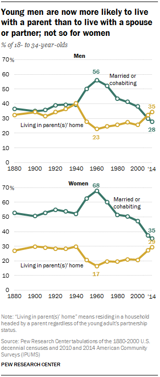
Times aren’t so good for many Americans. A recent survey found that 78% of U.S. workers live paycheck to paycheck -- "38% sometimes live paycheck-to-paycheck, 17 percent said they usually do and 23 percent said they always do.", that's 78% on the edge --- and 71% live in debt, and 56% save less than $100 a month, and 40% of adults say that finding $400 in cash for an emergency within 30 days would be impossible. The total national income divided by all who worked and submitted a W-2 form, 163 million, equals over $92,000 per worker. Something is wrong here. The Millenial generation (comprising 34% of U.S. population and between 18 and 34 years-old) is often paying between 68% to 90% of income just to rent an apartment. Nationally a rate of 34.1% of young adults are living at home with parents; this rate has never before been so high; in Miami area “a whopping 44.8% of 18- to 34-year-olds live with their parents.” The Pew Center published a graph showing in 1960 the median income for this age group was $27,300 a year, and it is now $15,000. Rental costs as a percentage of income have increased. The Federal Reserve conducts an annual survey, page 7, on household well-being, and reading the fine print, it concludes that 40% of all adults “have scores that suggest a high likelihood of material hardship”. The U.S. Census poverty study, the Supplemental Poverty Measure, shows that 43% of Americans live in households with after-tax and after-transfer incomes below 200% the poverty line. That indicates a per person income of below $12,500 in a family of four. Yet our very prosperous economy generates over “$45,090” of income after taxes for each individual, says the Bureau of Economic Analysis (Table 2.1). Very likely, 40% of Americans live with incomes that are less than, and often much less than, a quarter of the average that our economy generates. That is shocking and depressing. We should work to change the depressing picture. Some of these data come from an article by Paul Buchheit at Common Dreams. Another article by Buchheit argues that about half of Americans live in poverty. Kathleen Short of the U.S. Census has stated, see page 30, in 2013, about 30% live below 140% of the poverty threshold, and that's poverty.
As Woody Guthrie once sang,
“If you ain't got the do re mi, boys, you ain't got the do re mi,
Why, you better go back to beautiful Texas, Oklahoma, Kansas, Georgia, Tennessee.
California is a garden of Eden, a paradise to live in or see;
But believe it or not, you won't find it so hot
If you ain't got the do re mi.”
It was not always like this. Let’s look at past distribution ratios of wealth and income, this will restore a little hope on our sad condition. I printed out a page from Edward Wolff's 2018 report on wealth , 2017, "Household Wealth Trends in the United States, 1962 to 2016: Has Middle Class Wealth Recovered?" (For a summary, see here.) Table 2 shows figures for wealth and income distribution from 1962 to 2016. The wealth picture shows in 1962 the lower-saving 80% owned 19.0% of everything, and now they own 10.1%. If we had that 1962 ratio today, an additional $87,840 would be in the savings of each of the 100 million households of the lower-saving 80%. It would increase the median household savings from $78,100 to almost $166,000, and it would erase the debt burden of the lower-saving 40% of U.S. households.
And for income distribution, in 1962 the lower-earning 80% took in 54.0% of all income, but by 2015 its share had dropped to 36.0%, a drop of 18.0%. What happened to the 18%? The top-earning 10% in '62 took in 30.0%, and in 2015 they received 49.9% - an increase of 19.9% of all income. How much is 18% of all income? Today it's $2.7 trillion (multiply 18% times $15.007 trillion, from Congressional Joint Committee on Taxation, Overview), or it's $2.9 trillion (BEA.gov, Table 2.1). So $2.7 trillion distributed to the lower-earning 80% of workers, and that would be about 130 million workers, would increase the income of each of the 130 million by $20,769 every year. Other researchers also report the same general shift in income shares. This is in the ballpark for the figures that the Economic Policy Institute present on their web page “What should you be earning?” It also matches the general picture drawn by Olivier Giovannoni (Working Paper #66) showing a distribution slide of the lower-earning 90% beginning in 1980. The CBO report of 2011 also shows a massive shift.
Now let’s look at the change that would happen to the incomes of the lower-earning half of U.S. workers. The median income worker — half earned more wage income and half earned less — among all 163 million workers in 2016 earned in wages $30,533. That means 81 million earned less than $30,533, and the average income for the lower half was just under $13,000 in 2016. (You have to add the income columns of the Social Security Administration report, and divide by number of workers.) If we could add back the income share they once enjoyed, it would be, on average, an additional $20,769 of yearly income on top of today’s average of $13,000, for a total average income of $33,769 per worker for all 81 million in the lower-earning half. This is to say this average income would increase by times 2.6, and would be a little more than today’s median. The median worker’s income would increase from $30,533 to $51,299. The Economic Policy Institute estimates that $47,050 would be this worker’s income.
Wolff’s report shows the lower 80% earning 36.0% of all income in 2016. Restoring that to 54% adds $2.7 trillion back to the lower 80% of worker’s income. So the upshot -- if we had the same distribution as 1962, half of all workers would nearly triple their average incomes, from $13,000 to $33,769. Today’s median would become the average for the lower 50%, and the median would be between $47,000 and $51,299. A different world it would be.
How did the economy survive with such a strange and equal distribution of income? It grew faster, and all wage levels grew together, not like today (see here). We still could return to 1962 policies, I think the top marginal income tax rate was 91% on all income in excess of $3,000,000, and 81% on all income above $1,050,430 (see the Tax Policy Institute).
Many economists would claim this distribution ratio would be impossible. When Gerald Friedman stated that the Sanders’ proposals for the economy would drive growth to 5% a year he was thoroughly scolded by mainstream left-wing economists such as Paul Krugman.
Friedman offered a reasonable reply, affirming it is possible. It is.
As another song goes, “I want that old time religion (or income distribution), It is good enough for me."
Some Recommendations
OK, too much info already. But here's some reading that is promising. First the Center for American Progress published a positive paper, Blueprint for the 21st Century, which includes a government jobs program. What a relief that this is getting some attention. I calculated recently that the actual unemployment rate is around 11.8%, not the official 3.8%. The report states unemployment is 8.7%, but they should add on part-time workers who want full-time, and it jumps to close to 12%. Here's a few relevant sentences from the Intro: "As part of the Jobs Blueprint, the Center for American Progress proposes five major initiatives that will provide high quality, affordable child care; rebuild America’s infrastructure; modernize K-12 schools; prepare America’s communities and housing stock for the effects of climate change; and provide critical supports to senior citizens and persons with disabilities. We propose investing in America’s physical capital and human capital for the 21st century—investments that the market will not make by itself. Together, these nationwide investments will create more than 3 million new jobs. Furthermore, in the most economically distressed areas of the country, CAP proposes a job guarantee that, we estimate, about 1.2 million persons will take up."
Also I'm listening to the Ralph Nader Radio Hour, this morning I'm listening to economist Robert Pollin talk about the California health care for all program, funded by a corporate tax on "gross receipts" on the largest corporations with more than 500 employees. Remember that 1,900 or so corporations in the U.S. employ 34% of all workers and generate 44% of all revenues. They will fund the California health care tax, in part, the other part is a sales tax that exempts spending on food, housing and transportation, and has a tax credit to households with low incomes. Same show, Dr. S. Woolhandler explains health care for all. Ralph's shows in general are very high quality; you can learn a lot.
Here's a quote from the Sanders' web page: "According to the OECD, in 2013 Americans worked 54 more hours [one week] per year than Japanese workers, 119 hours [3 weeks] more than British workers, 299 hours [7.5 weeks] more than French workers, and 425 [10 weeks] hours more than German workers. According to this Gallup poll, the average American working a full-time job is working well over 40 hours a week:", and a graph follows. Here's a link to an article published at In These Times, "Sanders Has a Sweeping Plan to Expand Worker Rights and Workplace Democracy". The "last" recommendation, for now, July 16, continues. Professor William Lazonick published this month in the American Prospect, the article "The Curse of Stock Buybacks". Here's the concluding paragraph: "And most importantly, on March 22, [Senator] Baldwin introduced legislation known as the Reward Work Act, which would rescind Rule 10b-18 [that allows stock buybacks] and, for the sake of retain and reinvest, mandate that all U.S. publicly listed business corporations have one-third of board members be representatives of workers. Rolling back the 2017 corporate tax cut is imperative. In addition, a ban on stock buybacks would be a giant step in resurrecting corporate employment as a foundation for a prosperous and expanding middle class."
Two such new rules -- eliminating stock buybacks and mandating workers on corporate boards -- would mark a radical departure from the predatory, value extraction model that now characterizes the core of the American economy. Lazonick is the source of the fact that "The largest 1,909 corporations, all employing more than 5,000 workers in the U.S., generated 44% of all revenues, and employed 34% of all workers. The health (or non-health) of these large companies spills over to the smaller ones. "
I wrote that sentence, it appears in this recent essay. Certain reforms are critical: 1) Prohibit stock buybacks; 2) Establish a short-term capital gains tax that will kill the pernicious short-term speculative beast that has captured American finance; 3) Place workers and community members on corporate boards; 4) Legislate tax incentives to transform American corporations into profit-sharing and ownership-sharing organizations (ESOPs); 5) Re-establish the power and legitimacy of worker strikes; 6) Raise the minimum wage to $15 an hour, which would increase the incomes of 41 million workers (see here), or 25% of U.S. workers. 7) Tax financial assets; 8) Finance elections with public funds only; 9) Re-establish the guillotine. Maybe only #9 is necessary. Nick Hanauer also published at the American Prospect with the advice to raise taxes on the wealthiest. "Want to Expand the Economy? Tax the Rich" -- The "Solutions" essay at this blog elaborates on this theme.
A reader stumbling on to this blog might wonder what to read. The essay below is easy and basic, "America's Economic Decline Simply Explained". The next about Stark Inequality is a little harder, but full of basic info. The Solutions essay breaks a lot of assumptions about how to solve economic problems, and the Full Employment is good, also bursting with unconventional ideas; and last of all the Radical Populist Budget is one of my favorites. The most popular essay is "The 1950s and Today." I have few readers, but few is better than none. This is my public record book where I store thoughts. I also enjoy constructing the photos and making detailed and very involved searches -- Growth and the Federal Budget is such a long-winded and overly detailed screed. Often I'll come back and realize that I've forgotten the content of an essay. That's because they are too dense, but, then, also I repeat a lot. The graph from Olivier Giovannoni on the decline of income share for the lower-earning 90%, from 1980 to the present, is the most important thing a reader should learn. Most of the above articles I recommended contain this graph. The Radical Populist essay has it, and in several more it appears. Even this present essay could use, so here it is, again.
What does the graph show? The deep blue area represents the "labor share" to the lower-earning 90%. Note that in 1980 is begins to decline, from 55% to 38%. Here's what Giovannoni states at the Levy Institute: "This amounts to a transfer of $1.8 trillion from labor to capital in 2012 alone and brings the US labor share to its 1920s level."In 2018 the share decline, of 17%, represents $2.75 trillion. Without this drop the incomes of the lower-paid workers would be about $19,000 higher per worker among each one of the 144 million workers whose income is below $90,000 a year. So this is a major shift in income distribution, and if we could ever regain the "labor share" of 1945 to 1980 we would be living in a much improved society. Not perfect, by any means, but improved. That's why the graph is so important. The following is a short introductory essay on the economy. It should be published somewhere soon, it's not long or complicated.
America’s Economic Decline Simply Explained
Many people wonder why the U.S. economy is not working for them. I’d like to explain in simple terms. I’ve written a blog for 10 years, Economics Without Greed. I may be an amateur, yet my reasoning is not that far off. Here’s why the economy is not working:
Most people work for large corporations or non-profits. The U.S. Census shows that 82% of private sector workers are employed in firms with more than 20 workers, 65% work in firms with over 100 workers, and 51% work in firms with more than 500 workers. (I have to warn the readers to not focus on the numbers, but focus on the main concepts.) The largest 1,909 corporations, all employing more than 5,000 workers in the U.S., generated 44% of all revenues, and employed 34% of all workers. The health (or non-health) of these large companies spills over to the smaller ones.
Large corporations distribute around 91% of their profits to shareholder owners, not to workers in higher wages, nor to plant expansions, nor to research. Wages are kept as low as possible. Since 2001, when corporate profits were 4.6% of GDP, they have increased to 8.9% of GDPin 2018. Some years these large corporations distribute more than 100% of their net profits to shareholders, thus looting their own companies. Professor William Lazonick’s research has shown “How American Corporations Transformed from Producers to Predators.” (Also “Profits Without Prosperity” published and winner of best article of the year at the Harvard Business Review.)
Most of the profits (85%) generated by corporations end up in finance seeking the highest rates of return; this surplus is not recycled into productive economic activity that would employ workers and increases prosperity. It is tied into hedged bets which act to diversify risk of catastrophic decline. Assets are added to existing value of financial assets. Seventy-five percent of financial assets are owned by 5 % of households.
Since there is a limited amount of corporate stock, these stocks necessarily increase in value. Wealth then accumulates exponentially for the minority owner class. In the past 9 years, since January of 2009, financial assets have increased their value by 87% (inflation adjusted), from $48 trillion to $98 trillion. In the same period wages for non-supervisory workers grew by 5%. And looking further back, since 1964 the S&P 500 Index has increased by 250%, and average weekly wages for nonsupervisory workers are exactly the same as in 1964, a zero percent increase. The aggregate value of stock more than triples, while weekly (and yearly) wages for 80% of the work force stays frozen. The economy’s per capita “disposable personal income” has tripled since 1964 (inflation adjusted) shows the Bureau of Economic Analysis. But average weekly wages for 80% of workers have not increased at all.
Labor organizing rights are suppressed by both corporations and by law; most of the change occurred by judicial amendment of the National Labor Relations Act, not by enacting a new law. Now strikes are rare because the original purpose of the NLRA has been nullified, and strikes normally result in lay offs.
If wages had matched the growth of productivity, the average wage income would not be today’s $46,640 but $69,648 (and that’s 49% higher). The median worker’s wage would not be $30,553 but $47,703 (and that’s 56% higher). Half of U.S. workers earn less than $30,553 a year. Adding their collective income, they earn a little more than $1 trillion in an economy that generates $16.2 trillion. Their collective average income, for 81 million workers, is less than minimum wage paid to a full-time year-round worker. There’s an interactive web page at the Economic Policy Institute that asks and answers the question “What Should You Be Earning?” It shows how large the productivity to wage gap is. Most workers could be earning about 50% more income.
Earnings -- Would Be ---- wage income
percentile
$10,000 ---- $17,845 --- a gain of 78% 22
$20,000 ---- $32,256 of 61% 36
$30,000 ---- $46,855 of 56% 49
$40,000 ---- $60,744 of 52% 61
$50,000 ---- $73,299 of 47% 70
$60,000 ---- $82,747 of 38% 77
$70,000 ---- $92,308 of 32% 82
$80,000 ---- $100,453 of 26% 86
$90,000 ---- $107,919 of 20% 89
$100,000 --- $115,832 of 16% 91
$110,000 --- $123,807 of 13% 93
$120,000 --- $131,782 of 10% 94
According to the EPI table and the Social Security table, at least 61% of workers (all in the lower earning 61%) would receive more than a 50% increase in income. Of the 163 million American workers submitting W-2 forms to the Social Security Administration in 2016, 91% reported income below $100,000.
These are the reasons the economy is failing so many.
The U.S. Census report, “The Supplemental Poverty Measure”, shows 43% of Americans live in households with incomes below 200% of poverty (see Figure 6). This interesting graphic shows one important facet of the economy: many households, about 20%, are pushed below 400% poverty. They are pushed into the lower income ranges, and the range between 1.0 and 1.99 of poverty enlarges, nearly doubles. That is, taxes push incomes down, government programs do not raise incomes upwards out of poverty, for the most part. Some researchers say that 200% of poverty income ispoverty, and some say that 140% is actual poverty (Kathleen Short, page 23). Below 140% includes 28% of Americans. Short, a 30 year veteran of the Census department, stated, "This suggests that families with resources
below approximately 140 percent of the SPM threshold, rather than 200 percent, may be characterized
as not able to meet their basic needs and achieve a safe and decent standard of living, or as families
with ‘low income’." That sounds like a definition of poverty, "not able to . . . achieve a safe and decent standard of living."Either way, a sizable portion of Americans, perhaps 93%, live with incomes below the average “disposable personal income” which the Bureau of Economic Analysis places at over $44,000 per person in 2017. A household of four with the per capita average “disposable personal income” (meaning post-taxes) would have an income of $178,000 (and that is post-tax income, so pre-tax would be about $210,000). An income of $48,600 for a four-person family, which is twice the poverty level (200%FPL), is slightly over a quarter of the average of $178,000.
As the SPM shows, 43% of Americans live below 200% FPL, and their pre-tax income is less than a quarter of the AVERAGE. This is inequality of a very high, extreme, stark nature. In my opinion the resources flowing to the highest income groups putrefy and go to waste. Hoarding is waste.
Shared prosperity is a long, difficult American dream away for many Americans.
Observing stark inequality is difficult. Yes, on the sidewalks of urban America the homeless and poor are often visible. When I walk Market Street in San Francisco the homeless are visible, and tent communities are popping up on urban sidewalks in Oakland, Berkeley, Fresno, Sacramento and I’d guess many other cities across the U.S. But most of the time, we Americans appear alike in dress, in the housing we live in, in the cars and trucks we drive, and we seem to be watching the same sports, television and Netflix, and addicted to the same computer fascinations — equal, more or less. But below these mass similarities there are substantial differences. For a view of the stark side, read the Guardian articles by Chris Arnade here.
Here are four important facts about inequality in the U.S.:
44% of American adults report they would be unable to pay an emergency $400 expense within 30 days without borrowing or selling something. But, if all adults were "average" -- or even close to average -- it would be no problem. The average net worth per adult is almost $400,000. I call this stark inequality. The Federal Reserve study also shows that 25% of adults report not seeing a doctor or a specialist or a dentist, or not purchasing a prescription drug in 2016 because of lack of money. And, one would not guess by looking, 42% report owing an unpaid medical debt, typically of around $1,000, and on average of about $1,500.
2. Half of all U.S. workers (81 million) in 2016 earned a collective $1 trillion in wage income; this is about 6.4% of the national income. Their average income per worker is under $13,000 a year. A full-time year-round worker earning minimum wage earns $15,080, which by the way is more than $13,000. Earning just one fifteenth of all income, half of American workers are starkly underpaid.
3. Since 1960 the median (middle) income for male workers age 18 to 34 has fallen from $27,300 a year to $15,000. The per capita “disposable income” increased by 86% between 1960 and today. In 1960 about 62% of young adults, age 18 to 35, were married or cohabiting, today it’s 32%. The average age at marriage was 22 in 1960, now it’s about 28 years old. In 1960 only 5.3% of children were born to unmarried women, in 2016 it’s 40.2%. And the average weekly and yearly earnings of a non-supervisory employee, 80% of the workforce, was 2% higher in 1964 than today, even though real per capita “disposable income” has increased by 86%. That is stark income stagnation.
4. Since 1980 the lower-earning half of U.S. adults has seen its annual income virtually freeze, it increased by 1%, from $16,000 a year to $16,200. Concurrently the highest earning 1% of adults tripled their incomes, from $420,000 a year to $1.3 trillion. The gap also tripled from 27 to 81. Two recent reports on income growth report a total growth of 60 or 61%, 1980 to 2014. This is stark inequity of growth.
These documented facts emphasize the extreme condition of wages, income, wealth, and the shifting trends since 1960 and 1980.
Recently the Congressional Budget Office (CBO) weighed in with a new report, “Income Distribution in the U.S. for 2014.” Reading it in conjunction with a report from the Washington Center for Equitable Growth (WCEG) brings up interesting comparisons and conclusions. Both reports cover the identical time period, 1980 to 2014.
Both studies show the top-earning 1% of households or adults tripling their incomes, as do other reports show (see here, here, and here). Both studies show average economy-wide growth of 60 or 61% between 1980 and 2014. The WCEG states that while the lower-earning 50% of adults gained none of the added growth, the percentiles 50 to 90 received 32%, the percentiles 91 to 99 received 32%, and the top 1% received 36%. The WCEG report states that the share of all income going to the lower earning 50% retracted from 20% in 1980 to 12.5% in 2014; and this is a mirror image of the share of income going to the top 1%, its share grew from 12% to 20%.
The CBO report shows income growth by household income level, not by per adult income level. The growth in social benefits lifted the incomes of the lowest-earning 20% of households. This group increased its 2014 “market” pre-tax and pre-transfer income from $19,100 to $31,100 a year, an increase of 64%. The driver of this increase was in-kind (non-cash) income in the form of Medicaid services and other benefits. The income gap between the average income of the lower 20% and the top 1% before taxes is 92 times ($19,100 vs. $1,770,000). It is reduced to 38 times by taxes and transfers ($31,300 vs. $1,180,000).
There are at the least two more important factors to consider in the big picture about inequality. The first is the fact that the share of yearly national income received by the lower-earning 90% has decreased from 55% to 37%, a shift of 18% that values today at about $2.9 trillion. (See the first graph in the essay "America's Economic Decline Simply Explained".) Dispersing that $2.9 trillion to 145 million workers would mean between a $15,000 to $20,000 a year income increase for all workers with wage income below $90,000, which is also the 90th percentile. In other words, restoring the former income distribution profile would change everything about our economy. It would re-align distribution to the contours of what it was between 1945 and 1980, and that would be a stark change.
The other important fact of inequality has to do with the spectacular doubling in the total net worth of all U.S. households over the past 9 years, from a total of $48 trillion in January of 2009, to a total of over $98 trillion in 2018. The federal government will spend $4.1 trillion this year in comparison. Financial assets have surged in value, we have a bubble with no end in sight. This is the glowing growth center of the U.S. economy. The lower-saving 50% own perhaps 1.1% of all assets. The top one percent own maybe 42%. The wealth gap is an incredible 1 to 1,909, between the average wealth of a household in the top one percent and one in the lower 50%. Stark.
Society experiences tensions from the extreme imbalance of financial and monetary power expressed through income and wealth divisions. Harmonizing the needs of society while maintaining an efficient economic world is the challenge we face; the imperatives of each sphere, the social and economic, must be adapted to find a living, creative balance.
Hope is brought to the fore in a WCEG report, as it compares the different approaches between France and the U.S. between 1980 and 2014. The lower-earning 50% of French adults increased their incomes by 32%, which was the identical growth rate of the entire economy. In 1980 the lower 50% were earning an annual average income of $14,418, and now they earn almost $19,000. Now this low earning French group earns about $3,000 more than the American group. The French economy is less productive than the U.S. on a per capita basis, it produces an average income of about $42,000 per adult, in comparison with the U.S. $64,600 per year per adult. This shows that the spread in inequality is and was not inevitable. Policy made the difference.
Inequality is stark world-wide. Oxfam America reports that the wealthiest 8 men in the world, if they were comfortably squeezed into a stretch limo, would collectively possess more wealth than half of the humanity, some 3.6 billion humans on our marvelous planet. What would the wealth gap be? It would be stark. And the Pew Research Center reports that these low-income-and-low-wealth humans are existing day to day on an income of less than $5 a day, at most. In the U.S. at the median household income level, each person survives on $64 a day. The inequality problem stretches and stretches beyond the concerns of developing nations. To sum up, we once shared growth and prosperity, but now we have a lot of catch-up to do.
_______________________________________________________ A Tax on Wealth, OECD? A tax on wealth? The OECD report promotes a wealth tax? The Organization for Economic Cooperation and Development published a report, "The Role and Development of Net Wealth Taxes in the OECD". The Real News Network reports on this report by interviewing economist Michael Roberts, a Marxist. As I shared before, a tax on financial assets equivalent to the rate of tax on "immovable property" (OECD language) or "tangible assets" (FRB Flow of Funds language) would yield about $1.2 trillion a year to the federal government. Figure 1.7 in the OECD report shows how governments tax property.
The U.S. receives, in state and local taxes, around $458 billion in property taxes, about 2.5% of GDP, as the graph indicates. Financial assets comprise 70% of all assets, non-financial about 30% (see Flow of Funds report, Table 101.B, page 138). Here are two graphs that illustrate ideas I've brought up:
Michael Roberts writes a very interesting, nearly indispensable blog. The OECD report does not advocate the radical position I take. It seeks to neutralize among OECD countries tax evasion and distortions as presented by imposition of taxes on wealth. This is hardly a remedy. But at least they are exploring. _______________________________________________________ The report from U.S. Census scholar, Kathleen Short, about poverty increasing from 13% to 30% bares repeating. Page 28 of her 2013 report states:
The difference between the family budget poverty rate and the percent of the population
below 140 percent of the SPM threshold was not statistically significant. The percent of the population
below 200 percent of the SPM thresholds (48.1 percent) was 60 percent higher than the percent of the
population below the family budget threshold (30.0 percent). This suggests that families with resources
below approximately 140 percent of the SPM threshold, rather than 200 percent, may be characterized
as not able to meet their basic needs and achieve a safe and decent standard of living, or as families
with ‘low income’. The "family budget poverty rate" that many researchers claimed to be about 200% of the the "federal poverty level" was refuted by Short. She claimed that 140% of poverty was actual poverty. The reports that claimed 200% of FPL brought almost half of the U.S. population into poverty status. She states that 29.9%, call it 30%, of the U.S. population are unable to "meet their basic needs and achieve a safe and decent standard of living". The average income per household is well over $100,000 a year. And 140% of poverty is about a third of $100,000 in all household sizes. This is stark inequality. Perhaps 48% are struggling to get by, but at least 30% are definitely unable to achieve a decent standard. The U.S. Census report, HINC-01 shows the breakdown in household size and median income. The median pre-tax income among four person households is over $91,000 a year, and post-tax it's about $64,000. The median pre-tax income for single person households is low, but for larger households it's somewhat high. The economy has improved since Kathleen Short's report, but the lower income households still comprise well over a quarter of all the population. And the household "average" and "median" for both income and wealth are hugely disparate, in separate worlds it seems -- income median: $60,000, income average $129,000, and wealth median $100,000, wealth average $789,000. (I'm using BEA.gov, Table 2.1 for income, and FRB Flow of Funds figures for net worth, with the US Census 125 million households, and doing simple division) The Congressional Joint Committee data shows (page 34) that 35.4% of all pre-tax income goes to just 6.6% of tax payers who earn over $200,000 a year, which is about equal to the income of 75.5%, all with incomes below $100,000 a year. That means the average income for the lower 75% is 11% of the average for the top 6.6%, or it's $11,000 a year versus $100,000 a year -- get it? Simplify: the total collective income of 75% is less than the total for the top 6.6% -- not a good ratio for a society. And wealth ratios are much worse.