Is Capitalism Broken?
One Percent Earns 18.7% of annual income, while the lower 55% Earns 16.2%
2% Owns 50% of private wealth and the lower 50% own 1%

This graph shows who received the growth since 1949. Pavlina Tcherneva created it, see this essay and her web page, and the article at Bill Moyers.
__________________________________________________
The U.S. economy does not pay workers adequately; we could raise wages and improve life for most Americans --- the conclusion. This is a long essay. I suggest you break it into parts. Skim it first, and then take in the sections. Take it slowly, go to the links at times for more graphics.
________________________________________________________________________
The picture that emerges in the course of this essay is that the economy is below real functionality for about 40% of the population, especially the younger adults. More importantly, it's unjust. See if you do not agree. The economy has become the master of the society, and that should be reversed. Democracy is needed, and some real deep understanding of the profiles of the economy, which is what motivates my inquiry.
________________________________________________
Average earnings for the lower-earning 90% of the U.S. population (real inflation adjusted) has not changed in over 45 years, says this 2015 report from the Congressional Research Service. I can't get the graph to reproduce, so readers will have to link to site. Here's a quote from the Q and A portion: "5. From 1970-present, how did overall wages change for the bottom 90% of earners?
The reported income of the bottom 90% of tax filers in the United States decreased from an average of $33,621 in 1970 to $30,980 in 2013 for an aggregate decline of $2,641 or a percent decline of 7.9% over this 43 year period.
6. From 1970-present, what was the net change in the share of income held by the bottom 90% of the U.S. income distribution?
The share of income held by the bottom 90% of the U.S. income distribution declined from 68.5% in 1970 to 53.0% in 2013, an absolute decline of 15.5 percentage points over this 43 year period."
The question then one would ask, how much income was lost individually owing to the 15.5% decrease? --- $2,247,500 million in all, divided by 144 million taxpayers, or $15,607 per tax payer unit in the lower-earning 90%. Or per household $19,977 per household, call it $20,000 per household lost to 90% of American households. -- The CRS report is short, you might read it. And the corollary is a web interactive page from the Economic Policy Institute, "What Should Be Your Pay?". You'll find much the same answer, about $20,000 per household for those with incomes below $70,000 a year.
____________________________________________________
A look at the income distribution, pre-tax and pre-transfer, called "market income", shows a highly unequal distribution. The Congressional Joint Committee on Taxation (page 28) in the table below shows the top-earning 0.9% earning 18.7% of all income while the lower-earning 55% take in 16.2%. A very recent report from the Washington Center for Equitable Growth, July 3, 2016, shows the top 10% earning 50.5% and
the top 1% earning 22.0% in 2015.
I will assume this 22.0% figure is accurate, and also assume the other details of the chart below are accurate. This means that the average income for the lower-earning 55% is $23,016 and the average income for those 1 percenters is $1,719,412, 67 times greater than the lower income. I find this disturbing, something is gravely amiss.

Taxpayers with income below $50,000 earn 16.2% of all income, and taxpayers reporting income over $500,000 earn 18.7%, or 22.0% per the other report.
Presumably income is derived from work. The contribution and value of one great worker is 67 times the value of each worker in the lower half? That's hard to believe. The labor market does not reward adequately the labor of lower-earning workers. Wages are on a race to the bottom. Wage reward is so out of balance that it is BROKEN? The Social Security Administration shows that 45% of workers -- 71 million in all -- earn less than $25,000 a year (their average income is about $11,130) -- collectively 45% of workers earn less than 6% of total income . This was more or less the case in 1990 when the SSA began these reports. I don't think readers believe this, so here is a screen shot from the report. The total income for 71 million workers, the 45%, is less than $750 billion, less than 6% of $13.287 trillion.
| Wage earners | Net compensation | ||||
|---|---|---|---|---|---|
| Net compensation interval | Number | Cumulative number | Percent of total | Aggregate amount | Average amount |
| $0.01 — 4,999.99 | 22,574,440 | 22,574,440 | 14.27075 | $46,647,919,125.68 | $2,066.40 |
| 5,000.00 — 9,999.99 | 13,848,841 | 36,423,281 | 23.02549 | 102,586,913,092.61 | 7,407.62 |
| 10,000.00 — 14,999.99 | 12,329,270 | 48,752,551 | 30.81961 | 153,566,802,438.45 | 12,455.47 |
| 15,000.00 — 19,999.99 | 11,505,776 | 60,258,327 | 38.09315 | 200,878,198,035.07 | 17,458.90 |
| 20,000.00 — 24,999.99 | 10,918,555 | 71,176,882 | 44.99547 | 245,317,570,246.88 | 22,467.95 |
(If the blog does not reproduce pdf file "copies", graphs can be found in the original documents.)

The real change began when the lower-earning 90% saw their wages stall, around 1980, in this graph. And between 1980and 2015 the economy grew on a per person basis by 90%, see here. Why did wages stop growing? Distribution has not always been so one-sided. A report about "labor share and profit share" from the University of Texas "Inequality Project" (Paper #66, page 34) shows the decline in labor share for the lower-earning 90%. The dark blue represents the lower-earning 90% labor share dropping from 55% to 37%. For 36 years, 1945 to 1981, it averaged around 55% only to drop to 37% in 2009.
The author, Olivier Giovannoni, states in the conclusion, " Within the aggregate, financial and top incomes grew tremendously at the expense of labor compensation, at the pace of 15 points of net national income or $1.8 trillion in 2012 alone. It is not that labor compensation has fallen in relative terms; all evidence points to most gains going to the top incomes and a muddling through middle-class. As a result, the average American worker has experienced a triple squeeze: (1) overall, there is relatively less money going to labor; (2) among the “labor money”, less is going to the bottom 99% as wages; and finally (3) the purchasing power of the bottom 99% wages has gone down due to higher-than-assumed inflation."
Today, 2016, the total is $2.0 trillion that has shifted out of the paychecks of the lower-earning 90%. The labor share of income has stayed constant at 80%, but the distribution within labor share has shifted greatly.

Giovannoni also provides an inverse mirror of the drop in a graph showing the increase of "profit share". From 27% post-war to 1980, to today's 44% which approximates 17% of national income that went to the lower 90%. (page 33):
For more on the declining labor share of income, you can read this PERI report by James Heintz, here.
 -
- Compare the flat red line, 1970 to 2015, with a graph from the Federal Reserve, "Real Disposable Personal Income: Per Capita", --- per capita income doubles (increases by a multiple of 2.35 between 1970 and 2015, from $16,518 to $38,889).
The median per capita income in 2010 was $18,700 (see here). This is roughly the same as the Pew Research, see here, amount, $72,520, for a 4 person family. The average "disposable income per capita" was $36,274 in 2010 (see BEA.gov, personal income, Table 2.1), and that is about double the median income amount. And the total income (before taxes) per capita was $45,342. So -- the middle person's income was about 41% of the average (18,700 / 45,342 = 41%).
That means -- the typical income per person is less than half of the average income person.
That means extreme inequality.
Half of U.S. families struggling to get by?
The Basic Family Budget -- Calculator
It looks like about half of the U.S. live in households who cannot afford a modest lifestyle. The EPI.org has a family budget calculator, and Des Moines, Iowa, has the median expenses for the nation. A four person family, with 2 children, needs an income of $63,741. This budget calculates "the dollar amount necessary for families to live securely but modestly in various communities across the nation." No frills! No savings!
The author of the U.S. Census report on poverty, the Supplemental Poverty Measure, states that 140% of poverty is the actual poverty level (see page 23), not the official amount. These nearly 100 million Americans, in a population of 325 million, she states, are "not able to meet their basic needs and achieve a safe and decent standard of living."
- if the graphic does not display, look below to the section on the Supplemental Poverty Measure -- it shows that 52.8% live with more than 2 times the poverty level income, so I'm guessing that around 50% live with less than 2.4 times the poverty level, which is the "modest" lifestyle level, below which people are struggling to get by. (See the EPI report.)
The author of the SPM says, "This suggests that families with resources below approximately 140 percent of the SPM threshold, rather than 200 percent, may be characterized as not able to meet their basic needs and achieve a safe and decent standard of living, or as families with ‘low income’." NOT ABLE TO MEET THEIR NEEDS -- 30% of Americans, after taxes and transfers -- and 50% living below the modest lifestyle threshold.
The graph from the Levy Institute is almost identical to the separation of wages from productivity, an EPI.org graph, see here.

Is this a sign that capitalism is broken? Since 1989, when the incomes of the lower 90% and the top 10% had clearly parted company, the
"real disposable per capita income" has grown by 54% (see BEA.gov, Table 2.1 or this graph from the Fed), and the
GDP per capita has grown by 45%, see here, the
median household income has grown by 0.006% -- it's flat. That's 26 years and no growth at the median.
Since 1999, 17 years ago, "real disposable per capita income" has grown by 29% and median household income has declined by 7%. Is capitalism broken?
Here's a graph showing unequal growth trends, a reflection of the first graph of this essay on growth distribution, from the U.S. Census:
 The Urban Institute (who co-sponsors the Tax Policy Center) has nine graphs demonstrating income and wealth inequality (see here). Between 1970 and 2013 the incomes for the 10th and the 50th percentiles of households decreased, the 90th percentile increased by 36% or $43,000. The web page Measuring Worth shows that per capita GDP increased by 92%.
 The wealth graph is pretty amazing, well worth the bother of clicking the hyperlink. Wealth holdings for the top 1% since 1983 have doubled to nearly $8 million, the 50th percentile showed no movement, the lower went from +$750 to -$2,050.
The income of the top 1%, according to this report from the Economic Policy Institute, increased by 200.5%, while the bottom 99% grew by 18.9%. !!! Ouch !!!
The most comprehensive explanation to be found is in this Economic Policy Institute report, here, a set of 9 graphs showing that the income of the middle 60% of households would be greater by nearly $18,000 if the wages had matched productivity since 1979, as they had between 1946 and 1973.

U.C. Berkeley professor Emmanuel Saez again provides (below) a new finding that underscores the not-even-glacial movement of income for 90% of U.S. families over 35 years. Their average income increased by $12 -- twelve dollars! During these years "disposable personal income" per capita increased by 80%, from $28,325 to $50,820 according to Measuring Worth. But none of it reached 90% of the capitas. From Saez's own web page, the latest on "U.S. Income Inequality" updated to 2015, Table A3 shows income share for the top-earning 10% was below 34% from 1943 to 1978, and today it stands at 50.47%, a shift of 16.5%, similar to Giovannoni's finding shown above, a shift of $2.2 trillion, which averages to $19,700 per household for all 112 million households in the lower 90%.

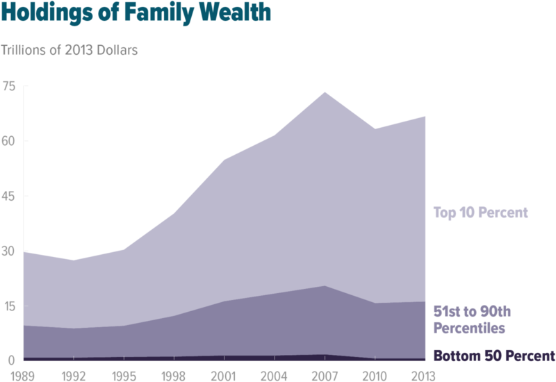
Wealth
A recent issue of Pathways magazine from Stanford University's Center of Poverty and Inequality, presents an article by Gabriel Zucman. He shows that 1% own 42% of all private savings. In most European countries the 1% own between 12% and 25%.
Another source is derived from the Congressional Research Service quoted in a blog posting at EPI.org, it states that 50% of the U.S. own just 1.1% of all wealth. And Edward Wolff is the third source, his report can be easily digested by looking at Table 1 which shows that 30.9% of Americans have "zero" "non-home wealth"-- nothing in the bank savings account. And 50% have less than $10,000. The Federal Reserve's Flow of Funds report, page 2, shows the "Household Net Worth" stands today at $88.1 trillion, which is also
$710,000 private net savings for every U.S. household -- almost a laughable statement in light of the fact that half have less than $10,000 outside their home equity. The FRB report Survey of Consumer Finances, 2013, is the last report, showing a decline of 40% for the middle household net worth between 2007 and 2013, a loss of $54,200, from $135,400 to $81,200 (page 37).
This graph from the Congressional Budget Office report shows dramatically unequal growth in family wealth: (I'm not able to load the graphic, so you must click for the title page. When looking, remember that $89.1 trillion is the Fed's Flow of Funds total net worth, page 2, not this one in the graphic.)
The Flow of Funds reports, FRB, all of them going back to 1996, show the growth of financial assets, Table B100. In 1996 total financial assets were valued at $24 trillion, which is $36 trillion adjusted for today's inflation. Today the total is $72 trillion, double. The economy has grown by 15% of a per capita basis, see Measuring Worth. Again:
Financial Assets: grew by 100%
Economy grew by 15% -- over a 20 year period.
Financial assets should be taxed. See James Kwak essay on how to.
The Economy's Strength To look optimistically at our economy we can see (BLS site here) a healthy strength that bodes well -- about 55% of the workforce are nonsupervisory employees working full-time whose average income is $37,544 a year ($722 a week and $21.49 an hour). These 87 million private sector workers, excluding low-paid retail and leisure/hospitality workers, hold the economy together with their purchasing power. To them we can add 22 million government workers, and they total 69% of the workforce. Combined their collective wage income amounts to 35% of all income. The top graph in blue shows that labor share for 90% is about 38% of all income. So my calculation does not match Giovannoni's. We can look to a table at the EPI's State of Working America web page, Table 2.4, which shows
Sources of Income
Sources of pretax comprehensive income, by income group, 2007 (2011 dollars)
| Income fifth | Breakdown of top 10% | ||||||||
|---|---|---|---|---|---|---|---|---|---|
| Bottom | Second | Middle | Fourth | Top | 90th–<95th percentile="" th=""> | 95th–<99th percentile="" th=""> | Top 1 percent | Average all households | |
| Households (millions) | 24.6 | 22.2 | 22.9 | 23.0 | 23.7 | 6.0 | 4.7 | 1.2 | 116.88 (Total) |
| Share of total pretax income | |||||||||
| Wages | 50.5% | 59.3% | 60.5% | 63.2% | 48.4% | 61.8% | 55.6% | 26.7% | 54.3% |
| Proprietors’ income | 6.0 | 2.6 | 1.9 | 1.6 | 2.6 | 2.8 | 4.8 | 1.6 | 2.4 |
| Other business income | 0.1 | 0.6 | 0.9 | 1.1 | 8.2 | 3.3 | 7.3 | 15.5 | 4.6 |
| Interest and dividends | 1.0 | 1.2 | 1.9 | 2.6 | 7.6 | 5.0 | 7.1 | 12.1 | 5.2 |
| Capital gains | 0.3 | 0.4 | 0.6 | 1.1 | 13.8 | 3.8 | 6.3 | 31.3 | 8.1 |
| Pensions | 1.9 | 4.1 | 7.1 | 8.2 | 5.2 | 7.6 | 5.9 | 1.1 | 5.8 |
| Cash transfers | 20.3 | 12.2 | 9.6 | 6.6 | 2.3 | 3.3 | 2.3 | 0.4 | 5.7 |
| In-kind income | 15.4 | 13.1 | 11.1 | 8.7 | 3.6 | 5.2 | 3.5 | 0.6 | 6.9 |
| Imputed taxes | 4.4 | 5.1 | 5.3 | 5.7 | 7.3 | 6.5 | 6.0 | 9.5 | 6.5 |
| Other income | 0.2 | 1.4 | 1.2 | 1.2 | 1.2 | 1.2 | 1.0 | 1.3 | 0.6 |
| Total | 100.0 | 100.0 | 100.0 | 100.0 | 100.0 | 100.0 | 100.0 | 100.0 | 100.0 |
| Average | |||||||||
| Wages | $10,082 | $27,346 | $42,341 | $64,528 | $139,009 | $121,552 | $174,477 | $542,615 | $56,561 |
| Proprietors’ income | 1,198 | 1,199 | 1,330 | 1,634 | 7,467 | 5,511 | 15,008 | 32,516 | 2,500 |
| Other business income | 20 | 277 | 630 | 1,123 | 23,551 | 6,580 | 22,803 | 315,001 | 4,792 |
| Interest and dividends | 200 | 553 | 1,330 | 2,655 | 21,828 | 9,890 | 22,130 | 245,904 | 5,416 |
| Capital gains | 60 | 184 | 420 | 1,123 | 39,635 | 7,451 | 19,908 | 636,099 | 8,437 |
| Pensions | 379 | 1,891 | 4,969 | 8,372 | 14,935 | 15,047 | 18,435 | 22,355 | 6,041 |
| Cash transfers | 4,053 | 5,626 | 6,719 | 6,739 | 6,606 | 6,410 | 7,082 | 8,129 | 5,937 |
| In-kind income | $3,075 | $6,041 | $7,768 | $8,883 | $10,339 | $10,138 | $11,039 | $12,194 | $7,187 |
| Imputed taxes | 878 | 2,352 | 3,709 | 5,820 | 20,966 | 12,745 | 18,971 | 193,065 | 6,771 |
| Other income | 40 | 646 | 840 | 1,225 | 3,446 | 2,362 | 3,245 | 26,419 | 625 |
| Total | 19,965 | 46,114 | 69,985 | 102,102 | 287,208 | 196,838 | 313,616 | 2,032,265 | 104,163 |
| Shares of total income categories claimed by each group | |||||||||
| Wages | 3.8% | 9.2% | 14.7% | 22.5% | 49.9% | 11.0% | 12.4% | 9.9% | 100.0% |
| Proprietors’ income | 9.8 | 8.8 | 10.1 | 12.5 | 58.8 | 11.0 | 23.4 | 13.0 | 100.0 |
| Other business income | 0.1 | 1.0 | 2.4 | 4.3 | 92.3 | 6.5 | 17.7 | 62.5 | 100.0 |
| Interest and dividends | 0.8 | 2.0 | 4.9 | 9.8 | 82.6 | 9.5 | 16.6 | 47.1 | 100.0 |
| Capital gains | 0.2 | 0.4 | 1.0 | 2.6 | 95.8 | 4.6 | 9.5 | 77.9 | 100.0 |
| Pensions | 1.3 | 5.9 | 16.0 | 27.1 | 49.7 | 12.7 | 12.2 | 3.8 | 100.0 |
| Cash transfers | 14.4 | 18.1 | 22.3 | 22.5 | 22.7 | 5.6 | 4.8 | 1.4 | 100.0 |
| In-kind income | 9.0 | 16.0 | 21.3 | 24.4 | 29.3 | 7.3 | 6.2 | 1.7 | 100.0 |
| Imputed taxes | 2.7 | 6.6 | 10.8 | 17.0 | 62.9 | 9.7 | 11.3 | 29.3 | 100.0 |
| Other income | 0.7 | 9.9 | 13.3 | 19.5 | 56.6 | 9.8 | 10.6 | 22.0 | 100.0 |
| Average | 4.0 | 8.3 | 13.1 | 19.1 | 55.5 | 9.6 | 12.0 | 19.9 | 100.0 |
Source: Authors' analysis of Congressional Budget Office (2010)
This states that "average" income for all households was $104,163 in 2007, updated to 2011 dollars (see the middle rows, Average, lower right side, total income). Looking at the top line, at the left, total wage income amounted to 54.3% of all income (which also means that 45% of all income is not wage income but mostly ownership income), and looking in the lower section, the wage share for the first four quintiles was 3.8 plus 9.2 plus 14.7 plus 22.5 -- 50.2% of all wage income. Therefore, the
total wage share for the lower 80% was 27% of all income (50 times 54 = 27). This is $3.6 trillion adjusted to 2015's national income of $13.287 trillion (taken from the table above from the CJCT). This results in an average income of $36,363 for all households in the lower 80%. Remember also the average household income for all in this table is $104,163. The CBO reports (page 2) that the average household income in 2011 was $93,900, and that adjusts to just under $100,000 in 2016.
This table of real weekly wage income of nonsupervisory workers from the BLS shows a drop of 8% in 44 years. The second graph in this series showing "real mean household income by quintile" from 1965 to 2015 shows perhaps 8% growth for the middle quintile.
Between 1970 and 2014 "per capita disposable income" (the average per citizen growth of the economy) grew by
123%. See here. To repeat, 80% of workers see 8% decline in weekly buying power over a 50 year period while economy more than doubles on a per capita basis.
There is an immense disparity in income, and labor has not been receiving it's fair share. The Social Security report on wage income shows that the lower-earning 45% of all workers, 71 million, earn below $25,000 a year, and their average income is about $11,130 a year -- while the total national income divided by all in the workforce is $86,600 a year. The lower 45% also have a combined income of under 6% of the national income.
Is capitalism broken?
Is capitalism broken?
Full Employment ?
The National Jobs for All Coalition shows that 19.7 million workers -- about 1 in every 8 -- are unemployed (7.4 million) or working part-time involuntarily (6.4 million) or not counted (5.9 million). To that group add the other 19 million who are working full-time but for less than poverty level wages -- total 38 million or 24% of all workers or would-be workers -- looking for living wage employment. I did the math recently, and arguably the nation needs about 18 million full-time year-round jobs, with 4% unemployment, to achieve "full employment". The expert prognosis from the Economic Policy Institute (EPI) recently stated we need 3 million. So there is room for discussion on this topic.
In April, 2000, the Employment to Population ratio for age 25 to 54 workers was 81.9%, it dropped and then recovered to 80.3% in January of 2007, then it fell to 74.8% in November, 2010, and today is 77.8%. In short, since 2000 it dropped 7.1%, and now it is up 3.0%, and so --- we have almost half-way recovered -- still 4.1% lower than year 2000. That's about 5 million prime-age workers not working.

President Obama likes to remind us that 13 million jobs have been created in 6 years since 2010, up 10% (2.17 million a year). But he does not state that a total of only 15.1 million have been added since year 2000, about 15 and a half years (971,000 jobs a year, 80,000 a month). Over 16 years we have had a 11% increase in jobs. For over 7 years there was no increase in jobs. And have the new jobs been good jobs?

This is answered by a study from two professors, one from Harvard, the other from Yale: "A striking implication of these estimates is that all of the net employment growth in the U.S. economy from 2005 to 2015 appears to have occurred in alternative work arrangements."
" . . . these figures imply that employment in traditional jobs (standard employment arrangements)
slightly declined . . . "
All the net gain in employment, they state, occurred in four "alternative" work categories: "Independent Contractors", "On-Call Workers", "Temporary Help Agency Workers", and "Workers Provided by Contract Firms". Traditional full-time and year-round work is shrinking.
After maybe an hour of researching BLS data, I conclude that we need about 14 million additional full-time year-round jobs, and the total number of employed should be 8 million higher than today, at 159 million instead of today's 151.0 million.
Since 2000 over 64 million Americans joined the noninstitutional civilian population, they crossed from 15 years old to 16. While 64 million aged in, 41 million aged out, turned 65 -- a net increase of 23 million. We need about 4 million more full-time jobs to return to 2000 levels. We also need a pay raise across the board of about $10 an hour for all "employees", from an average of $21 an hour to $31 an hour. And while most of the advanced world have around 25 days, more than three weeks, of paid holidays and vacation, the U.S. has zero (see here).
What Should Your Pay Be?
What Should You Be Making?
Let's look at the Economic Policy Institute's web page. The median employee pay in 2014 was $28,815 -- what should it be if wage growth had matched productivity as it did for about 40 years:
up by $17,000
$45,941 -- that's an increase of 59%
What if you earned the median household income of $53,600?
up by $25,000
$78,300 -- that's an increase of 44%
Remember that I stated above that since 1989 the "real disposable per capita income" had grown by 54% ?
Is Capitalism Broken? Did it perform better and more fairly?
The Minimum Wage Debate
In the Australia or the UK, a days work at minimum wage is equivalent to seven working days in the U.S.
In short, a higher minimum wage, combined with more generous social benefits -- such as universal health care, child care subsidies, housing subsidies, low-cost or free post-secondary education, and a more generous EITC (Earned Income Tax Credit) -- would improve life for millions, especially younger workers.
David Howell has published articles at the American Prospect, and several at the Washington Center for Equitable Growth. (See here and here.) Howell's articles are excellent, better than my ramblings by far.
"Other affluent countries provide much higher and more universal support for working families than the United States, in the form of health care, housing, education, and child subsidies.
This means the legal wage floor must carry a much higher burden [in the U.S.] for maintaining minimally
decent incomes for working families than in other rich countries.
. . . the United Stated is at the
extreme low-end among affluent countries on the level of the minimum wage, whether
measured in terms of buying power or relative to the median wage. (See Figures 1 and 2.)
As a result, after taking into account taxes and benefits, it typically takes a minimum wage
worker six to seven times as many hours of work per week to keep a lone parent or two
child family out of poverty compared to the United Kingdom or Australia (50 hours versus
7 or 8 hours)."
Low-wage work in other advanced countries (1) pays more and (2) social benefits reduce family expenses. And in all these advanced countries low-wage work is a smaller share of employment, and half have higher employment rates. In France, with an $11.64 (USD) minimum wage, they count 11% of all workers in low-wage positions, while the U.S. counts 25% of workers as low-wage with a $7.25 an hour minimum (which is the actual minimum in 21 states). "France spent about 3.8% of GDP on family benefits, cash payments, and services and tax breaks for families, the country had the highest investment level in the OECD, which had an average spending level of 2.9%." (See here) If the U.S. spent 3.8% on families alone, the cost would be $684 billion, and the OECD average, 2.9%, would be $522 billion. The U.S. spent $362 billion a year on the entire safety net expenditures, not just family related benefits, in 2015, 10% of the budget, and 2% of GDP. (See here.)
Both are necessary -- a higher minimum, and greater social benefits.

________________________________________________
The People's Budget
The Progressive Caucus, of which Bernie Sanders is the only, the one and only, Senator to be a member, presented a budget. Here is the key recommendation, in my opinion:
"Make necessary public investments. The budget finances roughly $295 billion in job-creation and public-
investment measures in calendar year 2016 alone and roughly $565 billion over calendar years 2016–2017.3 This
fiscal expansion is consistent with the amount of fiscal support needed to rapidly reduce labor market slack and
restore the economy to full health."
This morning while drinking coffee I read this report from the Levy Economics Institute: Investing in Social Care Delivery. Apparently one job in social care -- health care for the elderly and chronically ill, and "early childhood development services" -- costs about $41,600 per year. While a job in infrastructure costs about $100,000 a year. One mainly employs women, the other mainly men. A 50 - 50 split of the two types leads to a $70,000 per year cost per job, and to save the reader the math, a $300 billion investment would create 4.3 million jobs, half for men, half for women.
More workers = more taxes. More workers = less excess labor supply and higher wages for 109 million full-time workers.
A financial transaction tax could finance such a program according to this report from the Chicago Political Economy Group.
The year before the Progressive Caucus budget planned to created 9.1 million jobs over a three year period, but they have trimmed down their proposal in this latest edition. We could use 9.1 million new jobs. That would raise wages for all 109 million full-time workers are jobs would be "tight" and wages would grow, and we are far away from inflation.
Is Capitalism Broken?
A Look at the Supplemental Poverty Measure
A Look at the Supplemental Poverty Measure
The following section is difficult, it has so many numbers. In short, 30% of Americans live in poverty, another 10% have low incomes, too low to achieve a basic, frugal lifestyle. Another 40% are doing well with income, and the top-earning 20% are doing quite well. So 60% are doing well (but they are working too hard without vacations), 40% are struggling. Is Capitalism Broken? I recommend the Pew Research report that breaks down the complexity: The American Middle Class Is Losing Ground, a 9 page paper.
Let's look at the U.S. Census Supplemental Poverty Measure to see how they measure well-being from a base of poverty.
But first, this report shows several very important things. On page 9 they show that poverty has been lowered by government transfer programs, principally Social Security, from around 30% to 15.3% -- cut in half by my calculation. A June, 2016, report from Robert Greenstein at Center for Budget and Policy Priorities says that government programs reduce poverty from 25.5% to 15.3%, a reduction of 10.2%. He states: ". . . the safety-net programs . . . lifts more than 40 percent of such (poor) people above he poverty line." He also says of the Republican (Ryan) plan for poverty "42 percent of all federal resources for low-income programs would disappear by 2026." Just great, cut about half of all funding for poverty! Here's a report from CBPP that states that 90% of benefits go to -- guess who -- the elderly, the disabled, working households.
This CBO report, The Distribution of Income and Federal Taxes in 2011, shows (page 2) this distribution by household quintiles
1 2 3 4 5
Market
Income 4% 7% 12% 20% 57%
After-Tax 6% 11% 15% 21% 48%
Income
-- Gain or +2% +4% +3% +1% -9%
Loss
So roughly 9 or 10% of income from the top-earning 20% is shifted through transfers to the lower-earning 80%. The 2nd quintile receives more than the 1st quintile.
Page 13 of the SPM shows that of the 29 million adults (15.0% of all adults) who fall into poverty, 52% worked in the past year, 22% (6.4 million) "worked full-time, year-round". And another report, showed that 35% of the adult poor were disabled, retired, or in school. Of the remaining 65% who are work-eligible, 63% of them were working either full- or part-time. So, 35% are not work-eligible, 41% are working, leaving 24% of the poor adults, 18 to 64 years old, whose poverty rate is 15.0%. Well, 24% of 15% equals 3.6% -- that's the rate of adults 18 to 64 who do not work, period. That implies that 3.6% of adults between age 18 to 65, about 7.1 million, were able to work but not working. Then, 96% of adults between 18 and 64 are either working, have home responsibilities, are in school, are disabled, or are retired. Only 3.6% (7.1 million adults) are not working and poor. They probably survive on food stamps, and could easily be homeless, or in prison. As the report cited above states, 90% of safety net funding goes to the elderly, to the disabled, and to working households.
But page 8, Figure 2, gets at total distribution, the graph shows
 Look at the right pillar, the SPM measure. 15.3% of Americans after all government transfers live in poverty -- 48 million -- 1 in 7.
". . . not able to meet their basic needs"
". . . not able . . . to achieve a safe and decent standard of living"
This is precisely a definition of poverty "not able to meet their basic needs . . [not able] to achieve a safe and decent standard . . .". I repeated it three times. -- 30% "not able".
It raises the after-tax after-transfer poverty rate from 15.3% to about 30% (29.9% to be exact in 2011), look at the pillar graph to compare. So, it is a fiction that the poverty rate is 15.3% or 14.9%, when it's actually around 30%, according to Kathleen Short who has been employed at the Census for over 30 years.
One of the glaring defects of the SPM is that "poverty" is not strictly defined. What are the defining qualities of poverty? The report of 2013 was a comparison of the SPM with another report from the Economic Policy Institute, and it concurs that the EPI reported "poverty rate" of 30% was accurate, and this EPI threshold comprised approximately the same number of citizens who live with income below 140% the SPM poverty theshold. That places the poverty threshold income for a family of four at $35,644, just a few thousand below the average income, 37,544, for the 87 million nonsupervisory private sector workers I cite above under "The Economy's Strength". This is why 65% of married couples with children over 6 years old are working in the economy. One full-time non-supervisory wage worker at the median -- equals just a little above poverty! Around 80% of U.S. workers are non-supervisory.
Now back to the chart above:
5.1% of Americans live with half the poverty amount, deep poverty. The poverty income for a family of 4 is less than $25,460 if they rent an apartment, or $6,365 per year per person -- or $17 a day per person --- and this value includes all government benefits such as food stamps, EITC, Medicaid, Social Security-- called government transfers.
But let's look at the sector that earns (or receives benefits) twice the poverty level -- about 47.1% of all Americans fall in this category-- over 152 million Americans. As $17 a day is poverty, then $34 a day is 2 times poverty, it comes to $12,410 per person per year. A family of four will have less than $49,640 yearly income. This is low-income. The median for a four person family is $84,000 (see this report, page 9) and at a Pew Research Center report (page 1) it is $72,520. The median for all families $63,810, see here.
Now look at the average expenses for a family in the U.S., see this EPI site, Family Budget Calculator --- $63,741 is needed for a frugal but adequate life style in the median expense city of Des Moines, Iowa. So about 33% to 50% of U.S. families have incomes below what is needed for a frugal but decent life style.
About 47% live below twice the poverty, 200% of poverty, and that's about $49,640 a year for a four person family whose expenses for a frugal lifestyle, in Des Moines, is $63,810.
The SPM does not breakdown their groups as to family size and income.
Is capitalism broken? But 47% live with half of the average income, which is less than 2 times poverty level, which is $49,640 for a four person family.
The Pew Research report, here, states that in 2015 a total of 9% of households were "Upper Income", meaning 3 times the median income. A four person family will have an income above 3 times $72,520, or $217,560, and 9% of the nation live at that 3 times the median level. For households of various sizes that "3 times the median income" equals income above:
Upper 9% Official Poverty Threeshold
one person --- $108, 780 + $11,770
two person --- $153,840 + $15,930
three person --- $188,412 + $20,090
four person --- $217, 560 + $24,250
five persons of more --- $243,240 + $28,410
A multiple of 10 separates these two groups.
And in 1981 only 3% of households entered this upper income group, but 9% were in this group in 2015. The Problem with Pew and SPM
The problem with the Pew report is that its central reference is the "median" income for various size households. And I've shown that the median has not budged in decades while the entire economy has doubled on a per capita basis. And the problem with the SPM is that the likely understated low poverty rate is the central reference point of comparison. An improved measure would be the "average" income and the distance from it for all households. I venture to guess that only about 10% of households live at "average" or above. That does sound incredible, but I've looked closely. Average would be at $42,543 per person -- $170,172 per year for a 4 person family. And the BEA is using the "disposable income" figure, not the higher market income figure. We are a very wealthy nation, on paper at least -- had it not been for extreme inequality. We are so poor that we can't pay our national public debt of $14 trillion with the $88.1 trillion in private net worth!
 The hollowing of the American middle class
 The BEA reports (Table 2.1) that the "disposable personal income per capita" is how much? --- $42,543. The poverty income per capita in a four person family, $6,365, and that is almost 1/7th of this $42,543 average. (That $42,543 figure may sound too high, but multiply it by 320 million citizens and it's close to the CJCT (first paragraph of this essay) reported national income of $13.287 trillion.)
The per capita average, $42,543, leads to an income of $170,000 for a four person family. And $25,460 is about 1/7th the average of $170,000. This is not a democratically owned economy, quite obviously.
Yet 81% live below 4 times the poverty level (19.1% above) per the graph copied from the SPM. The Pew report states that, when separated into family size, 21% live with more than double the median. For a 4 person family, above $145,000 (2 times $72,540). But according to the SPM 19% live with income above $101,200. Therefore, I find the SPM graph in error, it share is greater than 19%.
Perhaps 80% of Americans live below 60% of the average per capita income. Maybe. Definitely few live at or above average.
I think the Pew and the SPM would be improved if they both showed the percentage of the population living at 100% of "average income" or $42,543 per person. The SPM could scrap the multiple of poverty, and the Pew could scrap the multiple of median. The multiple of "average" more clearly shows the economy's health.
Since a poor family of four is in poverty at $25,460 or below, as SPM reports, then 4 times that is $101,840. The 80th percentile is about $114,000. The Pew figure, $145,041, where 21% of the population live, is 2 twice the median! And to add complications, 4 times the per capita income -- $42,543 is $170,172. ------- One must not lose the forest for the twigs on the trees. Our very wealthy economy could eliminate poverty easily, but we just don't care to do so.
Here's are a few reports with suggestions: here, here and here.
A Radical Solution? - - Worker Management
I've just finished reading the American Prospect article by Nick Hanauer, "Confronting the Parasite Economy", and it's excellent. But the only solution he mentions is to increase the minimum wage, which will not solve the problem.
A new charter --
I think corporate governance must change, that all firms of a certain size must receive a national corporate charter, and this charter would require worker representation on the board of directors to a certain percentage.
A new NLRA --
A re-writing of the National Labor Relations Act (NLRA) would mandate that every worker with one year of seniority would have a vote to select a percentage of corporate board members. Greater labor union organizing rights for workers also would help, which means re-writing the NLRA. Ellen Dannin's book and interviews -- see here, here and here -- outline the process of reforming the NLRA.
A tax advantage --
And -- most importantly -- abolition of corporate tax for all corporations that are managed, if not owned, by workers with no management input from owners. This tax advantage would position worker-owned firms over those owned by "absentee" owners, and this automatically would transform wages for the entire economy. Worker managed or owned firms would disperse profits to workers.
Large Corporations Are Where Most People -- 65% --Work This U.S. Census report shows that 51.6% of all workers (just under 60 million workers) are employed in corporations with more than 500 workers, and 65.4% work in firms with more than 100 employees. (This U.S. Census report (Establishment Size) shows somewhat different data.) A firm that pays high wages should receive a market advantage, and over time these firms would all drive out of existence the current ownership system of corporations. That would be radical.
Where Corporate Profits Go William Lazonick, at this Harvard Business Review article, has shown that at the 449 largest U.S. corporations, between 2002 to 2012 inclusive, 91% of profits went to either stock buybacks or corporate dividends. "That left very little for investments in productive capabilities or higher incomes for employees," Lazonick states.
Very little for higher incomes for employees -- he hit the nail squarely on its head. As Hanauer has shown, employers cannot raise wages in this system without being driven out of business by competitors. "Good" employers subsidize bad employers with taxes that support the low-paying companies through government benefits to low-income workers. "In effect, many real-economy companies end up subsidizing their parsite-economy competitors," states Hanauer. This is a broken system. Remember 91% of profits go to owners while average weekly earnings of workers since 1964 are lower by 8%.
We need worker ownership or management as a national policy. And still that might not be sufficient.
S&P 500 out grows all others
Since 1974 an investment of $1,000 in the S&P 500 has grown by 410%. (by a multiple of 5.09, adjusting for inflation)
The BEA (Table 2.1) "disposable personal income per capita" adjusted to "chained 2009 dollars" has grown by 108%.
The U.S. median household income, according to the U.S. Census has grown by 10.1%
The Federal Reserve shows the "Average Weekly Earnings of Production and Nonsupervisory Employees: Total Private"
has fallen by -4.9% since January 1974.
A Tale of Two Periods ------------ wages grow with the economy, and then they don't
Between 1947 and 1973 (26 years) the GDP per capita grew by 90%, and the BEA "disposable income per capita" grew by 106%.
The hourly wages for non-supervisory workers grew by 76%, and their weekly earnings grew by 61%.
But in contrast, between 1973 and 2013 (40 years) GDP per capita grew by 92%, about the same as '47 to '73.
The BEA "disposable income per capita" increased by 94%. But hourly wages for non-supervisory workers, over 80% of all workers, increased by only 4%, and total compensation by 9%.
(Go to here and here and here Table 2.1 for confirmation.)
How did Warren Buffet become the wealthiest man? He put his money in corporate ownership shares, and they grew by about 4 times faster than the economy, and about 40 times faster than the median household's income. The economic surplus for decades has been channeled into the minority wealthy who have no constructive use for this surplus. The surplus has been wasted on the wealthy. They systematically bid up the value of stock prices creating a bonanza for stock values. Since 2008 the nominal wealth of the nation has grown by 57%, see the Federal Reserve report Flow of Funds, page 2. Since 2008 "household net worth" has increased from $56.2 trillion to $88.1 trillion, an increase of $31.9 trillion, $257,000 per household, a nominal increase of 57%. Since 2007 the median household income has dropped by -6.5%, and the median household's wealth has fallen by -40%. A Tale of Two Cities -- the cities of Paper Assets and Dwindling Assets.
The surplus is going to waste. Or you might have some other explanation?
Capitalism is Broken -- but it has not collapsed.
Material standards are only a part of well being. Cultural values, human relations, family, friends, social attitudes play a much greater role in personal happiness, security, and life at its best. Yet for many, perhaps 40% of the nation, the best of non-tangible values is not enough. Material security often determines life's opportunities and fulfillment of human potentials, for the individual and society.
I have to look at the Economy's Strength section above with 87 million workers earning on average $37,000 a year. That is a strong economy. But it could be so much stronger! No paid vacations? The greatest child poverty rate among developed countries? I have failed to mention the United Nations report on Human Development, adjusted for inequality. The U.S. ranks eighth, but then more realistically it is ranked for inequality, and it drops to 28th between Italy and Greece. See here, page 16. Imagine, just above lowly Greece which is in a major depression. You might wish to skip the rest of this sentence: The Greek GDP/capita is $22,648, USA is $51,925, and Italy is $32,827. What, dear faithful reader, does that tell you?
Capitalism was and is broken for his neighborhood, his friends, family relations, even his generation. A large portion of our population are struggling unnecessarily.

Since 1880, as recorded by the Pew Research Center, the U.S. Census and Harold Meyerson (here), "the percentage of Americans ages 18 to 34 who live with their parents (32.1 percent) exceeds for the first time in recorded history" those who are married or living with a partner (31.6%) or living solo or with friends. And the share who are married or co-habiting has dropped from 62% to 31.6%, half as many as in 1960.
There goes our birth rate, our family formation rate, our families, and our nation. This looks like the end of our traditional view of society.
Capitalism is not working for those still living with Mom and Dad.
There goes our birth rate, our family formation rate, our families, and our nation. This looks like the end of our traditional view of society.
Capitalism is not working for those still living with Mom and Dad.
It is breaking apart. It could be fixed with some attention.