I present two stories today: Obamacare results, to date, and E/P, the Employment to Population story. The second is for nut-cases like me who can't quite unravel the mystery of the decline in the share of adults who are employed. The official versions are unconvincing, and here is an argument why. But first, Here's some info about the Obamacare, or ACA, that relies on this New York Times article, "Obama's Health Law: Who Was Helped Most", and several other sources. I live in Mariposa County, so it is addressed to my neighbors, but not exclusively. In Mariposa County the percentage of people without health insurance dropped from 18% in 2013 to 10% in 2014, according to the New York Times article of October 29, 2014. The article begins, "We know that about 10 million more people have insurance coverage this year as a result of the Affordable Care Act." The national picture improved from 16.4% not covered to 11.3%, which also represents 32 million and 22 million, respectively. The NYTimes article continues, "The areas with the largest increases in the health insurance rate, for example, include rural Arkansas and Nevada; southern Texas; large swaths of New Mexico, Kentucky and West Virginia; and much of inland California and Oregon." Unlike poor American children, poor American adults, age 18 to 65, do not automatically qualify for Medicaid support; each state determines their eligibility according to annual income. But Obamacare, or ACA, replaces the state limits and covers all adults whose incomes fall below 138% of the federal poverty threshold. But states must opt to expand Medicaid coverage, the additional costs are 90% covered by the federal government. Here's a map of all states showing the 22 that rejected Obamacare, the 5 that have a hybrid plan, and the 23 that expanded. The biggest winners due to Obamacare are ethnic African Americans and Hispanic Americans. The graph at the bottom of the NYTimes article shows nationally, state-by-state, the areas where lack of health insurance is both highest and lowest. The majority of Southern states, most of whom rejected Obamacare expansion, still have greater than 16% of their adult populations without coverage. The states with Medicaid expansion comprised 68% of all enrollees, and those that rejected it comprised 32% (according to this HHS report, page 5, April 2014. California reduced its rate of uninsured from 22% to 11%, according to this LATimes article, The article also states: "Texas, which didn't expand Medicaid, saw its uninsured rate among adults fall from 34% to 22%. Florida saw a smaller decline, from 30% to 26%." States in the South have the highest percentage of employees earning the minimum wage: Texas 6.4% vs. California 1.3%, and the median hourly earnings vary accordingly, Texas $11.99 an hour, California $13.11. See this report. To read an article about different states' decisions to expand or not Medicaid to poor adults, you can read this article. In Texas, a couple earning more than $4,900 a year is excluded from Medicaid. In Minnesota, adults in families with over $40,000 still qualify for Medicaid. And the Texas legislature and governor rejected Obamacare expansion, along with 22 other states, which would have increased eligibility to an income equal to 138% of the federal poverty level, or $27,310 for a family of three. See a table chart of other states, mostly in the South, that rejected Medicaid expansion, and the maximum income exclusions still in place excluding about 4 million adults from health insurance. Here's an illustration from the Kaiser Family Foundation:
Figure 1: In states that do not expand Medicaid under the ACA, there will be large gaps in coverage available for adults.
How We Treat the PoorestIn Texas, for instance, a couple with an income over $4,900 per year is denied Medicaid, but in the above chart the "Median (for all states) Medicaid Eligibility Limits" is $9,900 for a family of three. Adults in families earning between $9,900 (or above $4,900 in Texas, or $9,393 in Georgia, or $4,699 Alabama) and $27,186 are denied Medicaid coverage. The article also states, "and in nearly all states not expanding, childless adults will remain ineligible."2" This KFF article (linked above) states that 4 million adults fall into this "coverage gap" and 86% of them are in the South, and 2/3rds are working adults. The Cost of Medical Insurance in the U.S. From the Milliman Medical Index report: Executive Summary $23,215. That's how much is spent in 2014 on healthcare for a typical American family of four covered by an average employer-sponsored health plan according to the 2014 Milliman Medical Index (MMI). And yet while the amount has more than doubled over the past 10 years, growing from $11,192 to $23,215, the 5.4% growth rate from 2013 to 2014 is the lowest annual change since the MMI was first calculated in 2002. According to the Family Budget Calculator at EPI.org, the cost of "health care" in the median-priced locale in the U.S., which happened to be Topeka, Kansas, in 2013, was $16,104 for a family of four, or 25% of their basic, frugal budget. The FBC says in "Rural" California the cost is $17,928 or 28% of the annual budget, and in Madera County it is 16,992 or 27%. I suggest the reader play around with this family budget calculator, it's fun. 2013 Costs: $9,255 per person in the U.S This NYTimes article, Dec 7, 2014, states, "Spending on health care in the United States grew in 2013 at the lowest rate since the federal government began tracking it in 1960, the Obama administration said Wednesday." That is still 17% of GDP. The graph shows that healthcare has risen by 15.6% in the past 6 years, and over the same period median household income has been down from 7% to10% of its 2008 high. An expanded New York Times article answers 7 major questions. A companion story tells the story of a 27 year old woman in 2008 who develops extensive numbness, weakness and fatigue. Her symptoms disappear, but as a result she is denied insurance because of this pre-existing condition. Later her problems resurface and she is diagnosed with multiple sclerosis. She obtains coverage through the ACA in January 2014 and runs up a medical bill for $65,000 but her monthly premium stays at $66 a month. “It’s great coverage,’’ she said. “It’s affordable for me. It has changed the trajectory of my life for the next 10 years. I feel very, very blessed.’’ Individual Enrollees Plan About the 7% of ACA enrollees who purchase individual plans, this article is enlightening: From the article: "Last month the government announced that 87 percent of shoppers received a subsidy on the federal exchange, bringing their average monthly premium down from $346 to only $82! That's a 76-percent reduction, and it more than makes up for the 14- to 28-percent premium increase, which may not be much of an increase after all if you include people who didn't buy insurance in the past. Bottom line: On average, Obamacare clearly lowered the cost of health insurance. Sure, some people will pay higher rates, but you have to remember that those people only paid low rates in the past because insurers were discriminating against sick people. The new market is much fairer and more affordable for more people -- a fact that you might want to point out to Republicans on the campaign trail this fall." High Cost and Poor Results of U.S. Medical Services No conversation about health costs is complete without the following comparisons: See this report from the OECD. Average costs for U.S. citizens is almost $8,000 a year, in the rest of the developed nations it is around $3,200. We spend over 17% of GDP on health, others spend 9.6%. It is past time to institute what all others have, a comprehensive system that limits expenses. We are wasting our incomes on exorbitant costs that other people have learned to control. Our system does not work well. Out of eleven nations we rank last, see this report or this Common Wealth Fund report. Or this article citing an OECD study of 26 nations. We spend double and our results are the worst !
25.1% of U.S. workers are out-of-luck, about 41 million adults. The out-of-luck rate includes those who are unemployed, plus the under-employed involuntary part-timers, plus "working-full-time-but-still-in-poverty" employed -- and the rate is 25.1%, according to the NJFAC.org. (Find similar figures at this site: click here.) That means 13.8% are unemployed or underemployed and another 11.3% are working full-time and year-round for wages less than the poverty level for a four-person family, see here. Personal income for every citizen (babies, infants, toddlers, children, teen-agers, adults, seniors, everyone) after paying federal taxes is over $40,000 according to the BEA.gov. And average household income is above $95,000 according to the recent CBO report on income distribution in 2011. This means only 23% of Americans are average, 77% are below average (see here, page 23). But still, incredibly, a quarter of workers are getting shafted, and half are making less than $28,031 per year in wages.
As I've pointed many times, the Social Security Administration shows that the wage income of half of U.S. workers is 7.9% of total U.S. personal income. Workers are inadequately paid in this country. The recent CBO report (page 26) on income distribution in 2011 places the Gini coefficient of inequality at 0.59, which is high. A comparison of the U.S. with other countries is found here at Wikipedia, we compare unfavorably with other developed countries.
___________________________On December 11, 2014 the Chicago Political Economy Group, CPEG, issued their report on the Unemployment report. This graph below shows in simplest form the conclusion. Be sure to read the report as well. It is the most reasonable report I've read.
Here's how I interpret the graph: We had the largest collapse of jobs since the 1930s, note that the E/P, the employment to population ratio, dropped by more than double all other recessions. And the important part for today, it's only half way recovered. The graph's creators factored into it the demographics of age cohorts -- something I do not understand completely, but the St. Louis Fed has lots of data on this, as well as the U.S. Census. I think we have a 40% recovery just looking at the E/P for the age 25 to 54 group, and a 20% recovery looking at the "all groups" E/P. But the demographics are that the imaginary bucket had a hole in the bottom as well as a flow-line at the top, and the hole enlarged while the flow-line constricted a little, the net result is a demographically adjusted interpretation of the E/P ratio. We have half a recovery after 5 and a half years, according to the above graph, but the impact of the recession was double the impact of all other recessions. That's simple and accurate. Whatever more I've written, below, you might as well ignore. But it is an exercise in this topic. I used think that we could substitute the E/P ratios for 2007 or January 2000 and use them as benchmarks. If we did that, then today's U3 unemployment would be 11.2% or 13.0%, respectively. I used to think that there was a hidden demand for work not captured by the BLS figures. But apparently, but not fully convincingly, the demographics matter, there is no hidden army of workers, they have aged-out. But the U3 employment is close to 9% I would guess -- a true recession. At EPI.org, see link here, Heidi Sheirholz said, July 3, 2014, that the U3 would be 9.6% if "missing workers" were reinserted into the workforce. So today December 2014 it would be 9.2%, according to me and this expert. Recession -- does this meet the specs? And 25.1% -- the out-of-luck rate. Like a depression.
__________________________________
Why Did the Employment to Population Ratio Drop by 5% between 2008 and 2010, from about 80% to 75%, among the group 25 to 54 Years Old?
Best to look at this chart at St. Louis Fed: click here. The CBO and the OECD say the retirement of Baby Boomers accounted for half of this drop. The FRB of Atlanta says 1/4 was the cause of retirement. The EPI.org says 1/3. Who is correct?
The graph below shows the decline for all citizens over 16 active in the labor force, the LFPR, the participation rate, between 1999 and 2013. To view the Federal Reserve, Atlanta report, see here.
The above is the Employment to Population chart for everyone in the Civilian Non-Institutional Population, or those age 16 and above (from the BLS). Then, below, just for those age 25 to 54:
According to the chart at Atlanta Fed, the age 25 to 54 group, comprises 51% of the CNP, and their participation rate is much higher than that of the full CNP, around 81% instead of around 60% for the full population. The age 25 to 54 group has recovered about 35% of its loss since 2007, and only 27% of its loss since April 2000. I call this a 35% Recovery.
Employment
Employment-to-Population Ratio, SA (Seasonally Adjusted), 16+ non-institutionalized population, is the ratio of the number of employed persons to the number of 16+ non-institutionalized population, times 100.
Source: Bureau of Labor Statistics, Current Population Survey (CPS).
This Employment to Population chart comes from FRB New York, see here. It places the total population E/P at 59.01% which is just 20% above the drop-off since 2007, a 20% recovery.
And from April 2000, when unemployment hit 3.8%, the recovery is only a 14% recovery. But due to demographic shifts, the above 35% recovery is more accurate. I wish I had never looked into this issue, it's too confusing, but that's the best I can do!
I recommend readers go to the FRB Atlanta site and explore their reasons, and then read this report by Michael Cassidy, "Uncovering the Labor Market Recovery", at The Century Foundation, plus this article by Cassidy. He writes clearly and adds the human touch to this dry story. At the end of the first report he shows that wage income as a percentage of total "gross domestic income" has dropped from 50%, between 1948 and 1974, to 42% of GDP. (See this Fed Reserve graph to confirm.) An 8% drop is equivalent to $1,120 billion (or $1.12 trillion). If we could add that 8% back to wage income, lost since 1974, and evenly distribute it, then all households would receive an additional $9,333. This would eliminate poverty in the U.S. The average income for the lower-earning 20% of households is around $15,500. It could be $24,500 if we had a distribution curve similar to the 1948 to 1974 era. Then the redistribution of income would be a minor issue.
Wage Growth, 1964 to 2013 -- Compared with Disposable Income per capita Growth In 1964 the average wage for non-supervisory workers was $2.50 per hour, which translates to today's $19.15 an hour adjusting for inflation. In 2014 the average wage is $20.48. (See this St. Louis Fed graph) Non-supervisory workers make-up about80% of all workers, they are called employees. So average wages have increased by $1.33 in 50 years. That's a 7% wage increase in 50 years (not much a raise is it?). The "real" (meaning adjusted for inflation) GDP per capita has increased by 155% (using this source). Or, "real" disposable personal income per capita increased by 177%, nearly tripling, (using this Federal Reserve source). Where did the extra surplus go? Not to workers. If the (inflation adjusted) average wage of $19.15 had increased at the rate of GDP per capita, then today's average would be $48.80 per hour, not $20.50 and hour. This is why an increase in minimum wage is just a beginning of a process of sharing prosperity. This corresponds to my article that places the minimum wage at $22.81 an hour, read it here. I like this last paragraph, it summarizes 50 years of economic history.
The Birth Rate Issue -- Did the Baby Boomers Stop Working?
The following section is complex. Sorry. In fact, I'd prefer that you don't read it. It will just annoy you, it annoys me, but I want to keep the data on the web page! An AnalogyVisualize a can of water with a flow hose at the top and a hole at the bottom, and a thirsty dog. Water pours in, the dog drinks, the hole empties. The dog is the main reason the E/P decreased between 2008 and 2010 (look at the graphs above again, if you must). Think of the population group 25 to 54 over time. It's like a can of water with a flowing hose at the top and a hole at the bottom. Both have valves to increase and decrease according to birth rates. The hole gets bigger and smaller depending on the population size at the bottom. The flow increases and decreases depending on the flow rate at the top. This is too complex. The dog gets thirstier as the economy tanks.
The U.S. birth rate between 1975 and 1990 dipped. In the mid '70s the rate dipped. Here is a site with the birth rates for the U.S. Many claim that the "retiring baby boomers" is the major factor of the E/P ratio. The age 25 to 54 group in October 2014 is the same as 8 years ago, May 2006. It has decreased by 1.4 million since 2007, see here, FRB St. Louis graph. The principal reason for the 5% decline in employment to population was the Recession. The second reason has to do with the birth rate issue, and lastly the retiring baby boomers contributed to the fall in E/P.
In 1998 approximately 95.4 million were employed among the working population age 25 to 54 years old, the prime working years. This total population was 117.4 million in 1998. In October 2014, 16 years later, still 95.4 million are employed but total population has increased by 7.2 million to 124.6 million (call it 125 million). Of that 7.2 million increase, normally about 80% would be employed, or 5.7 million. (I argue that we could add at least 10 million more jobs with public employment, and another 414,000 private sector jobs would added. See this essay, the part "14 million new jobs".) So, 95.4 million are working, 5.7 million more should be, a total of 101.1 million out of the total population of 25 to 54 year-olds in their prime work years using the approximate LFPR between 1988 and 2008. Meanwhile, the older group aged 55 years and above has increased its LFPR from 30% to 40% since 1996, so they have cushioned the drop in employment and lack of slow population growth among the core age, 25 to 55 year old group.
The other irregularity is that between 2000 and 2014,
total U.S. population has increased by 12.4%, or 35 million,
the age 25 to 55 group has increased by 3.2%, or 3.9 million,
and the group above 16 and above, the Civilian Non-Institutional Population, the "working age population" has increased by 17.0%, or 36 million. We old folks are living longer.
(Note, CNP stands for Civilian Non-Institutional Population, who are citizens 16 years old and older. Core Age CNP (CA-CNP) are those 25 to 54 years old.):
Between 1980 and 1990 CNP grew by 25.3%, increase of 21.3 million;
CA-CNP grew by 32.6%, increase of 21.7 million.
Between 1990 and 2000 CNP grew by 15% or 15.5 million;
CA-CNP grew by 14.8%, increase of 13.1 million. Between 2000 and 2010 CNP grew by 11.8%; increase of 25.0 million.
CA-CNP grew by 3.0%, increase of 3.6 million.
Between December 1998 and October 2014, about 16 years, the
CA-CNP population grew by 6% or 6.8 million (from 117 to 125 million)
Between April 2007 and January 2010
CA-CNP employment decreased by 6.3 million !!!!! Since January 2010, CA-CNP has added 1.3 million jobs, an increase of 21%, a 21% recovery. BUT ----
Between January 2010 and November 2014 While total CNP increased by 5.0% or 11.8 million,
CA-CNPopulation (age 25 - 54) decreased by 600,000 and employment increased by 1.8 million, the E/P increases by 1.6%. After dropping 4.9% it gains back 1.6%, still need 3.3% for Recovery -- it's a 33% recovery for this age group !!!!! OK. That's all. Read Elise Gould's reports at EPI.org, several reports, for more. But, again the CPEG report below the first graph at the top is the best report. ___________________________________________ In 16 years, there has been a net zero increase of employed, age 25 to 54, between December 1998 and Oct. 2014 -- 95.8 million both dates !!!!! (See here, St. Louis Fed graph. This Fed graph shows the next set of comparisons.)
But between Jan.2000 and Oct. 2014 CA-CNP employment is down 2.6 million.
In 2000, with a total population (age 25 to 54) at 120.7 million, E/P was 81.3%, 98.1 mn. employed. By 2007 100.5 million employed.
In 2014, total population of age 25 to 54, 124.6 million, E/P is 76.8%, down to 95.4 mn. employed, down 2.7 million in almost 14 years, and down 5 million in 7 years.
There are some obvious patterns here: the CA-CNP growth rates slow, and then becomes negative.
Between January 2000 and October 2014 CNP increased 17.6% or 37 million;
CA-CNP increased 3.6% or 4.4 million. And total employed for CA-CNP from 1999 to 2015, unchanged, no growth in spite of population growth of 6.8 million. Surely there are some needed infrastructure projects that could employ these millions.
Private sector employment also had very slow growth, it increased by 6.6% or 7.3 million in 14 years, 2001 to Oct. 2014, or about 0.5% per year increase. Between December 2000 and April 2012 (11 years 5 months) private sector employment growth was a net zero, see below. In 11 years, between December 2000 and April 2012, it decreased from 111.9 mn. to 111.8 mn.
See the bls page: http://data.bls.gov/timeseries/CES0500000001
Total employment (not just private sector employment) increased 5.3% or 7 million in almost 14 years, between Jan 2001 and October 2014. ---- that is total employment since 2001 hasincreased by 500,000 per year (42,000 a month) on average. Doesn't that seem slow?
You should access this St. Louis Fed graph again to see the slow growth of age 25 to 54 population, only 3.6 million growth between Jan 2001 and Oct. 2014. Of that about 80% would normally be employed, or 2.9 million, or again 206,000 per year. This is why I'm not convinced with the Baby-Boomers-Dropping-Out-of-the-Labor-Force argument. Yes, they dropped out, but the faucet flow at the top of the can decreased as well. Core age, 25 to 54, population shrunk by 1% after 2007 (see the graph here), but it did not shrink by 5%, while the employment rate for older workers after 2007 dropped by 2% (see the graph here), not by 5% as the E/P shrank. The Recession was the major cause of the drop.
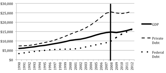
I hope you didn't read any of that. ___________________ I thought I was done. But I wrote a comment here on Sunday 12.7.14. Let's look at employment in private enterprises between January 2000 to Nov 2014, 15 years. (I'm taking data from two bls sites, here and here.) The adult population increased by 17%, but employment in private sector work increased by only 7%. Normally the two rates will match, both would grow by 17%. So private sector growth is 10% lower than normal, over a 15 year period. Or 7.7 million found private sector work, a growth rate of 43,300 a month, or a 7% increase over 15 years (save two months). In 15 years, 36 million people joined the working age population, but only 7.7 million (or 21% instead of 50%) found employment in private sector work. Normally, 50% of 36 million would have found private sector employment. Another way of saying it is that of the 17.9 million expected to obtain private sector employment, only 43% (or 7.7 million) found private sector employment work and 57% (or 10.2 million) did not find employment whatsoever over a nearly 15 year period. The official list shows 9.1 million as unemployed. To this 9.1 million add the 10.2 million I've just discovered, then the total becomes 19.3 million unemployed. The actual U3 unemployment arguably is 11.6%, not 5.8% --it isdouble the official rate. In this calculation I have accounted for the 17% who would normally be employed by all levels of governments. (I used this BLS web page for some of the calculations. And the data bls private sector employment web page.) We are still in RECESSION. ______________________________ Why has the Recovery been so disappointing? This graph from EPI's Josh Bivens argues that the Republican filibuster in the Senate crushed all attempts to recharge the economy with federal spending. In the past the government has led the way out through spending. "Spending" is not the problem, it's the answer. Even Reagan knew this, see the above graph. In the 1940s government spending for the war, WWII, increased GDP by 75% in 6 years, and increased employment by 40%. During 1933 to 1937 spending reduced the unemployment rate from 25% to 9.6%. And Bivens' graph shows the same relationship. The financial system increased its debt by 49% in 10 years, 1998 to 2008, while the economy, GDP per capita, grew by 17%. (see "Credit Market Borrowing by Sector", "Domestic Financial Sectors", Federal Reserve data here, Table D.2, page 4, and see GDP/capita data here.) All that private sector debt spending, not government spending, was unsustainable. George Bush was President mostly, Alan Greenspan was Chair of the Fed. Bush cut taxes and raised spending, the public debt under his term increased from 55% to 83% (see here). http://research.stlouisfed.org/fred2/series/GFDEGDQ188S And see this Atlantic Monthly article (I just read it myself, it's excellent, much like Dan Alpert's book The Age of Oversupply.) that provided this graph:
Crisis of 2007-2008: U.S. GDP, Public Debt, and Private Debt (in Billions)
GDP data comes from the Bureau of Economic Analysis, private-debt data from the Federal Reserve, and Federal-debt data from the Treasury. (Richard Vague) When payments came due, foreclosure and default resulted, private sector spending collapsed, corporations contracted and employees were let go, unemployment more than doubled, government aid to the unemployed kicked in, personal income for the second time since 1933 decreased -- the greatest recession in 75 years ensued! And the richest are richer than before as 95% of recent growth goes to just 1% of households who are under-taxed and unscathed. Their share of national income was 8% in 1979, now it's around 17%. Their taxes are lower, and much lower than 1940 to 1983 when the economy did its best. Government spending was the only method to restore consumption and production and employment. We have a 33% recovery after 5 and a half years. ______________________________ L. Randall Wray has an article about public jobs, here. It just appeared, 12.3.15, at EconoMonitor. Laura Tyson writes about inequality here, "The Rising Costs of U.S. Income Inequality". Paul Buchheit writes the most important journalism today often focusing on extreme inequality at Common Dreams. Did you know that 14 individuals' combined income exceeded the "food stamp" federal budget for 50 million poor Americans? Read here. In the U.S. 33% of the population live in rental properties and 52% pay more than 30% of their income on rent. And here is a portrait of net worth by Race/Ethnicity for 2011. Both available in this report by Population Reference Bureau (and here). Black or African Americans are 13% of the population, Hispanics are 17%, for a total of 30% who have approximately $3,000 in net worth exclusive of home equity. Liquid asset poverty can also been seen here, showing 44% of U.S. population has less than $6,000 available for emergencies. This survey from Credit Union National Association (CUNA) says that 83% of households with incomes below $25,000 a year " said they did not have extra funds available to pay for an unexpected expense of $1,000." (I found this info at TooMuch.online, December 8, 2014) In 2012 one in four Americans lived in households, or some 24.7% of households, had income below $25,000 (according to the U.S. Census report on Poverty Income and Health Insurance, page 33). And for all households, "When asked whether they have extra funds available to pay an unexpected expense of $1,000, the proportion who said no fell from 49 percent in 2013 to 47 percent this year." The mean average -- you know, average for all 120 million households -- for household net worth is about $627,000, see here page 89. And the Federal Reserve says it is $678,000 (see here, page i) Sixty-two percent of Americans are "white alone" and half of them have less than $33,408 in liquid funds. How long can one live on that amount? I guess it's paycheck to paycheck for many people.


 Total employment (not just private sector employment) increased 5.3% or 7 million in almost 14 years, between Jan 2001 and October 2014. ---- that is total employment since 2001 has increased by 500,000 per year (42,000 a month) on average. Doesn't that seem slow?