We Are Not Poor,
We Can Create Prosperity for All

We Are Rich, We Do Not Have to Tolerate Poverty or Economic Gloom, There Is a Clear Path Forward . . .
I present Three Solutions mid-way through this essay.
Economy Doubles -- Incomes Drop -- What's Going On?
Lawrence Mishel, a co-founder of the Economic Policy Institute, reported on February 2, 2012 that,
"Over the 1970-2010 period, the output of goods and services per hour worked [productivity] rose 119 percent and per capita disposable income [after all taxes] grew 114 percent." Unfortunately all the growth went to the top 20%, with 81% going to the top 5% of households. The output value of the economy more than doubled, and as University of California at Berkeley professor Saez reports here (and see graph below) the lower-earning 90% of households saw a 12% drop in incomes! This is outrageous. I hope it is just a matter of time before the U.S. public catches on. Look here, in this essay, just below for a recent graph issued by professor Saez on income growth.
Though the political Right and even the President are calling for cuts in social safety-net expenditures -- call it the austerity agenda -- the nation is very wealthy and can afford these necessary programs. How wealthy are we? Each household in the U.S. enjoys a savings of $481,000. You may be surprised to learn this. The total household worth is over $56 trillion. Divide $56.823 trillion - from this source - by 118 million households to reach the mean average $481,551 figure. Yet the bitter truth is that we have stark disparity of wealth and income. 25% of Americans live in households with "zero or negative" net worth --- no savings at all --- and another 12% live in households with less than $12,000 in savings. (See page 8) That means that 118 million Americans (37.1%, about 3 in 8) live very precariously with scant savings. The NBER conducted a survey of 1,500 adults asking if they could pay off an emergency $2,000 expense within 30 days. Almost half (44%) of U.S. adults report they could NOT. The average savings for the bottom 40% is $2,200 in 2009 while the national average is $481,000. As I report below, the median adult owns $53,000 in assets while the average owns $220,000, according to the World Wealth Report, 2011, Credit Suisse Bank. And the wealthiest 1 million households have an average net worth (assets minus debt) of over $14 million in savings. That a $1 to $7,000 savings ratio between the bottom 40% of the population to the top 1%. The top 20% of households own 87.2% of everything (same source as above, page 5), and the top 5% own around 72% of all financial assets.
Presently the poverty rate (16.0% or almost 50 million citizens) is the highest poverty rate in almost 50 years, and 45 million Americans would starve if it were not for Federal food programs. Our national problem should be quite obvious from these summary paragraphs. In Australia, as a contrast, the minimum wage is $15 an hour, double our $7.25 an hour. Australia also distributes its wealth much more equitably, having a median wealth of $220,000 per adult in contrast to $53,000 in the U.S.. There are models for improvement, we don't have to look far. We pay double for medical care in the U.S., our financial system is infamously predatory, and our political system is bought by the highest bidder. We stack the deck against ourselves. Examples In much of Europe and Japan show that civility is possible. The homicide rate in much of Europe and Japan is 1/5th the U.S. rate, and the incarceration rate is 1/7th to 1/9th the rate. Much of the disparity -- U.S. to the rest of the developed world -- results from the economic insecurity of the lower-earning working class. Class warfare has taken its toll in the U.S..
Class warfare since 1980 has knocked down the incomes of 90% of lower-earning families (see graph below), and it is time for the entire population to reverse the unhealthy effects of greed, ignorance and apathy.
This economic insecurity, compounded with shrinking employment and wage downsizing, is driving a majority of Americans to the brink. See this link. and this link for studies on insecurity. The wealthiest 20% of households own 87.2% (almost 90%) of all private property -- this link, page 2. Employment growth is not robust enough to solve the problem; it is just keeping up with population growth (see this link from the Chicago Political Economic Group).
My entry of Feb. 2, 2012, is very long, so I am summing it up with this briefer entry. -- Admittedly it is getting longer and longer as I tinker with it.
_____________________________________________________
Income Distribution in the U.S.
This is a tricky subject. First, look at the Social Security Administration report on income, wages only, for 2010. It shows 150 million workers reporting wage income of just over $6 trillion in wages, an average of $40,000 per worker. In comparison, look at the BEA data, that shows $6.5 trillion in wage income for 2010 Q4, not including "supplements". The average Social Security annual wage income (SSA report) is $40,000, and half of U.S. workers earn less than $26,363 a year in wage income. (The poverty level in 2011 for a family of four was $22,350, for comparison.) Looking at all sources of income, the total pre-tax personal income reported from the BEA, the total personal income increases to $12.846 trillion. Divided equally among 150 million workers, the average then increases to $85,640 per year. Half earn less than $26,363 and the average is $85,640, pre-tax and pre-transfer income. This is called inequality.
Furthermore, 1/6th of workers, 25 million workers, earn less than $5,000 a year, another 1/6th earn between $5,000 to $15,000, and another 1/6th earn between $15,000 and $26,363 a year. Three sixths are equal to 1/2, which equals 75 million American workers, half the work force. The average yearly wage income for the lower-earning half of U.S. workers is below $13,000 a year, which is a little more than 1/3rd of the average wage income for all workers which is $40,000 in wages. One must remember that wage income is less than 2/3rds of total personal income as there is also Business Income (7.1% of all income) and Capital Income (11.0% of all income) and "other" income (17.3% of all income) -- this breakdown comes from the Tax Policy Center report on income for 2006. The "other" income (17.3% of total income) breaks down into pension income, Social Security income, and government transfer to social safety net income, according to the TPC. The BEA figures for 2010 Q4 show 60.0% of all personal income accruing to "compensation of employees" including "wages and salary disbursements" and "supplements".
Looking back at the report from the S.S.A., the top-earning 25% of workers, all earning over $50,000 a year, receive 63.3% of all wage income, the lower-earning 75% of workers receive 36.7% of all wage income. If you multiply 36.7% (wage income) times 64.5% (the percentage that wage income is of total income), then you arrive at the conclusion that less than 25% of all personal income in 2010 went to the lower-earning 75% of workers as compensation for labor. Three-quarters of all workers get one-quarter of all income. INEQUALITY.
The Tax Policy Center, part of the Urban Institute and Brookings Institute, issued their report in 2006, but the income distribution trends are somewhat stable. It shows that 28.2% out of 100% of income went to the lower-earning 80% of households deriving from "Labor Income". It requires some simple calculation to multiply and add those amounts, and the book State of Working America, 2006-2007, page 69, shows the calculation. So, 28.2% out of 100% is the wage income portion of employees in this country. Not a very large portion. It matches my calculation from the SSA report showing 75% of workers receive almost 24% of all income.
It's a tricky subject.
The average after-tax income per household (note: household not worker) in 2011 was about $98,000 per household among 118 million households. (See page 30 of Joint Committee on Taxation, Feb. 2012) The median (middle) household income is about half the average, which should tell you something about inequality of distribution of income. Half (56%) of the nation's personal income goes to 19% of households earning over $100,000 a year, the highest-earning 19%. The Tax Policy Center's report, for 2006, showed the lower 80% of households receiving 40%, not 44%. One should remember that personal wage Income above $110,000 is untouched by the Social Security taxation. (See this report for an analysis of raising the cap on income subject to SSA taxes.) Disposable income (meaning after taxes income) according to the Bureau of Economic Analysis, Department of Commerce, was above $11.6 trillion in 2011, and spread among over 118 million households the average is above $98,000 a year. In other words, we are very wealthy as a nation. (Go to BEA web page, click Section 2, Personal Income and Outlays, and then click Table 2.1)
The Joint Committee on Taxation released an income and taxation report, February 2012, showing the distribution of income on page 30. As I've argued before, if the income distribution ratios of 1979 were the same in 2012, all the 94 million lower-earning households, 80% of a total of 118 million households, would receive approximately $10,000 more income per year each year. This in itself would solve the unemployment and economic crisis.
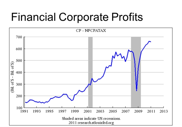
The web page TooMuch.org, March 12, 2012, shows a graph from U.C. Berkeley professor Emmanuel Saez that reports a drop in income of almost $4,000 since 1973, a drop from $33,795 to $29,840, for the lower-earning 90% of households. So, in spite of the economic output per citizen of the nation doubling (a Federal Reserve graph) since 1973, 90% of U.S. households have seen a drop of income of 12% on average. Even more, average hours worked per household has increased by 10% according to State of Working America.
Income Distribution in the U.S.
This is a tricky subject. First, look at the Social Security Administration report on income, wages only, for 2010. It shows 150 million workers reporting wage income of just over $6 trillion in wages, an average of $40,000 per worker. In comparison, look at the BEA data, that shows $6.5 trillion in wage income for 2010 Q4, not including "supplements". The average Social Security annual wage income (SSA report) is $40,000, and half of U.S. workers earn less than $26,363 a year in wage income. (The poverty level in 2011 for a family of four was $22,350, for comparison.) Looking at all sources of income, the total pre-tax personal income reported from the BEA, the total personal income increases to $12.846 trillion. Divided equally among 150 million workers, the average then increases to $85,640 per year. Half earn less than $26,363 and the average is $85,640, pre-tax and pre-transfer income. This is called inequality.
Furthermore, 1/6th of workers, 25 million workers, earn less than $5,000 a year, another 1/6th earn between $5,000 to $15,000, and another 1/6th earn between $15,000 and $26,363 a year. Three sixths are equal to 1/2, which equals 75 million American workers, half the work force. The average yearly wage income for the lower-earning half of U.S. workers is below $13,000 a year, which is a little more than 1/3rd of the average wage income for all workers which is $40,000 in wages. One must remember that wage income is less than 2/3rds of total personal income as there is also Business Income (7.1% of all income) and Capital Income (11.0% of all income) and "other" income (17.3% of all income) -- this breakdown comes from the Tax Policy Center report on income for 2006. The "other" income (17.3% of total income) breaks down into pension income, Social Security income, and government transfer to social safety net income, according to the TPC. The BEA figures for 2010 Q4 show 60.0% of all personal income accruing to "compensation of employees" including "wages and salary disbursements" and "supplements".
Looking back at the report from the S.S.A., the top-earning 25% of workers, all earning over $50,000 a year, receive 63.3% of all wage income, the lower-earning 75% of workers receive 36.7% of all wage income. If you multiply 36.7% (wage income) times 64.5% (the percentage that wage income is of total income), then you arrive at the conclusion that less than 25% of all personal income in 2010 went to the lower-earning 75% of workers as compensation for labor. Three-quarters of all workers get one-quarter of all income. INEQUALITY.
The Tax Policy Center, part of the Urban Institute and Brookings Institute, issued their report in 2006, but the income distribution trends are somewhat stable. It shows that 28.2% out of 100% of income went to the lower-earning 80% of households deriving from "Labor Income". It requires some simple calculation to multiply and add those amounts, and the book State of Working America, 2006-2007, page 69, shows the calculation. So, 28.2% out of 100% is the wage income portion of employees in this country. Not a very large portion. It matches my calculation from the SSA report showing 75% of workers receive almost 24% of all income.
It's a tricky subject.
The average after-tax income per household (note: household not worker) in 2011 was about $98,000 per household among 118 million households. (See page 30 of Joint Committee on Taxation, Feb. 2012) The median (middle) household income is about half the average, which should tell you something about inequality of distribution of income. Half (56%) of the nation's personal income goes to 19% of households earning over $100,000 a year, the highest-earning 19%. The Tax Policy Center's report, for 2006, showed the lower 80% of households receiving 40%, not 44%. One should remember that personal wage Income above $110,000 is untouched by the Social Security taxation. (See this report for an analysis of raising the cap on income subject to SSA taxes.) Disposable income (meaning after taxes income) according to the Bureau of Economic Analysis, Department of Commerce, was above $11.6 trillion in 2011, and spread among over 118 million households the average is above $98,000 a year. In other words, we are very wealthy as a nation. (Go to BEA web page, click Section 2, Personal Income and Outlays, and then click Table 2.1)
The Joint Committee on Taxation released an income and taxation report, February 2012, showing the distribution of income on page 30. As I've argued before, if the income distribution ratios of 1979 were the same in 2012, all the 94 million lower-earning households, 80% of a total of 118 million households, would receive approximately $10,000 more income per year each year. This in itself would solve the unemployment and economic crisis.
The web page TooMuch.org, March 12, 2012, shows a graph from U.C. Berkeley professor Emmanuel Saez that reports a drop in income of almost $4,000 since 1973, a drop from $33,795 to $29,840, for the lower-earning 90% of households. So, in spite of the economic output per citizen of the nation doubling (a Federal Reserve graph) since 1973, 90% of U.S. households have seen a drop of income of 12% on average. Even more, average hours worked per household has increased by 10% according to State of Working America.

Wealth Distribution in the U.S.
The typical Australian adult has 4 times the wealth or savings as the typical American adult, $220,000 vs. $53,000. "Typical" here means median, or middle, in a scale from least wealthy to most among all 234 million U.S. adults. The U.S. lags behind most advanced nations in the ratio of median net worth per adult compared to average net worth per adult. According to Credit Suisse Bank's World Wealth Report, 2011, the median adult's net worth, or wealth, in the U.S. is $52,752, but the average wealth among all 234 million adults is $248,395, and this is median to average ratio of 21%.
Australia on the other extreme has a median to average ratio of 56%. That is, in Australia the wealth is distributed among adults such that the median (middle) person has an amount that is 56% of the average wealth. In the U.S. that median adult only has a wealth amount of 21% of the average. Even India and China have higher distribution ratios than the U.S. If the U.S. ratio equaled the Australian ratio, the typical U.S. adult would own not $52,752 but $140,000, and in a family of two adults, the net worth would be $280,000 at the median instead of $62,200 in 2009 (see page 6). The typical Australian is 4.5 times wealthier than his American counterpart.
The report State of Working America's Wealth by U.C. Berkeley professor Sylvia Allegretto also shows that two out of eight Americans (75 million) live in households with zero or negative net worth (no wealth or savings), and another one in eight (37.5 million) live in households with less than $12,000 in savings (see page 8), even though the average wealth per household in the U.S. is $481,000 per household. (See Statistical Abstract of the U.S., aggregate net worth of all households, $$56.823 trillion in 2010, divided by 118 million households: $481,000 per household.) This is the state of distribution of wealth in the U.S.
See Statistical Abstract of the U.S. table 722, page 440)
Wealth Distribution in the World
According to the Credit Suisse report, the wealthiest 0.5% of adults own 38.5% of all assets, and the wealthiest 8.9% of adults own 82.1% of everything that can be sold. See page 14 of the above link to the report. We are so poor only because the resource of money is so unequally distributed. And money you might say is only ink on paper. But cash is king, even in a putative democracy. There are sensible ways of ameliorating this extreme inequality, and it is the political and economic imperative of our times to execute the leveling of income and savings to the benefit of the whole of society and the world.
In contrast, U.S. Poverty
Yet, some 50 million citizens, nearly one in six, lived in poverty, 16.0% of all Americans in 2010, according to the revised US Census report, http://www.census.gov/prod/2011pubs/p60-241.pdf -- see page 5. Yet the nation is very wealthy. The number using the food stamp program, SNAP, is also very high, and 14.5% of households were "food insecure" during 2010. That's about 45 million U.S. citizens. See http://www.ers.usda.gov/Publications/ERR125/ERR125_ReportSummary.pdf
A recent Rockefeller Foundation report, Economic Security at Risk, states that
"In 2009, projections suggest, approximately one in five Americans experienced
a decline in income of 25 percent or greater." This rate contrasts with that of 1985 when 12.2% experienced such a drop in income.
A recent Rockefeller Foundation report, Economic Security at Risk, states that
"In 2009, projections suggest, approximately one in five Americans experienced
a decline in income of 25 percent or greater." This rate contrasts with that of 1985 when 12.2% experienced such a drop in income.
We are not paralyzed, we can repair the economy and cause it to function to the benefit of all. The political options as presented by the Republican Party and the Democratic Party are woefully inadequate and should be rejected.
Solutions --- One -- Two -- Three
Here are two articles and one report that will help citizens understand the needed steps.
One
1) James Crotty's article in In These Times, "How the people can fight back against plans to cut the social safety net." This proposal rejects both Obama's and the Republican Party's position that deep cuts are necessary. He shows a simple two-step process to solve the federal revenue deficit: end the Bush tax cuts, decrease the military budget. This is just the beginning of his remedies. A longer, more thorough piece by Crotty can be found at PERI. Two interviews are available at The Real News Network. Crotty's longer paper is the best analysis I've read giving a rear-view and present-day-view of government's interaction with the economy. It is a professional job on the topic I've been trying to write about. I plan to write more about it. Some data are simply amazing -- regarding the RepublicanParty's plan to halve the size of the federal government, Obama's partial surrender to the austerity agenda, and how incredibly expensive our medical care system is. If we spent the same portion of GDP on medical care as Canadians do, the net savings to US households would be $1.6 trillion per year, or 10% of GDP, or $13,500 distributed yearly and evenly among all 118 million US households. Is that incredible? The "cost" of reducing our nation's health care costs would be slightly higher taxation to pay for this universal care system.
Two
Two
2) John Miller and Katherine Sciacchitano's article "The United States Is Not Greece" published in Dollars and Sense magazine, explains why "cutting deficits right now will only weaken a still-fragile recovery, and that weakening the recovery will only increase deficits". Very clearly written. They pin the blame on the German policy of suppressing wage growth to the average German worker, thereby driving the German export surplus across the Euro zone, and cutting growth and competitiveness in the periphery countries.
Three
Three
3) The most important contribution comes from Dr. Doom and his co-authors: Nouriel Roubini, Robert Hockett, and Daniel Alpert's report "The Way Forward" published by The New America Foundation. This report presents a "three pillar" program to 1) create public jobs, a $1.2 trillion program over 5 years, 2) a debt-restructuring proposal that "we believe will unclog the real estate and financial arteries", and 3) a program to "correct the current imbalance in global supply relative to global demand." A YouTube video shows the three authors presenting a summary of their proposal, see this link. In two hours you can learn more about the economy than you could in 2 years of reading. You'll have to listen closely. For instance, at the beginning Daniel Alpert describes the build-up of debt in the U.S. since 1980 to a level of $52 trillion, or 362% of the level of GDP. The federal government in 2011 is in debt by 102% of GDP (see Statistical Abstract here, Table 470). The rest of the 362% of GDP debt (260%) goes to household, financial corporations and non-financial corporations. Jack Rasmus's book Epic Recession, page 220, reports in 2008 total "Domestic" debt of $50.666 trillion, 23% to consumers, 17% to federal government, 22% to non-financial business, and 38% to financial corporations. Financial corporations increased their total debt from 1978 to 2008 by an incredible factor of 47 times, from $412 billion to over $19 trillion, in non-adjusted-to-inflation figures. As a portion of GDP, financial corporation debt exploded from 10% to 116%, 1970 to 2007 (see The Great Financial Crisis, by Magdoff and Foster, page 121). Financial corporation debt exploded since 1980, just as Daniel Alpert reports at the beginning of this presentation. This fueled the very fragile growth of the last 30 years, debt spending. And since the financial system's meltdown and self-destruction in 2007, their debt has been transferred to the public, off the corporation's balance sheet onto the federal government's balance sheet. Before 1980 the total national debt (all components) was equal to GDP. What caused such an explosion in debt and easy credit? What can be done about it? It's worth your time. Watch the video twice or four times.
_________________________________________
Here is a comment I left at In These Times after Crotty's article:
A complementary article to Crotty's is "Why the United States Is Not Greece", published at Dollars and Sense Magazine. See: http://www.dollarsandsense.org/archives/2012/0112millersciacchitano.html
The U.S. economy produces $47,000 of economic output per human citizen per year -- over 310 million people times $47,000 equals the GDP of over $15 trillion. Each worker produces over $109,000 in output, on average according to the Federal Reserve Bank of San Francisco. The Disposable Income is over $11.5 trillion each year, that is after tax income. Even after all taxes, there is over $75,000 per worker available as income, and that includes all the not-working, unemployed workers. Yet according to the Social Security Administration, the median income for 150 million workers was $26,263 in 2010; half of all workers, 75 million, had incomes below that $26,363.
What has happened since 1980 is a growing disparity of income among workers, and the CBO issued a report showing that the top one percent increased its income share from 8% to 17% (after-tax and after-transfer income) and this 9% shift in income share came out of the income shares of the lower-earning 80% of households, 93 million households. The lower-earning 90% of households received only 9% of all growth, 1979 - 2007, while the top 10% got 91% of all growth. See this web page and make your own confirmation: http://stateofworkingamerica.org/who-gains/#/?start=1979&end=2007. (Move the two markers to the two years 1979 and 2007 and note the % going to the top one percent.) The middle 60% of households grew their income by 38%, the top one percent grew their income by 277%, according to the graph on display (top graph of this blog entry) from the CBPP. The CBO report "Trends in Household Income Distribution Between 1979 and 2007" echoes these other reports. (Read my entry for November 20, 2011 to learn about the CBO report, as well as the most previous entry, January 2012, a short paragraph.)
Crotty's argument is very important to grasp. We can publicly employ the unemployed, and thereby generate growth, the type of growth that is sustainable and actually improves the standard of living. Obama and the Republicans have offered an option that is wrong, based on the false premise that the rich cannot be taxed. Most readers of In These Times know all this, especially after reading the article. My blog is http://benL8.blogspot.com where I make the above case.
In France the Socialist Party candidate for president, Sarkozy's top rival, is calling for a top marginal tax rate of 75%, a step in the right direction. (See this report)

At TooMuchonline.org, Sam Pizzigati reports on the highest tax rates, and the effective tax rates. "The effective tax rate on Americans who make over $1 million currently averages around 25 percent. In 2013, under the Obama budget, millionaires would likely average a federal income tax bill that equals somewhere between 30 and 35 percent of their incomes.
Not chopped liver. But not adequate either. The current White House tax vision for 2013 and beyond simply leaves too much money on the table — money the rich have siphoned off from America's 99 percent, money that could be rebuilding the American middle class.
A little history can be useful here. In 1953, the heart of our middle class golden age, taxpayers who made at least $1 million — in today’s dollars — paid far more of their incomes in federal income tax than millionaires would pay in 2013 under the new White House budget. Our 1953 rich, after taking advantage of every loophole they could find, paid taxes at nearly a 55 percent effective rate." For 13 years, 1951 to 1964 (read this table), the highest tax rate stayed at this level. So, 25%, or 30 to 35%, or 55% tax rate only on incomes over $1 million a year? That's the choice. After the great income shift, it's appropriate to return the tax rate to the former level when the economy benefitted families at every income level, not just the super rich. It is also appropriate to raise the minimum wage to $12,30 an hour and double the Earned Income Tax Credit (see my article here), increase union participation and encourage corporate cooperative enterprises, all towards equalizing income and wealth distribution. (See my Six or is it Seven Point Program, here.)