Stark Inequality
Observing stark inequality is difficult. Yes, on the sidewalks of urban America the homeless and poor are often visible. When I walk Market Street in San Francisco the homeless are visible, and tent communities are popping up on urban sidewalks in Oakland, Berkeley, Fresno, Sacramento and I’d guess many other cities across the U.S. But most of the time, we Americans appear alike in dress, in the housing we live in, in the cars and trucks we drive, and we seem to be watching the same sports, television and Netflix, and addicted to the same computer fascinations — equal, more or less. But below these mass similarities there are substantial differences. For a view of the stark side, read the Guardian articles by Chris Arnade here.

Here are four important facts about inequality in the U.S.:
- 44% of American adults report they would be unable to pay an emergency $400 expense within 30 days without borrowing or selling something. But, if all adults were "average" -- or even close to average -- it would be no problem. The average net worth per adult is almost $400,000. I call this stark inequality. The Federal Reserve study also shows that 25% of adults report not seeing a doctor or a specialist or a dentist, or not purchasing a prescription drug in 2016 because of lack of money. And, one would not guess by looking, 42% report owing an unpaid medical debt, typically of around $1,000, and on average of about $1,500.
2. Half of all U.S. workers (81 million) in 2016 earned a collective $1 trillion in wage income; this is about 6.4% of the national income. Their average income per worker is under $13,000 a year. A full-time year-round worker earning minimum wage earns $15,080, which by the way is more than $13,000. Earning just one fifteenth of all income, half of American workers are starkly underpaid.
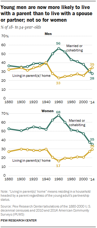
3. Since 1960 the median (middle) income for male workers age 18 to 34 has fallen from $27,300 a year to $15,000. The per capita “disposable income” increased by 86% between 1960 and today. In 1960 about 62% of young adults, age 18 to 35, were married or cohabiting, today it’s 32%. The average age at marriage was 22 in 1960, now it’s about 28 years old. In 1960 only 5.3% of children were born to unmarried women, in 2016 it’s 40.2%. And the average weekly and yearly earnings of a non-supervisory employee, 80% of the workforce, was 2% higher in 1964 than today, even though real per capita “disposable income” has increased by 86%. That is stark income stagnation.
4. Since 1980 the lower-earning half of U.S. adults has seen its annual income virtually freeze, it increased by 1%, from $16,000 a year to $16,200. Concurrently the highest earning 1% of adults tripled their incomes, from $420,000 a year to $1.3 trillion. The gap also tripled from 27 to 81. Two recent reports on income growth report a total growth of 60 or 61%, 1980 to 2014. This is stark inequity of growth.
These documented facts emphasize the extreme condition of wages, income, wealth, and the shifting trends since 1960 and 1980.
Recently the Congressional Budget Office (CBO) weighed in with a new report, “Income Distribution in the U.S. for 2014.” Reading it in conjunction with a report from the Washington Center for Equitable Growth (WCEG) brings up interesting comparisons and conclusions. Both reports cover the identical time period, 1980 to 2014.
Both studies show the top-earning 1% of households or adults tripling their incomes, as do other reports show (see here, here, and here). Both studies show average economy-wide growth of 60 or 61% between 1980 and 2014. The WCEG states that while the lower-earning 50% of adults gained none of the added growth, the percentiles 50 to 90 received 32%, the percentiles 91 to 99 received 32%, and the top 1% received 36%. The WCEG report states that the share of all income going to the lower earning 50% retracted from 20% in 1980 to 12.5% in 2014; and this is a mirror image of the share of income going to the top 1%, its share grew from 12% to 20%.
The CBO report shows income growth by household income level, not by per adult income level. The growth in social benefits lifted the incomes of the lowest-earning 20% of households. This group increased its 2014 “market” pre-tax and pre-transfer income from $19,100 to $31,100 a year, an increase of 64%. The driver of this increase was in-kind (non-cash) income in the form of Medicaid services and other benefits. The income gap between the average income of the lower 20% and the top 1% before taxes is 92 times ($19,100 vs. $1,770,000). It is reduced to 38 times by taxes and transfers ($31,300 vs. $1,180,000).
There are at the least two more important factors to consider in the big picture about inequality. The first is the fact that the share of yearly national income received by the lower-earning 90% has decreased from 55% to 37%, a shift of 18% that values today at about $2.9 trillion. (See the first graph in the essay "America's Economic Decline Simply Explained".) Dispersing that $2.9 trillion to 145 million workers would mean between a $15,000 to $20,000 a year income increase for all workers with wage income below $90,000, which is also the 90th percentile. In other words, restoring the former income distribution profile would change everything about our economy. It would re-align distribution to the contours of what it was between 1945 and 1980, and that would be a stark change.
The other important fact of inequality has to do with the spectacular doubling in the total net worth of all U.S. households over the past 9 years, from a total of $48 trillion in January of 2009, to a total of over $98 trillion in 2018. The federal government will spend $4.1 trillion this year in comparison. Financial assets have surged in value, we have a bubble with no end in sight. This is the glowing growth center of the U.S. economy. The lower-saving 50% own perhaps 1.1% of all assets. The top one percent own maybe 42%. The wealth gap is an incredible 1 to 1,909, between the average wealth of a household in the top one percent and one in the lower 50%. Stark.
Society experiences tensions from the extreme imbalance of financial and monetary power expressed through income and wealth divisions. Harmonizing the needs of society while maintaining an efficient economic world is the challenge we face; the imperatives of each sphere, the social and economic, must be adapted to find a living, creative balance.
Hope is brought to the fore in a WCEG report, as it compares the different approaches between France and the U.S. between 1980 and 2014. The lower-earning 50% of French adults increased their incomes by 32%, which was the identical growth rate of the entire economy. In 1980 the lower 50% were earning an annual average income of $14,418, and now they earn almost $19,000. Now this low earning French group earns about $3,000 more than the American group. The French economy is less productive than the U.S. on a per capita basis, it produces an average income of about $42,000 per adult, in comparison with the U.S. $64,600 per year per adult. This shows that the spread in inequality is and was not inevitable. Policy made the difference.
Inequality is stark world-wide. Oxfam America reports that the wealthiest 8 men in the world, if they were comfortably squeezed into a stretch limo, would collectively possess more wealth than half of the humanity, some 3.6 billion humans on our marvelous planet. What would the wealth gap be? It would be stark. And the Pew Research Center reports that these low-income-and-low-wealth humans are existing day to day on an income of less than $5 a day, at most. In the U.S. at the median household income level, each person survives on $64 a day. The inequality problem stretches and stretches beyond the concerns of developing nations. To sum up, we once shared growth and prosperity, but now we have a lot of catch-up to do.
_______________________________________________________
A Tax on Wealth, OECD?
A tax on wealth? The OECD report promotes a wealth tax? The Organization for Economic Cooperation and Development published a report, "The Role and Development of Net Wealth Taxes in the OECD". The Real News Network reports on this report by interviewing economist Michael Roberts, a Marxist. As I shared before, a tax on financial assets equivalent to the rate of tax on "immovable property" (OECD language) or "tangible assets" (FRB Flow of Funds language) would yield about $1.2 trillion a year to the federal government. Figure 1.7 in the OECD report shows how governments tax property.
 The U.S. receives, in state and local taxes, around $458 billion in property taxes, about 2.5% of GDP, as the graph indicates. Financial assets comprise 70% of all assets, non-financial about 30% (see Flow of Funds report, Table 101.B, page 138).
Here are two graphs that illustrate ideas I've brought up:


Michael Roberts writes a very interesting, nearly indispensable blog.
The OECD report does not advocate the radical position I take. It seeks to neutralize among OECD countries tax evasion and distortions as presented by imposition of taxes on wealth. This is hardly a remedy. But at least they are exploring.
_______________________________________________________
The report from U.S. Census scholar, Kathleen Short, about poverty increasing from 13% to 30% bares repeating. Page 28 of her 2013 report states:
A Tax on Wealth, OECD?
A tax on wealth? The OECD report promotes a wealth tax? The Organization for Economic Cooperation and Development published a report, "The Role and Development of Net Wealth Taxes in the OECD". The Real News Network reports on this report by interviewing economist Michael Roberts, a Marxist. As I shared before, a tax on financial assets equivalent to the rate of tax on "immovable property" (OECD language) or "tangible assets" (FRB Flow of Funds language) would yield about $1.2 trillion a year to the federal government. Figure 1.7 in the OECD report shows how governments tax property.
 The U.S. receives, in state and local taxes, around $458 billion in property taxes, about 2.5% of GDP, as the graph indicates. Financial assets comprise 70% of all assets, non-financial about 30% (see Flow of Funds report, Table 101.B, page 138).
 Here are two graphs that illustrate ideas I've brought up:


Michael Roberts writes a very interesting, nearly indispensable blog.
The OECD report does not advocate the radical position I take. It seeks to neutralize among OECD countries tax evasion and distortions as presented by imposition of taxes on wealth. This is hardly a remedy. But at least they are exploring.
_______________________________________________________
The report from U.S. Census scholar, Kathleen Short, about poverty increasing from 13% to 30% bares repeating. Page 28 of her 2013 report states:
The difference between the family budget poverty rate and the percent of the population
below 140 percent of the SPM threshold was not statistically significant. The percent of the population
below 200 percent of the SPM thresholds (48.1 percent) was 60 percent higher than the percent of the
population below the family budget threshold (30.0 percent). This suggests that families with resources
below approximately 140 percent of the SPM threshold, rather than 200 percent, may be characterized
as not able to meet their basic needs and achieve a safe and decent standard of living, or as families
with ‘low income’.
The "family budget poverty rate" that many researchers claimed to be about 200% of the the "federal poverty level" was refuted by Short. She claimed that 140% of poverty was actual poverty. The reports that claimed 200% of FPL brought almost half of the U.S. population into poverty status. She states that 29.9%, call it 30%, of the U.S. population are unable to "meet their basic needs and achieve a safe and decent standard of living". The average income per household is well over $100,000 a year. And 140% of poverty is about a third of $100,000 in all household sizes. This is stark inequality. Perhaps 48% are struggling to get by, but at least 30% are definitely unable to achieve a decent standard. The U.S. Census report, HINC-01 shows the breakdown in household size and median income. The median pre-tax income among four person households is over $91,000 a year, and post-tax it's about $64,000. The median pre-tax income for single person households is low, but for larger households it's somewhat high. The economy has improved since Kathleen Short's report, but the lower income households still comprise well over a quarter of all the population. And the household "average" and "median" for both income and wealth are hugely disparate, in separate worlds it seems -- income median: $60,000, income average $129,000, and wealth median $100,000, wealth average $789,000. (I'm using BEA.gov, Table 2.1 for income, and FRB Flow of Funds figures for net worth, with the US Census 125 million households, and doing simple division) The Congressional Joint Committee data shows (page 34) that 35.4% of all pre-tax income goes to just 6.6% of tax payers who earn over $200,000 a year, which is about equal to the income of 75.5%, all with incomes below $100,000 a year. That means the average income for the lower 75% is 11% of the average for the top 6.6%, or it's $11,000 a year versus $100,000 a year -- get it?
Simplify: the total collective income of 75% is less than the total for the top 6.6% -- not a good ratio for a society. And wealth ratios are much worse.