This essay was published at The Real News Network, see here.
Their "Economy" section provides quality interviews from some of my favorite economists. The INET does so also, The Institute for New Economic Thinking.
***********************************************************
Inequality of income and wealth has set in like a deep rot undermining the foundation of our society and economy. Uprooting it will not be simple.
I enjoy numbers and think they explain better than anything the problem, so bear with me. “If wages had kept up with productivity over the last three decades your pay would be closer to:” states the Economic Policy Institute web page, and then one types in an income amount.
An income of $20,000 would be $32,576, a 63% increase;
an income of $40,000 would be $61,055, up 53%;
an income of $60,000 would increase 40% to $83,728,
and an income of $80,000 would be $101,782, up 27%.
The median worker income for 2014 was $28,851 states the Social Security Administration (SSA), that would be $44,357 states the EPI. The Congressional Budget Office issued a report on income distribution in 2011, revealing that $93,900 was the average household income, and adjusting for inflation it is now $99,000. And adjusting to find average worker income, each worker contributes $80,379 to the national income — mean average. The SSA report shows the lower-earning 45% of U.S. workers earn less than $25,000, and the average income for this 45% is $10,523. The lower-earning 45% of workers earn in wage income about 6% of the total national income. Even though this seems unbelievable, you can do the simple math by following the steps in footnote below.
It’s depressing, isn’t it? The United Nations issued its Human Development Index and found the U.S. ranked 5th among all 187 nations of the world. The U.N. also issued an index adjusted for inequality in which the U.S. drops to the 28th rank. Who would know that 31% of the U.S. population live in households with "zero or negative non-home wealth", or that 50% lived in homes with less than $10,000 in "non-home wealth"? (see Table 1 on page 56) Especially when the net worth of all households is about $687,000. (See Flow of Funds report, page 2, and divide by 124 million households.) Or that 44% of the adults live in “liquid asset poverty”, or that 44% of U.S. children are being raised in families that are low income or poor?
As a result, millions of lives are damaged, and a few unfortunate ones are destroyed.
Reversing this baked-in, nearly invisible condition will not be easy, but it is the political imperative of our time. Money is power and our political institutions have been corrupted. It will take education and a collective determination to readjust the flow of monetary resources.
Remedies to Tame Inequality
Of the remedies put forth, those that raise wage income are the most promising: 1) create public jobs directly or through infrastructure improvement projects; 2) stronger and clearer labor union rights; 3) increasing the minimum wage and the earned income tax credit. In the late 1990s, during Clinton’s last term, the employment to population ratio reached its historical high, workers became scarce and employers raised wages. The employment to population ratio (E/P ratio) for all workers is at a 31 year low, and for prime working age workers it is at a 29 year low (see here and here). Using this scale, the E/P ratio, indicates a truer picture of the labor market than the usual unemployment rate which varies drastically because of labor non-participation, and the figure misleads the public into thinking the labor market is recovering. It is far from recovered. If we take the norm ratio for E/P to be the 20 year average, from 1986 to 2006, and calculate how far today we are from this norm, then we need perhaps 10 million jobs to come to the normal 20 year average E/P ratio. See below, in this essay, about the labor market. Bernie Sanders' proposal to spend $3.8 trillion over ten years is the only political solution that comes close to restoring and employing our workers. See this article, What Would Bernie Sanders Do?, at Dollars and Sense magazine.
The Economic Policy Institute (EPI.org) has over the decades become the nation’s strongest advocate for workers, and they present eleven proposals that will raise wages. The renown economist Joseph Stieglitz has just released the book Rewriting the Rules of the American Economy. He details the institutional changes needed to uproot inequality. These deal with corporate governance, tax laws, labor laws, trade, and other concerns. Ellen Dannin has written about reforming the labor laws in Taking Back the Workers’ Law. The American Prospect has a book review of Thomas Geoghegan's book Only One Thing Can Save Us, see here. Geoghegan advocates for renewed labor rights to organize. And Salvator Babones has presented sixteen solutions for 2016 in his book Sixteen for ’16. And my favorite solution is found in Phillip Harvey’s report Back to Work, proposing a government direct employment program. For an investment of $180 billion a year we could raise the employment to population ratio for prime working age workers, age 25 to 54, back to its high of 2000. This would raise wage income for 80% of workers (who are nonsupervisory workers) in the U.S.
I do not wish to snow readers under a blizzard of numbers, but two more examples are very telling. The first deals with wealth. The average private household savings now is $710,000 (see Federal Reserve data here, page 2), and only 10% of households reach or surpass this level. The second deals with income. The total combined market income of the top-earning 1% of taxpayers is greater (16.7% of all market income) than the market income of 54% of taxpayers (16.4% of all market income). Market income is income before taxes and before government transfers. The 54% who make less than $50,000 a year earn a combined total less than the 1% who earn over $500,000 a year. The average income of the top 1% is 65 times greater than that of the average income of the lower-earning 54%. This is data from the Congressional Joint Committee on Taxation, 2014, see here, page 30.
The Bureau of Labor statistics says the “median weekly earnings of the nation's 110.4 million full-time wage and salary workers were $803 in the third quarter of 2015,” and that equals $41,756 a year. The EPI web page would convert that amount to $63,259, except that inequality distorted the economy.
St. Louis Fed, FRED, shows that "average weekly earnings of production and nonsupervisory employees: Total private" at $722, or $37,544 per year. But the median weekly pay for full-time workers is much less than the average, $346 per week, which is $17,992 per year. The median is half the average.
There are 123 million working full-time, so about 61 million are earning less than $18,000 a year, that is $8.65 an hour working 2080 hours a year, or $10.58 working 1700 hours a year. Combine these full-timers with other 27 million part-time workers, and 56% of all U.S. workers are working either full-time at less than $11 an hour, or part-time, or unemployed. And add the labor force drop- outs, it's over 60%. So, 40% of workers are doing OK, and 60% are not.
The Social Security Administration shows that 45% of U.S. workers (71 million) took home less than $25,000 in 2014. The poverty level for a four person family is $25,500 (see Supplemental Poverty Measure here, page 3) The average income for the 71 million was under $11,000. Their combined or collective income was less than 6% of total national income.
Shocking?
Looking at the SPM, page 9, it appears that poverty was reduced from around 30% to 15.3% due to government transfers. Below in this essay I explain the size of the government safety net.
Shocking? In a nation with average household "market income" of nearly $100,000, this is shocking. See the CBO report, page 2, for the $93,900 figure in 2011, adjusted to $100,000 for 2016.
See National Jobs For All Coalition for their run-down on Jobs: see here. About 1 in 4 workers are either working full-time for less than poverty income for a family of four, or are unemployed or working part-time involuntarily (wish they had full-time work).
I packed a lot of information into this short article. The take-away is: Progress at this point is not necessarily growth of total output, the GDP, but is a fairer distribution of resources. This excessive inequality is a blemish on the nation.
**************************************************************
Notes: calculating 6% of national income.
Determine $12.7 trillion as total national income, at Congressional Joint Committee on Taxation report, page 30.
Multiply by .06. Answer $762 billion.
For workers earning below $25,000 a year, see the SSA report.
Add the “net compensation” figures for the below $25,000 groups.
It comes to $748,994,000,000.
Divide national income, $12.7 trillion into $749 billion.
Answer 6%.
********************************************************
I think the essay called Overview, July 2015 is the best summary of this blog.
******************************************************
Here is a graphic of Labor's Share of Income. It comes from the University of Texas Inequality Project, see here, page 34.
Note that the lower, dark share represents the lower-earning 90% of workers. The 90% received, between 1943 and 1980, in the range of 56% of total income. In 2013 its share appears at 38%, a drop of 18%. The 2014 total income was $12.7 trillion according to the Congressional Joint Tax Committee, and 18% of that is $2.286 trillion, divided among 112 million households (90% of total households) equals $20,483 per household. All this confirms the first paragraph above, the Economic Policy Institute's estimate of what incomes would be had they matched growth in productivity as they had for 30 years, 1946 to 1976.

To take this a little further, a look at State of Working America's table, Income 2.4, (SWA) shows that 80% of households earned 27.2% of all income in wages, $3.455 trillion. That is an average wage of $34,828 for the 99 million households in the lower-earning 80%. (One must multiply 54.3% by 50.1%, wage share of total income by the share of wage income to the lower-earning 80%.) In an economy with mean average household income at $99,300, when the lower-earning 80% are earning 35% of the average ($34,828 divided by $99,300 = 35%) for all, you have gross, excessive inequality, and it's damaging to all. Table 2.4 shows the lower-earning 60% earn just 25.3% while the top 1% earn 19.9%, probably equal, the top 3% vs 60% -- that's extreme ! .
An update to this blue graph:
The EPI has a graph showing "share of income going to the top 10%" in relation to "union membership". Take a look here.
As union membership has fallen, the top 10 percent have been getting a larger share of incomeUnion membership and share of income going to the top 10%, 1917–2014
In 1980 the share of income to the top-earning 10% was 23.6%, and in 2014 it was 47.2% -- the share doubled exactly. The national income in 2014 was $13.3 trillion (see here, page 28), and 23.6% of that is $3.14 trillion, and that divided by 90% of households (112 million) is $28,025. Each of the 112 million households is, on average, $28,025 poorer each year due to the shift in the distribution of income.
And a look at the EPI's page How Much Should You Be Making? shows the median income of $53,000 becoming $77,677 -- which is a jump of $24,677. Readers can play with this calculator and see the results -- what improved economic policy would have accomplished, equal to the results of 1947 to 1979, see here.
Average family income growth, by income group, 1947–2013
What if Income Were Distributed More
Equally?
What if our economy distributed 60% of its income among the middle 60% of households instead of today's 40.5%?
The SWA report distributes 40.5% of income to the middle 60%.
The CBO report distributes 41.3% as market income distribution.
The CBO report distributes 44.9% as after-tax income distribution.
The ideal per quintile distribution might be
7%, 15%, 20%, 25%, 33%.
-- 60% to the middle 60%.
4%, 8%, 13%, 19%, 56%.
-- 40.5% to the middle 60% --
(this array from SWA Income, Table 2.4)
2.2%, 7.3%, 13.0%, 21.0%, 58.1%
-- 41.3% to the middle 60% -- from CBO market income 2011
9.4%, 10.8%, 14.2%, 19.9%, 47.3%
-- 44.9% to the middle 60% -- from CBO after-tax income 2011 (these two last arrays come from this CBO report on after-tax income distribution, Table 7, see "data underlying figures, xls, Table 7)
The difference between the distribution of pre-tax to post-tax shows the effect of government transfers, a matter of 10.8% of national income, $1.44 trillion in transfers (2014). Social Security makes up $706 billion, (4.1% of GDP or 5.3% of national income) about half of transfers (see here, Table 1.1 and 1.2).
How big is the safety net? About 5% of total income, and if you include Social Security it's about 10% to 11%.
But the CBO report, page 10, states slightly different. "Before tax 'market' income is 86%, and "government transfers" is 14%.
All Households, government transfers: 14%
Social Security 6%
Medicare 4%
Medicaid 2%
Cash or In Kind 2%
Medicaid and Cash or In Kind, 4%, or $532 billion in 2014.
I think the CBO after-tax income distribution is most meaningful and accurate. I am suggesting that 44.9% to the middle 60% of households should be enlarged to 60% of total income. A 15.1% gain for these households would increase their incomes across the board by $1.9 trillion or $25,775 per household for all 74 million households. The median income for all households would be near $78,000. The EPI web page "How much should you be making?" shows that with an income of $53,000, close to the median, "your pay would be closer to" $77,007.
This was the norm between 1946 and 1976.
This was the norm between 1946 and 1976.
A Paradigm Shift
Robert Kuttner has a recent article, "The New Inequality Debate" that offers a paradigm shifting view of the role of inequality. He says, "THIS REVISIONISM HAS HUGE implications for economic theory, for possible remedies, and for politics. If greater inequality does not reflect market efficiencies, then market distributions of income are not efficient. And policies that produce greater equality will, at worst, do no damage to economic growth—and quite possibly will improve it."
Translation: inequality hinders an economy from reaching full potential. Everyone, especially low-paid workers, are hurt. The policy of full employment, government as the employer of last resort, would "quite possibly improve" economic efficiency. Not to mention providing meaningful work to willing workers whom the private sector has no use for. Kuttner's article offers much food for thought, and if the reader has a burning desire to probe the most advanced thinking on inequality, this is a good beginning.
**************************************
The Unemployment Story, again.
Not part of the above essay.
Want to read a great article on employment, just out today, November 6, 2015? See the EPI article by Elise Gould, explaining why restricted expansion of government employment has been the cause of a lackluster recovery. You could say that Reagan had it right, and he expanded the national debt from 25% of GDP to 48%. He proved, not that deficits don't matter, but that they are a great investment, in jobs and health, that can be paid off, if we don't lower taxes indiscriminately. In 2000 about 20% of GDP was collected as federal revenue, and in 2009 14.6%, the result of Bush II's tax cuts. Bush II left the country with the worst economy since 1933. The Great Recession officially lasted 18 months, the first 14 were under G.W. Bush. Since 2009 the Republicans have been rejecting all attempts to increase public spending, direct stimulus proposals, and all tax increases.
An additional 3.3 million jobs would have been created had we pursued a policy similar to Reagan's. Instead of having 22.0 million government employees we would have 25.3 million. The BLS has a graph showing the government employment here. To employ 3.3 million at $40,000 per job would cost $132 billion a year, about a 5% increase in federal spending excluding Social Security expenses. Also less than a 1% in spending as a percentage of GDP, which would require increasing federal revenue (taxes) from 17.5% to 18.5% of GDP. For comparison, 20.0% was the figure for revenues as a percentage of GDP for year 2000. See here.
An additional 3.3 million jobs would have been created had we pursued a policy similar to Reagan's. Instead of having 22.0 million government employees we would have 25.3 million. The BLS has a graph showing the government employment here. To employ 3.3 million at $40,000 per job would cost $132 billion a year, about a 5% increase in federal spending excluding Social Security expenses. Also less than a 1% in spending as a percentage of GDP, which would require increasing federal revenue (taxes) from 17.5% to 18.5% of GDP. For comparison, 20.0% was the figure for revenues as a percentage of GDP for year 2000. See here.
Here's the telling graph:
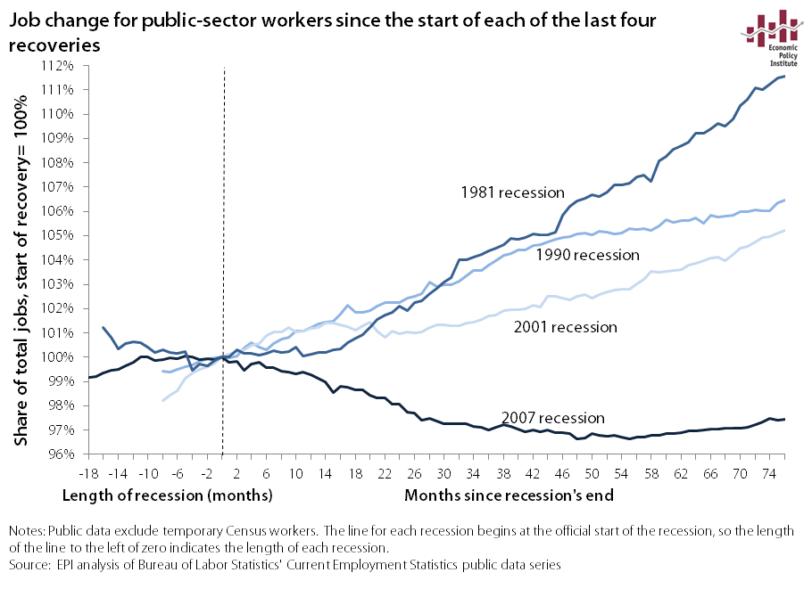
And here's a graph comparing growth post-recession since 1973:

Instead of today's 143 million employed there would be 158 million. What would that have done for the level of wages? They would have increased across the board, all your neighbors would have greater economic security. I wonder about my friends who are dubious about the power of good economics. Would you personally feel better if wages were at the level mentioned at the very top of the essay? No, say most of my friends! Most Americans give too little weight to good economic policy. Their children will be the ones who take the mantel for change.
Since January, 2008, private sector employment is up 4% or 4 million jobs, from 115,977,000 to just over 120 million. But, it dropped like a rock, 2008 to 2010, from 116 million to 107 million, roughly. Obama became President in the middle of this awful job disappearance when nearly 15 million lay offs occurred, and 8.8 million were permanent. If we had repeated the growth rate of the 1980s, from January 2008 onwards, then there would be 20 million additional jobs, not just 4 million new jobs since January, 2008. No, there would be not the current 142 million but 162 million.
How did Reagan do it? Public employment was part of the solution. Between 1981 and 1989 public employment increased by 8.6%, up 1.4 million, In contrast, since January 2009, Obama's inauguration, it has declined by 2.6%, down 591,000 (see here, bls data). That's a differential of 2 million public jobs.
Reagan in 8 years created almost 15 million private sector jobs, Obama, between 2009 and October 2015, nearly 7 years, 9.7 million. But that is deceptive since he came into office during a huge cascade of job losses. Since Dec. 2009, when job losses ended, some 13.4 million private sector jobs have been added (see bls data here). Obama is on track to creating a net 11.5 million private sector jobs in his 8 year presidency, even after losing almost 9 million in the recession. Add the missing 2 million from a cut back in public job growth, 13.5 million, it's comparable to Reagan's term -- except the 2 million is missing.
But Obama's term ends 15 months from today. He has time to match the Reagan record. Except -- and it's a big EXCEPT -- the employment to population ratio is at a 38 year low, and for ages 25 to 54, it's at a 31 year low. And the debt to income ratio for households, and the entire economy, is much higher, weakening the economy.

Admittedly that last paragraph was too complex. On December 2, 2015, I wrote a comment on the Bernie Sanders' proposal to create and infrastructure program. Here is the comment:
Another article at Dollars and Sense Magazine lays out the Sanders' plan; it amounts to $3.8 trillion over 10 years, that's $380 billion a year for 10 years. http://www.dollarsandsense.org/archives/2015/1115friedman.html
So that is $105 billion more in one year than Clinton's total program over five years. Clinton's plan is 7% the size of Sanders' plan. I hope this registers on our minds.
Sanders' plan is also a full employment plan. It will add 4.5 million to 7 million more jobs to the economy, enough to bring the employment to population ratio up to the 2007 level. The E/P ratio is now at a 38 year low. With full employment wages rise as employers are pressured to raise wages to keep employees from taking higher paid work. So 80% of the workers will benefit. This plan is the biggest and best thing about the Sanders' candidacy in my opinion. The Sanders' plan is not all infrastructure, it is also universal pre-K, Social Security enhancement, college tuition, paid leave from work for illness and family necessities, youth jobs, and private pensions, according to the article at D and S. It will require increasing federal revenues from 17% of GDP to 18.5%, well below the revenue amount, 20.0%, in year 2000. I write the blog Economics Without Greed, http://benL8.blogspot.com
The article I contributed to compares the Sanders' plan with the Hillary Clinton plan, see here.