Economics Without Greed

Essays on inequality and sustainable economics.

My Blog List

Sunday, July 23, 2017

           Inequality: A Tale of Two One Percents,        
                             The High and the Low           

                Hình ảnh

A shorter, improved version of this essay was published at inequality (dot) org, and the long version at The Real News Network.
__________________________________________________
It is instructive to view the entire spectrum of wealth and income, between individuals and nations. About half of humanity live on less than $5 a day, according to the Pew Research Center. (Check References at the end of this article.) In the U.S. the average income per day per capita is $121, but half of the population have daily incomes below $60. The wealth disparities are much greater. It’s becoming quite obvious that our global and national societies experience extreme inequalities. On viewing the extremes the issue of moral unacceptability comes into focus along with the concern about social cohesion. Fairness is crucial to cohesion and well-being, we are moral beings. Extreme differences create a toxic atmosphere of distrust, and danger. I’ll try to explain conditions in the U.S. between the two extremes, the lower and upper one percents, and relate them to the medians and averages of wealth and income. 

Wealth: $400,000 is approximately the average net worth of each adult citizen in the U.S.A.  But “average” is very deceptive. Only about 12% of adults are “average” or above. The wealthiest 1% of households own 42.1% of all household net worth, states one report. The lower-saving half of households  own only 1.1% of net worth, states another report. The difference in savings between a 1% household and a lower-half household is almost 2,000 times. The median adult owns $44,977, or 11% of the average,  states the Credit Suisse Bank report, Global Wealth Report. The Federal Reserve’s report on household well-being says that 44% of adults surveyed cannot pay an emergency $400 expense within a 30 day period. No savings. Since 2009 total household net worth has increased by 71%, from a nominal $48.4 trillion to $94.8 trillion. In other words, since the financial sector self-destructed in 2008, throwing millions out of work and causing millions to lose their homes, the wealthiest have amassed 71% more in net worth. This economic model is now facing rejection from populations in the U.S. and in Europe.  


Income: $90,000 is the average (again average) income per worker if we divide the national income with the number of workers in 2015. But only 56% of the yearly national income is derived from salary and wages. Workers of course earn “wage income”. The Social Security Administration report shows that the lower-earning half, or 80 million workers, had income below $30,000; their average income was under $13,000; and their collective wage income was less than 8% of total national income. But since workers are often married, and perhaps they receive pension income, Social Security and other incomes, collectively the lower 50% of tax filers receive 16% of all income, about a sixth of total income. The average annual income for 2.3 million adults in the top one percent is $1.3 million (and that doubles to $2.6 million in a married couple household). The yearly income for the lower 2.3 million adults: under $1,000 a year, $2 a day. One report shows that in the 35 years from 1980 to 2015, the income of the lower half of U.S. adults increased by 1%, and for the top 1% it has tripled, and the gap is 81 times. This is a profile of an economic model facing rejection.

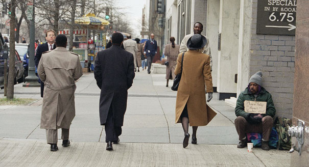
A recent book, $2 a Day: Living on Almost Nothing in America, states, “the number of American families living on $2.00 per person, per day, has skyrocketed to one and a half million American households, including about three million children.” This is one percent of all households, the lower one percent. The authors published an article in Pathways, the magazine from Stanford University’s Center on Poverty and Inequality, and it states, “This figure shows that the number of households living on $2 or less in cash income per person per day in a given month increased from about 636,000 in 1996 to about 1.65 million in mid-2011 . . .  In mid-2011 about 3.55 million children lived in extreme poverty in a given month.” The authors chose 1996 because it marks the date when "welfare as we know it" was dismantled. This resulted in creating perhaps 5 million citizens living in extreme poverty, cashless. The total in 2011 of 3.55 million extremely poor children is just under 5% of all children, one of every 20, a horrifying American distinction.


                  Powerful image to go with this story - Ignoring America’s poor | With 46 million people living in poverty, why are the presidential candidates so quiet on issues affecting the poor - http://aje.me/T0H8tV
                   

  The Daily Incomes of American Income Stratas  
A line-up of the spectrum of daily incomes shows the enormous range our society has created. 

The top one percent earn far more than other earners.   


1% at the top     —               $3,561 per day per adult, ($1.3 million                             
                                               per year) and double if a married                                                    
                                                couple         
                        
1% at the bottom    —                 $2 a day, perhaps as high as $6 a
                                                        day with children

BEA average income    —      $184 a day per adult, derived from
                                                  BEA total income of $16.2 trillion
                                               
Median family income —       $120 a day per adult in a typical four 
                                                   person family in 2015, $87,739                      
                                                  annual income.   

Median household income -    $77 a day per adult
                                                                           The median adult income is not a four person family, only 24% of the nation's households are four persons, five, six or more persons. Some 62% of households are 1 person and 2 person households (See the link, U.S. Census, hinc-01). The average household is comprised of 2.6 persons. The actual income per adult for the median household is $77  per day. Some 28% of households are single person, with a median daily income of $79, yearly median of $28,800. Another 34% are 2 person (mostly 2 adults in household, I presume) with median  daily incomes of $87, and yearly median income of $63,850. I find this complex, reader. But above all, the average is about $180 per day per adult, using BEA figures.

Nonsupervisory employees --  $106 a day. $38,728 per year. 
   average                                    About 80% of workers in this 
                                                   category. Since 1980 this wage 
                                                    income has increased by 5% while
                                                    per capita GDP has increased by 
                                                    82%. See the very last reference. 

Median cost of living  —         $87 a day per adult in a four person 
                                                    family living in the median cost                                                                                                  
                                                    U.S. location, Des Moines, Iowa, 
                                                     $31,755 annual income per adult             
                                                     The median income is 31% above 
                                                      median expenses, a good sign. 

Official Poverty level  —         $34 a day per adult in a four person 
                                                   household, under half the median              
                                                   expenses. SPM records 14% of 
                                                   U.S. population in poverty. 

140% of poverty   —                $47 a day per adult in a four person 
                                                    household, about 25% of the BEA     
                                                    average adult income. In 2011 
                                                    some 30% of Americans lived 
                                                    below 140% of Poverty.
                                                    The author of the Supplemental
                                                 Poverty Measure, U.S. Census, 
                                                    stated that this was insufficient to 
                                                    achieve a “safe and decent” 
                                                    standard of living. 

    
We are not without solutions to inequality, but we are bereft of conversation, information and political will. We have abundant prosperity, it is time we shared it. 

________________________________________________________________________________

References

$5 a day: "A Global Middle Class Is More Promise than Reality, Pew Research Center, chart “How Many Live on How Much” 

average income is $121 a day: Congressional Joint Committee on Taxation, 2017, page 31. Divide total income by 325 million citizens and by 365 days.  

$60 a day:  $56,516, median household income, divided by 2.6 people, average household size, divided by 365. 

$400,000: 237.9 million adults 20 years and above in 2017, see here, p. 37, adjust for 2017 population growth to 239 million, results in $396,600 average net worth per adult. $94.8 trillion private household net worth, see here, page 2, and 138.  Number of U.S. households, here.  

12% of adults: see U.S. Census here, Table 4. And see Net Worth percentile calculator 

42.1% of all savings: see here, page 39

1.1% of all savings: see Economic Policy Institute

2,000 times: see Credit Suisse Bank, Databook, Table 2-4, 6-5

Credit Suisse Bank: see here, Table 6-1, 6-5, 6-6.

44% of adults: see here, page 26

71% increase — Federal Reserve, Flow of Funds, 2009, Q4, Table                     B.101, and Flow of Funds, 2017, Q1, Table B.101.e, adjust the 2008 figures for inflation at BLS inflation calculator. 

$16,000 per adult, Credit Suisse, Table 6-5, page 148

$90,000 is the average: see here, page 31

$56% of annual income: see here, Table 2.4

Social Security Administration: here  

$1.3 million, see here p. 37

1% at Top - $3,561 -- same as $400,000 and $1.3 million above

Median family income, $94 - see here - U.S. Census, HINC -01. This is for all families, and for a four person family, the median is $87,739, U.S. Census. Daily income per adult is $120. 

Median cost of living, $87 a day - see here and here. Annual cost
            is $63,741 in Des Moines, Iowa. 

BEA average, $156 - see BEA.gov, Table 2.1, "disposable income                    
              per capita", meaning after federal taxes income. 

$106 per day - see Bureau of Labor Statistics, and St. Louis Fed  
                        and see Measuring Worth and the BLS inflation
                        calculator

Kathleen Short -- from the U.S. Census, November 2013, see here
                      p.23 

Pew Research posted a report stating that 56% of Americans have incomes exceeding $50 a day, see here. Only 7% of humans enjoy this high income. 

See the BLS data on median and average incomes. BLS "average hourly and weekly earnings of production and nonsupervisory workers" from the BLS here:  $747 a week, and $38,688 a year. This is the source of my $106 a day figure.  The BLS reports median earnings for 110.7 million full-time workers, 72% of the workers, was $865 a week, $44,900 a year. Some 12% of workers work full-time but less than year-round (less than 50 weeks a year). Median is higher than average by 16%, indicating a large core of low-income workers. 
The SSA wage report shows only 34% earning over $45,000, and that is 55 million workers, half of the 110 million who work full-time. The two reports coincide or match.   

Dan Alpert at Economonitor describes this bifurcation of worker incomes, in a 2013 article, where 33% earn $15.38 an hour on average, and 67% earn $27.34 an hour. That averages to $23.54 an hour in 2013 in Alpert's report, which is considerably higher than the BLS 2017 report stating $22.10 an hour, for reasons I do not understand. The nature of the large lower-paid section is clear, and Alpert's and the BLS match if they are not the same exactly. 

This indicates that raising the minimum wage (along with a hike in the EITC) would go a long ways to improving the living conditions for those low paid workers. In previous articles here -- see this article, the very end part -- I've often used the info from the EPI.org site, What Should You Be Earning? "if wages had kept pace with productivity". For instance in 2015, the SSA wage report shows, 48 million workers, or 30% of all workers, were surviving on less than $15,000 a year. They would be earning $26,768 a year and less -- that's a 78% boost in income -- if wages and productivity  had matched in the last 30 years, and they DID match between 1946 and 1976. Why not now? With $94 trillion in private savings, about $400,000 per adult, one would easily conclude that taxing a fraction of that would be sufficient to fund the jobs programs and the wage and EITC increases that I prescribe.      


_________________________________________________________________________________

The chief author of the U.S. Census report, the Supplemental Poverty Measure, Kathleen Short, has written that the poverty level is about double the official rate: “The overall [SPM] poverty rate using the updated modified family budget thresholds [140% of poverty] was 30.0 percent, about 13.9 percentage points higher than the 16.1 percent SPM rate.  . . . approximately 140 percent of the SPM threshold, rather than 200 percent, may be characterized as not able to meet their basic needs and achieve a safe and decent standard of living, or as families with ‘low income’.” The key fact here is that the author of the SPM is saying poverty stands at 30%. Not the SPM rate of 16.1%, or the Official rate of 15.1% in 2011.      
Wealth Gap


A List of Needed Reforms 
I'm adding a short list of some of the changes and solutions needed. Elect a Congress that will 
1) eliminate private money from all public elections,
2) restore the right of workers to form unions and to strike without fear of losing their jobs,
3) provide tax incentives to corporations to pay higher wages to employees,
4) create public jobs and government subsidized private employment in order to tighten the job market and raise the norm for wage income. About 20 million workers are without full-time year-round employment, and another 17 million are earning below poverty on full-time jobs. Combined, that affects  22% of the U.S. workforce, almost 1 of every 4 workers.  
5) mandate paid vacation and holidays comparable to the European Union standard,
6) provide childcare subsidies for low-income mothers with children, 
7) raise the Earned Income Tax Credit, 
8) increase public housing funding. 

This will put the “demos” back in democracy and the economy. The nation can afford all these changes, we have a savings of nearly $100 Trillion. We have abundant prosperity, it is time we shared it. 

See the web page for $2 a Day: Living on Almost Nothing in America.

Bernie Sanders gave a speech on poverty in May of 2016, see here, and read his list of improvements. 


An Odd Coincidence:

If all 80,397,000 workers in the lower-earning half of U.S. workers earned $7.25 an hour, the minimum wage, and worked the average number of hours per week, 34.5 hours, and worked full-time and year-round, 1,716 hours, their average yearly income would be $13,006. This would be $220 higher than their actual average income of $12,786. We are a minimum wage nation, at least half of us. Half do not work at minimum wage and full-time year-round, rather that half includes most part-time and partial year workers. 68% of all workers are full-time and year-round, 12% partial year, and 20% part-time. (See U.S. Census, here) (And see the related note in the References section.)


Another odd coincidence: The SSA report states 44% of workers earned less than $25,000 in 2015. I found that 41% of workers fall into 3 categories. Adding the 1) "augmented" unemployed (12%) with 2) the group working full-time but less than 50 weeks (12%) (see USCensus here), and 3) those who are working full-time year-round with income below the poverty level of $24,250 for a four-person family (17%); the total is 41% of an augmented work force. 

UnemploymentThe essay by L. Randall Wray, "Full Employment: Are We There Yet?", page 7, at the Levy Economics Institute, Feb. 2017, provides the "augmented" unemployment figure of 12%. He states that about 20million workers are "at least partially idled" in 2017; I added his figures and got 18.8 million. The National Jobs for All Coalition has similar figures, see here. My conclusion: Many of those whose incomes fall below $25,000 (44% in the SSA report), are those who are 1) unemployed (augmented including part-time involuntarily workers and discouraged workers), or 2) working partial year, or 3) full-time year-round at low wages. This group comprises 67 million workers, and their collective income is less than 7% of national income. And by the way, we are not at Full Employment argues professor Wray, far from it. He promotes a permanent government  job program, an "employer of last resort" policy. An excellent paper cogently argued. 


Participatiory Economics 
And if you prefer radical departure from capitalism to a democratically inspired system: 
Robin Hahnel's essay on "Participatory Economics and the Next System", here, at Z Communications explains an economy owned by the workers and consumers. The corporation is eliminated and replaced by "social ownership of the productive “commons,” democratic worker councils and federations, neighborhood consumer councils and federations, and a very carefully constructed procedure we call participatory planning that these councils and federations use to coordinate, or plan, their interrelated activities themselves." There is an alternative to capitalism as we know it. Like universal health care replacing the current for profit model, this change will require a revolution. I wrote an essay at this blog about Hahnel's book Economic Justice and Democracy, see here. That was 9 years ago.  
Giving Every Child a Monthly Check for an Even Start
The adult income (if a two adult family) would be $38 a day, just above the $34 a day of official poverty. 


Posted by Ben Leet at 12:26 PM No comments:

Friday, June 9, 2017

A Ten Year Vision towards Full Employment

This post highlights two reports which describe plans to create millions of jobs by 2027. The first by Frank Stricker, and then the report "What Would Sanders Do?" by professor Gerald Friedman: 

          Full Employment and How to Get It       

                             (see here to read the article)

Full employment to men means an abundance of good jobs, higher wages, growing income. White Americans with "no college" voted for Trump by a margin of two to one, 67% to 28%, nearly a 40% margin in favor of Trump. And "white males" also went for Trump by a two to one measure, a 32% margin. They were impressed by Trump's claim to be able to create good jobs. Here is Stricker's report card on job and wage growth: 


Report Card on Growth in Real Wages and Total Jobs, Five-Year Periods, 1950-2015                                                                                    
                                  Wages          Jobs                 
1950-1955 A+           A
1955-1960 A B
1960-1965 B+ A
1965-1970 C A+
1970-1975 F B+
1975-1980 FF A+
1980-1985 FF D
1985-1990 FF A
1990-1995 FF D
1995-2000 C- A
2000-2005 F F
2005-2010 F F
2010-2015 D B 


Total five-year growth in wages and jobs graded thusly: 10% or more = A, 8%-9% = B, 7% = C, 6% = D, under 6% = F, decline =FF.

Stricker will have to revise his grade for the years 2012 to 2016, according to this report, up from a D to a C (a 7% increase over a 5 year period). The report concurs with Stricker that wage growth was low:  it rose at a "0.1% annual growth rate from 1980 to 2007." That's a 27 year "F" in Stricker's grade system, a total increase of 2.7%.  

The Federal Reserve graph (at St. Louis FRED, here) shows a 4% rise in wages over the past 38 years in "Employed full time: Median usual weekly real earnings: Wage and salary workers: 16 years and over."  That's 4% in 38 years, while the economy on a per person basis grew by 79% (see here at Measuring Worth, GDP per person). Again, so you will remember: 4% growth in median wage income, 79% growth in total economy on a per person basis. Give the economy an FF. Wage growth was abysmal. 

Total job growth, not that wonderful. The prime-age working population employment rate is the best indicator; see this graph at the BLS. Same rate as in 1987, 30 years ago, and we are 3.5% below the high point in April, 2000. That 3.5% equals 3.6 million jobs, even after adding 16.4 million jobs since February 2010. In October 2009 the unemployment rate hit 10.0%. To add clarity, the economy did add jobs, albeit not great jobs, in the past 7 years, but we are still down, not near the employment rate of 2000. Not recovered. And wage growth has been abysmal. See Table 1 here, real wage growth up 4% since 2008, that's 0.6% growth per year.  

I recommend readers go straight to "Full Employment and How to Get It", by professor Frank Stricker, who also wrote the book Why America Lost the War on Poverty, and How We Can Win It. (He also wrote an article on Infrastructure here. Another excellent article on direct job creation is here at Demos. org by Algernon Austin. He calculates a need for 7 million new jobs for workers age 24 to 55. This implies a current unemployment rate of betweem 7 and 9% for this age group (not 3.3% the official rate), see this BLS site for confirmation, here. The unemployment rate for this age cohort is about 1% lower than the total unemployment rate. A 7% or 9% unemployment rate may seem so implausible as to be unbelievable, but it is believable and provable. This is why Austin's article is also powerful and important. And why such a direct job program is most important. I should mention that unemployment stood at 25% in 1933 and at 9.6 in 1937 -- fiscal policy works, see this article by Marshall Auerback.) Fiscal policy in this case means direct government job creation. 

Readers who really want a super-clear picture of the poor employment conditions, with 20 million unemployed, about 1 in 8 workers, can read this excellent report at the Levy Economics Institute by Wray and Dantas. This is a visionary report with a radical solution: "The creation of a new New Deal program could provide the workers we need for many of the infrastructure projects that Trump and others want, but would go well beyond this by creating jobs for anyone who is ready and willing to work. It would be an open-ended job guarantee—not limited by the labor requirements of any single project—since it aims to achieve true full employment on a permanent basis. The federal government would take responsibility to provide the funding for a base wage to be paid to anyone who works in the program." (see page 16)

Stricker's program, like the Sanders' Program I deal with below, would lift the income of the middle income, non-supervisory employee, whose income would increase by $20,000 a year, a 50% increase by 2026.              

Michael Braxton.

Michael Braxton states: “I am for Hillary. Praise the lord. Trump will probably start us another war. Praise the lord. And he is a racist. Praise the lord.”
This photo originates from an article in the British paper The  Guardian, by Chris Arnade, "What I learned after 100,000 miles on the road talking to Trump supporters". Pictured above,   Michael Braxton, a resident of Natchitoches, Louisiana, offers his straight-from-the-shoulder assessment of Trump before the election. Arnade, the author states,  
"It became simple: if I wanted to talk to a community overwhelmingly supporting Trump, I would go to a white town or neighborhood nearest the rusting factory surrounded by razor fence. . . .  The early Trump voters I met were the losers from these changes. Their once superior status – based only on being white – was being dismantled, while their lack of education was also being punished. They lived in towns and communities devastated by economic upheaval. They were born in them and stayed in them, despite their fall. For many, who had focused on their community over career, it felt like their entire world was collapsing."
Read the article  here.

These articles vividly portray the men and women who swung their votes to Trump. "Pride and Poverty in America" is the apt title of his articles. Arnade drove his car 140,000 miles across the U.S. searching for his interviews. Then you can listen to a friendly interview with Arnade at the radio broadcast Behind the News with Doug Henwood, here.

I need say no more. But here's some additional background reading. 

The Political and Economic Impact of                        Infrastructure Programs                                         

Bernie Sanders called for a $1 trillion investment in infrastructure over 10 years. Unfortunately he downplayed the direct job creation part of the program. Had he called it a jobs program first, that also upgraded infrastructure, the clear intent would have been appreciated by voters -- white male voters -- who rejected Hillary Clinton. But perhaps he shied away from sounding too socialistic. Read this important report   What Would Sanders Do?  , describing the wide-ranging effect of his public investment program. See Table 1 for a quick glance. Most of his spending increase, 74%, deals with universal health care or Medicare for All. Yet he calls $1 trillion over 10 years in Infrastructure, and another $1.2 trillion in spending for "Climate change, energy resiliency." 

Also see his web page platform describing his program" Rebuilding America. His program would have served two important national purposes: 1) upgraded public roads, seaports, airports, rail lines, electrical grid, drinking water and sewage systems, private home and public building insulation leading to energy conservation, public school building and municipal building upgrades, and broadband internet improvements, as well as human services improvements in senior health care and pre-school education, and 2) jobs. See the Stricker article above for the impact millions of public jobs will have. Readers can review also the Progressive Caucus Budget, The People's Budget, 2017, which claims would create 3.6 million new good jobs; and view the spending program for this budget here at the Economic Policy Site, see Table 2, page 22. Page 8 states, "


This stimulus program includes a $208 billion investment in 

infrastructure, spending that reaches $1.2 trillion over FY2016–

2026, which approaches the level the American Society of Civil 

Engineers calls for to close the nation’s investment shortfall while 

offering a sustained, continuing dedicated source of funding 

specifically for infrastructure investments (ASCE 2013)."

Readers may also read the Center for American Progress report "Toward a Marshall Plan for America".

05_05_Infrastructure_02A member of Cal Fire, right, talks to workers on the Oroville Dam project in front of the main spillway in Oroville, 
A reminder of why the American Society of Structural Engineers gave the country a D+ in infrastructure.  (recommend this article at Newsweek magazine, with a photo of the 2007 collapse of a bridge in Minnesota, Interstate 35W. ) 


p1010080.jpg


Polls show as high as 81% support for infrastructure improvement, see here. 

Trump's plan will be financed by borrowing from the private financial market, doubling the cost of investment. And it will saddle users with life-time user fees -- an obvious avoidable error. But it will enrich the private corporations who feed on the government. 

Ellen Brown debunks Trump's plan explaining the hidden costs of private financing: 

"Private equity investment now generates an average return of about 11.8% annually on a 10-year basis. For infrastructure investment, those profits are made on tolls and fees paid by the public. Even at simple interest, that puts the cost to the public of financing $1 trillion in infrastructure projects at $1.18 trillion, more than doubling the cost. Cities often make these desperate deals because they are heavily in debt and the arrangement can give them cash up front. But as a 2008 Government Accountability Office report warned, “there is no ‘free’ money in public-private partnerships.” Local residents wind up picking up the tab." 

See a report from the Center for American Progress, How Donald Trump's Infrastructure Plan Fails America.  And more from CAP,  "Fact Sheet: A Plan for Investing in America's Infrastructure". 
The Economic Policy Institute presents several articles on Infrastructure and Trump. The first, here, states "The recently released Trump federal budget plan guts infrastructure, period. Read the link—the damage the Trump budget would do to public investment and infrastructure is staggering. This alone should make any open-minded person extraordinarily skeptical of their claims to value infrastructure spending." The next here and the next here are long, dense, and you might read them only if you want to know in depth. The last "here" shows a graph of the cost of 20 year government bonds at 3.86% per year, which makes the 11.8% mentioned in Ellen Brown's article 3 times more expensive. The "here" before that shows a graph of non-defense discretionary spending dropping to 40% of it's 30 year historical average under the Trump 2017 to 2026 budget. And this article from the CBPP (dot) org states that the Trump Republican budget will cut $6 trillion in federal spending over 10 years, and 62% of these cuts ($3.7 trillion) would cut programs serving low- and moderate income people. "In 2026, it would cut such programs overall by 42 percent — causing tens of millions of people to lose health coverage and millions to lose basic food or other support."

Most people realize that the Trump-Rep. budget is a massive tax cut to millionaires, see this report, and this article. Half a million in lower taxes to millionaires, $240 to middle-income families (see page 7, first "report"). From the "article": "Trump’s tax plan would give $6.2 trillion in tax breaks, according to the non-partisan Tax Policy Center, mostly benefitting the rich and big corporations. The tax plan would also grow the deficit by $7 trillion because it closed few loopholes to pay for the tax cuts."   
This passes, incredibly, for responsible government taxing and spending. People do not pay attention, obviously. 

Hillary Clinton lost the "white no college" vote by 39% points -- 67% for Trump and 28% for Clinton. I remember this as 70 to 30. That represented 34% of all votes cast. And she lost the "men - white" vote by 32 points -- 63% to 31%; also representing 34% of votes cast. See the results at Wikipedia. White men with little education beyond high school turned to Trump, there's no doubt. 

If Democrats in 2018 wish to make gains among these voters they must offer better employment and wage growth programs that will rescue these disenchanted workers who have had decades of poor job and wage growth (see the Stricker article).  This malaise portends a future of bleak social disruption.   

Later I'll expand more of the infrastructure and direct job creation.  This is an essential issue that can break the iceberg of disaffection and recast our  political theater as we know it.  The American Prospect published an article supporting the idea of appealing to White Working Class citizens, and it concluded: "The party needs to rediscover its roots as a working-class party, one that was initially exclusionary of people of color but that today can and must represent the interests and values of working people of all races. As the party fights Trump and his brand of divisive right-wing populism, the party needs to bring in more working-class candidates and leaders who can credibly talk with their communities about common economic and social challenges, can forcefully take on the corporate interests that harm these communities, and who can be trusted to fight for the well-being and security of all working men and women. "


            Reviewing the Leet position:          
As a review of my strange viewpoint about the U.S. economy, the reader may as well watch William Lazonick's appraisal of U.S. corporations. Winner of the Harvard Business Review award for best article,  Lazonick speaks on a video here, repeating his claim that corporations, at least in the S&P 500 which comprises 75% of all stock market equity, over the past 10 years have appropriated 91% of their collective profits and distributed them as stock dividends or stock buybacks, thereby looting the corporations of research investments and depriving their workers of raises. 

And this finding dovetails perfectly with the shocking study by Saez, Piketty and Zucman that shows that the income of U.S. adults in the lowest earning half have not risen since 1980, their income is still $16,000 per adult 35 years later, 1980 to 2015. The BEA.gov (Personal Income, Table 2.1)  shows that "Disposable personal income" "per capita" in "chained 2009 dollars" has risen by 91%, from $20,158 to $38,432, 1980 to 2015. The Saez, et al report states:  "Average pre-tax national income per adult has increased 60% since 1980, but we find that it has stagnated for the bottom 50% of the distribution at about $16,000 a year.  . . .  Income has boomed at the top: in 1980, top 1% adults earned on average 27 times more than bottom 50% adults, while they earn 81 times more today."

While the gap was $16,000 to $432,000 in 1980, it is now $16,000 to $1.3 million. A companion article from the Washington Center for Equitable Growth may be read here.  
The World Wealth and Income Database is available to compare various countries, with graphs, tables, comparisons. 

I belabor my readers with all these extra reading projects because I feel the background is indispensable for a rounded evaluation of my eccentric position, which I find completely convincing. 

As I always state in my latest essays, my best utopian essay is December 2016, and the most thorough run down of Inequality is the one before that, July, 2016.  

Another photo from the Arnade articles, this of Robert McAdams of Peru, Nebraska, from the article linked to already, here.  "We need to get this country straight again," he says. 


Robert McAdams, 78, of Peru, Nebraska: ‘We need to get this country straight again.’


Here's a little extra on the Minneapolis bridge collapse, 2007, File:I35WBridgeCollapseMarineOne.jpg


p1010078.jpg


Posted by Ben Leet at 5:08 PM No comments:

Friday, March 17, 2017

Healthcare, One Aspect of a Failing System

                                  Healthcare
                  A Failing Part of a Failing System 


See the article at Forbes magazine. 


My two previous essays are more important than this one. I should get a web page instead of a blog. 

The Yosemite Democratic Club did publish this essay, also. 

After the AHCA passed the House on May 4, 2017, the head of the Center for Budget and Policy Priorities, Robert Greenstein, issued a short report, stating, "I have been in Washington, D.C. for 45 years.  But I have never seen members of Congress vote to so deeply hurt so many of their own constituents.  If enacted, this bill will stand as the biggest assault on ordinary Americans — and the largest Robin-Hood-in-reverse transfer of income up the income scale, from low- and middle-income families to those at the top — in our country’s modern history."
This short CBPP report succinctly clarifies both the Trump/Ryan AHCA and the previous ACA which may be repealed with Senate approval. The AHCA passed the House 217 to 213 with all Dems voting against and 20 Reps joining them. As Nancy Pelosi said, this vote will make those Reps glow in the dark. 

On September 19, 2017, I came across this video presentation by Dr. Ed Weisbart of Physicians for a National Health Program. It's 39 minutes and the most convincing argument I've found for the  Medicare for All proposal. Watch it here. 

Now for my take, written in March, 2017: 


Healthcare — It’s a Complicated Issue

I received a new titanium hip last September, I had hip replacement surgery. I’m 70 years old, and the doctor tells me it will last for 20 years or more. I have Medicare, and when the hospital sent me a bill for $67,000, more or less, I was happy because I knew I was responsible for only $3,000. Medicare saved me. If I had been under 65 years old, I would now be in debt or using a walker or a wheel chair. Or I could have flown to London or Paris where this surgery costs $11,000 or $12,000. In London they do six surgeries for the cost of one in California. Or to India, Korea, Mexico. In Canada the cost of an angiogram (an x-ray of arteries and veins) costs $35, the average cost in the U.S. is $914. An MRI in France costs $363, in the U.S. $1,121; a one day stay in a hospital bed in the Netherlands at $731, compared to $4,287 in the U.S. An appendectomy in England, $3,408, in the U.S. $12,851. And so on from the IFHP 2012 Comparative Price Report. The IFHP 2015 report here. Bypass surgery in England, $24,059, in the U.S., $78,318. Angioplasty in U.K., 7.264, in U.S. $31,620.  

We all have stories about the delivery of healthcare services. A friend, age 52, went in for an appendectomy, and his wife’s insurance paid the $40,000 charge, otherwise he might have died. A friend with a possible colon obstruction spent the night in the emergency room, received some laxatives, total cost $21,000. Another had a pig valve inserted into his heart 20 years ago. He was on MediCal. He has been a productive adult supporting his wife and daughter since then. Another, a PhD. in psychology, diagnosed with breast cancer, died because she could only get treatment by participating in an experimental treatment. We all have stories. 

Healthcare U.S.A. seems to be an irrational mess. We pay double per person what other advanced nations spend, and our outcome is worse. (We spend $9,500 per human, our yearly expense, about 18% of total annual GDP, a huge amount, while others average around $4,500 yearly, about 10% of GDP, with better outcomes). Author James Kwak states, “Of the [34] OECD countries, the United States ranks between twentieth and twenty-ninth on primary health status metrics, ranks in the bottom third for access to coverage, and has among the fewest doctors and hospital beds per capita.” Kwak concludes: “It seems quite possible that our high costs relative to the rest of the world are the result not of overconsumption but of a decentralized system organized around private profits rather than strong government spending controls.” Says Kwak at his web page:

"The Trump administration is rhetorically committed to deregulating health insurance; the question is whether they are willing to accept the political consequences of pricing millions of people out of not dying."

Healthcare is just a part of a dysfunctional economy. 
The Federal Reserve’s “Report on the Economic Well-Being of U.S. Households, 2015” shows that 44% of households cannot pay an emergency $400 expense within a 30 day period. Even though the average household net worth is $721,000, and the average yearly household income is over $100,000, almost half of Americans live in “liquid asset” poverty. Thirty percent of Americans “may be characterized as not able to meet their basic needs and achieve a safe and decent standard of living, or as families with ‘low income’,” states Kathleen Short, the author  of the U.S. Census Supplemental Poverty Measure (SPM). (see here, page 23) America has extreme inequality. 

The FRB report further shows that 22% of respondents in the past year had an emergency medical expense, and 45% of Americans carry an “unpaid balance” resulting from medical expenses. The initial median cost was $1,200 while the average cost was $2,383. And “Among those whose family income is under $40,000, 39 percent have gone without some form of medical treatment in the preceding 12 months.”  And the SPM of 2016 for 2015 states, Table 5.A, that the poverty rate would decrease from 14.3% to 10.8%, without “medical out-of-pocket” expenses.

A report from The Center for American Progress (see page 9)  shows that medical expenses doubled between 2000 and 2012, increasing from 5.5% of the family budget for the median four-person household to 10.1%. During the Bush years medical expenses were eating us out of house and home. The Congressional Research Service reported, page 8: "Private health insurance premiums have generally grown faster than the economy as a whole. The Office of the Actuary at CMS estimates that the average premium per enrollee in all private markets grew from about $2,320 in 2000 to about $5,080 in 2013, indicating an average annual growth rate of 6.2 percent.10"However, private insurance premiums grew more slowly from 2005 to 2013 (4.5 percent per year, on average) than they did from 2000 to 2005 (9 percent per year). 
 So medical expenses drive low-income families below the federal  poverty line, some into bankruptcy, some have to avoid medical appointments due to high costs, and in general weigh heavily on the family budgets of all the nation's households. 


(From a Washington Post article)
I’m afraid I’ve used too many numbers, and it is numbing. But the general message is pretty clear. We need some reform, healthcare-wise and economy-wise. 

A recent report shows that the lower-earning 50% of French citizens enjoy an income 16% higher than the same group in the U.S., even though the French economy is less productive per person by 36%, $36,000 versus $56,000 per capita. 
While the bottom 50 percent of  incomes were 11 percent lower in France than in the United States in 1980, they are now 16 percent higher. (See Figure 3.)
Figure 3


In fact, this understates the facts because, "Since the welfare state is more generous in France, the gap between the bottom 50 percent of income earners in France and the United States would be even greater after taxes and transfers."

In the past 34 years France's lower earning 50% saw their incomes increase at the same rate as productivity, both rose by 32%. In the U.S., over 34 years, 1980 to 2014, the lower-earning 50% had a 1% increase in earnings, despite the overall average growth of 61%. 

In the U.S. the higher earning groups all increased their incomes greater than the average: "In contrast, income skyrocketed at the top of the income distribution, rising 121 percent for the top 10 percent, 205 percent for the top 1 percent, and 636 percent for the top 0.001 percent." 

In my last post I show a graph of this uneven growth. The income gap tripled in size between the lower 50% and the top 1%, increasing from 27 times to 81 times, from $16,000 (per adult) to $432,000 in 1980, to $16,000 to $1,300,000 in 2014. This is the story of the past 30 years -- widening uneven income gaps, growing inequality. 

With commensurate growth that matched productivity gains, today's U.S. minimum wage would be $15.77, not $7.25, --- multiply $9.80 an hour, the 1978 minimum wage, with 1.61 to arrive at $15.77 -- and yearly earnings would be $32,818, not today's $15,080. We're not France. The Economic Policy Institute states the minimum would be $19 an hour (see here, the first graph). And that by 2024 the minimum would be $21.34, and a yearly income would be the unrealistic amount of $42,680, which is above the average wage income for all wage earners -- an obviously unrealistic prediction. 

Social expenditure and relative poverty rates in selected OECD countries, late 2000s


(From SWA site)

Extent to which taxes and transfer programs reduce the relative poverty rate, selected OECD countries, late 2000s


But I find that $32,818 much too high. So I refer you to the Economic Policy Institute web page "What Should You Be Earning?", where we find an annual income of $15,080, "would-be" $26,911 or $12.94 and hour, or still 78% higher than the current income. The BEA.gov (Personal Income Table 2.1)  site says that disposable income per capita in constant dollars rose, between 1980 and 2014, by 86%, not 78%, not 61%. But I think the Piketty, Saez, Zucman report, showing 61% increase) is the most exhaustive. Today the "Average Weekly Earnings of Production and Nonsupervisory Employees" private sector", are $734.50 a week, and for a full-time year-round worker that equals $38,194 annually. The EPI says his/her pay would increase to $57,328, a 50% raise. I believe about 80% of U.S. workers are "non-supervisory". 
My two most recent essays cover the shift of wage income to the lower-earning 90% of earners; see them for details.  

In 2015 30% (48 million out of 160.7 million) of U.S. workers   (Social Security Administration report on wage income) earned less than $15,000 a year. The mean average income for all 48 million (30%) was $6,246 in 2015. From the same Social Security Administration report, 50% (or 80 million) of U.S. workers earned less than $30,000, and their average income was $12,770. And the median for all workers, or the upper limit for the lower half, was $29,930.  


     An Inequality of Income Review      

The Bureau of Economic Analysis, Department of Commerce, (Table 2.1, Personal Income) states the average “disposable” income per capita in 2017 is $44,313, and this implies an average income of $177,252 for all four-person families in the U.S.  The U.S. median income of $84,000 for a four-person household is less than 50% of the average. At the BEA the total personal income is $16.4 trillion, and "disposable income" -- which is post-tax income -- is, by deduction, $14.4 trillion. This is different, considerably, from the total posted at The Congressional Joint Committee on Taxation, Overview, page 31, which shows a total income of $14.375 trillion. The highest-earning 6.1% of taxpayers, with incomes over $200,000, earn 35.3% of all income. The lowest-earning 66.7 (2/3rds) with incomes under $100,000, earn 36.2% of all income. 

  Therefore the collective income of 6% is nearly equal to the collective income of 67%.      And 67% collectively earn a little more than the 6%.   

Yet the best article on distribution is the Saez, Piketty and Zucman, showing an average income of $16,000 per year for all in the lower-half of U.S. adults (which I have already posted a link to, and do so again here and here). 

Looking at Table 1 of the report shows the average income for adults in the lower half in 2015 at $16,000, with a gap of 81 to the income of the earners in the top 1%, whose average income is almost $1.3 million per adult. But comparing the two halves of U.S. adults we get a ratio of  1 to 7 in income. The lower-half average is $16,000, while the higher half average is $113,000. The lower earns 12.5% of all income, therefore the upper therefore 87.5%, the ratio is 1 to 7. 

I try to repeatedly display the inequality so readers will be left with no doubt. IF only I could find more readers! 

As I said, healthcare is wildly unaffordable and compared with other nations Americans pay double and receive less. And now after the Trump/Ryan Care passage in the House on May 4, 2017, it is more unaffordable. 
Today I read that the owner of the Amazon retail web pages, Jeff Bezos, increases each hour his net worth by more than one lawyer will make in his entire lifetime. This was reported at Inequality.org on May 8, 2017. 


Here are a few facts from the CBO report on the Affordable Care Act: 
The annual federal cost in 2016 was $110 billion. The average subsidy per enrollee receiving a subsidy through a marketplace or Basic Health Program was $4,240. Through the ACA in 2016, 22 million Americans are insured,11 million were made eligible for Medicaid, and 10 million purchased subsidized insurance through marketplaces (often called exchanges), and 2 million purchased individual policies unsubsidized through marketplaces. In 2016 the ACA increased the share of the U.S. population with healthcare insurance from 83% to 90% by insuring 22 million people. 

All this data is overwhelming, maybe incomprehensible. The gist is that the ACA improved the healthcare system but not enough, it is a miserably failing sector in an already dysfunctional economy. 

*****************************************************************
Listen to Dr. Steffie Woolhandler explain the need for real healthcare reform on Doug Henwood's Behind the News. And watch her videos on the Real News, March 17. 
I recommend Ellen Brown's article on Single Payer reform. 
***************************************************

                                  Even More           
On May 23, 2017, a continuation . . . 

I have read Ed Dolan's essays on healthcare and I find this graph very useful for understanding the costs of healthcare. It shows that 1% of recipients cost the system each year 23% of all costs, 5% of them rack-up 50% of costs, and 10% of the sick cost the nation 67% of all expenditures. His source is this Kaiser Family Foundation report. 

healthpicture4

The Kaiser report states: "In any given year, among the 50% least expensive people in a year, 73% will remain in that group for a second year; similarly, of people who are among the most expensive 10% of the population in one year, only 45% would still be in that group the following year.1"
Five percent (or almost half of the most expensive 10%) of total U.S. population, will slip out of the high expense and uninsurable category -- perhaps many of them die. While 36% of total population (73% times 50%) remain in the insurable category, the lower half who consume just 3% of all medical expenses, going year to year. 


            The Republican Plan, Perhaps Workable
Dolan's article contends that caps on health expenditures will automatically shift patients from the private insurance market, the General Tier that covers 70% of all citizens, to the High Risk Tier that covers 10% who generate 66% of all costs. The remaining 20% are those in the Low-Income Tier. As I see it, this Republican plan is an extension of Medicare. It appears that if 66% of the costs are covered in the High Risk Tier, and perhaps 10% are covered in the Low-Income Tier, that places 76% of costs under government coverage, and allows the private market access to 70% of the population who generate only 24% of the costs. I may be wrong, as this is a hasty conclusion. The problem of pre-assigning people to certain risk categories therefore is corrected by automatic spending caps, year to year; the "Uninsurable" or the "Marginally Insurable" or the "Insurable" groups are fluid. And this makes the Republican plan, outlined in Dolan's article, workable. But the major issue of  egregiously high-costs-for-everything remains to be dealt with. 

The book The American Health Care Paradox, Why Spending More Is Getting Us Less, by E. Bradley and L. Taylor, makes the case that low social spending in the U.S. exacerbates health outcomes.  It says, p. 16, "The study found that if we counted countries' combined investment in health care and in social services, the United States was no longer spending the larest percentage of GDP -- far from it. In 2007, for example, the United States devoted only 25 percent of gross domestic product to health and social services combined, while such countries as Sweden, France, Austria, Switzerland, and Denmark dedicated about 30 to 33 percent of their respective GDP to the combination. In 2007, while the United States ranked highest in health spending, it ranked only thirteenth in spending on health services and social services combined (see Figure 1.4)." 
The New Yorker magazine carried an article from these authors. 

And lastly, Paul Starr at the American Prospect lays out a plan for expanding Medicare to middle age citizens, beginning at age 50. This would incorporate more of the "Uninsurable" and "Marginally Insurable" into the government risk pool. He makes a strong case, and he has written exhaustively about the medical health care problem. He concludes, "We need to move in a more promising direction that takes into account the difficulties that progressive reform has long faced in health care. Midlife Medicare could be a big next step toward a system that works better for everyone." 

     California Moves Closer to Universal Health Care Measure      
In the first week of June, 2017, the California Senate passed a bill to provide universal health care. Here is an excellent article concerning the measure.
Listen !! to Robert Pollin speak on Doug Henwood's radio interview show. Pollin authored the PERI assessment of California's universal plan that is linked to in the article above. He spoke to the California Senate before they voted, favorably, to go forward with the plan. I found it very informative. 
***************************************************

The book Sixteen for '16 -- This is my choice for readers. It has the virtue of a snapshot. It clearly and persuasively details sixteen elements of a progressive economy. Salvatore Babones writes for the Institute for Policy Studies, the same group that sponsors Inequality (dot) org where you can read his articles. You can read a short selection from the book at Google books, see here. Babones also publishes at Truthout. Here is the publisher's promotion page. And The Real News Network interviewed him in June 2015 after the book was published. Amazon sells used copies for a buck plus shipping -- it's well worth it. 


Posted by Ben Leet at 5:23 PM No comments:
Newer Posts Older Posts Home
Subscribe to: Posts (Atom)

Past essays, the Blog's Archive

  • ▼  2018 (4)
    • ▼  June 2018 (1)
      • Wealth and Income Distribution Charts
    • ►  May 2018 (1)
    • ►  April 2018 (1)
    • ►  February 2018 (1)
  • ►  2017 (5)
    • ►  October 2017 (1)
    • ►  September 2017 (1)
    • ►  July 2017 (1)
    • ►  June 2017 (1)
    • ►  March 2017 (1)
  • ►  2016 (4)
    • ►  December 2016 (1)
    • ►  July 2016 (1)
    • ►  March 2016 (2)
  • ►  2015 (11)
    • ►  November 2015 (1)
    • ►  September 2015 (1)
    • ►  July 2015 (1)
    • ►  May 2015 (1)
    • ►  April 2015 (1)
    • ►  March 2015 (2)
    • ►  February 2015 (2)
    • ►  January 2015 (2)
  • ►  2014 (8)
    • ►  December 2014 (1)
    • ►  November 2014 (1)
    • ►  August 2014 (1)
    • ►  June 2014 (1)
    • ►  March 2014 (2)
    • ►  January 2014 (2)
  • ►  2013 (7)
    • ►  October 2013 (1)
    • ►  August 2013 (1)
    • ►  June 2013 (1)
    • ►  April 2013 (1)
    • ►  March 2013 (2)
    • ►  January 2013 (1)
  • ►  2012 (8)
    • ►  October 2012 (1)
    • ►  July 2012 (1)
    • ►  June 2012 (1)
    • ►  May 2012 (2)
    • ►  February 2012 (2)
    • ►  January 2012 (1)
  • ►  2011 (19)
    • ►  December 2011 (2)
    • ►  November 2011 (2)
    • ►  October 2011 (1)
    • ►  September 2011 (3)
    • ►  August 2011 (1)
    • ►  July 2011 (1)
    • ►  June 2011 (2)
    • ►  May 2011 (2)
    • ►  April 2011 (2)
    • ►  March 2011 (1)
    • ►  February 2011 (1)
    • ►  January 2011 (1)
  • ►  2010 (9)
    • ►  December 2010 (2)
    • ►  August 2010 (1)
    • ►  July 2010 (1)
    • ►  April 2010 (2)
    • ►  March 2010 (1)
    • ►  February 2010 (1)
    • ►  January 2010 (1)
  • ►  2009 (23)
    • ►  December 2009 (3)
    • ►  November 2009 (2)
    • ►  August 2009 (4)
    • ►  July 2009 (2)
    • ►  June 2009 (3)
    • ►  April 2009 (6)
    • ►  March 2009 (3)
  • ►  2008 (34)
    • ►  December 2008 (3)
    • ►  October 2008 (2)
    • ►  September 2008 (3)
    • ►  August 2008 (5)
    • ►  July 2008 (4)
    • ►  June 2008 (1)
    • ►  May 2008 (4)
    • ►  April 2008 (5)
    • ►  March 2008 (5)
    • ►  February 2008 (1)
    • ►  January 2008 (1)

Logger or Blogger?

Logger or Blogger?
Blogger or Logger?

Followers

My Blog List

  • CEPR Feed
    Immigration Interference in Disaster Relief Efforts Invites Catastrophe
    17 hours ago
  • Monthly Review
    Freedom and Economics
    2 days ago
  • Center on Budget: Comprehensive News Feed
    In Case You Missed It...
    4 days ago
  • Jack Rasmus
    Putin-Trump Meeting: Endgame or PR Event
    3 weeks ago
  • Economic Policy Institute
    Number and share of workers without access to paid sick leave in Dallas, 2016
    5 years ago
  • Chicago Political Economy Group
    CPEG Releases Expanded LaSalle Street Tax Q&A
    7 years ago
  • Inequality.org
  • PERI: Home
  • Dollars and Sense: Real World Economics
  • National Jobs for All Coalition
  • The American Prospect

About Me

My photo
Ben Leet
I post essays on economics here. I'm learning about blogs and economics, I enjoy comments. My best essay is the first one, dated January, 2008.
View my complete profile
Watermark theme. Theme images by sebastian-julian. Powered by Blogger.