Wage Stagnation
The Fact that Unlocks the Mystery of a Bad Economy
Compare 2 periods
1st period -- 1947 to 1979 -- 32 years
2nd period -- 1979 to 2011 -- 32 years
__________________________________________________________
GDP/capita growth Weekly wage growth Average Family Income
(productivity) Growth, Middle
Quintile
1st period -- 113% 54.0% 113.0%
__________________________________________________________
2nd period 68% 0.5% 10.3%
__________________________________________________________
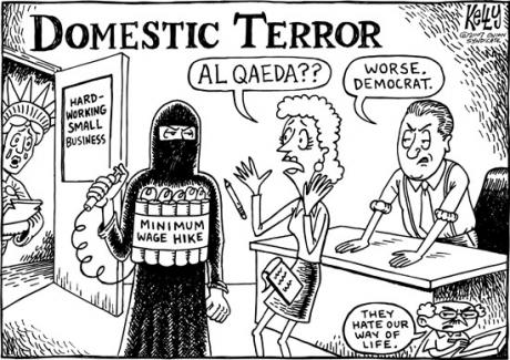
As you can see, wage income growth in the second period failed to match growth in GDP, disposable income per capita, or productivity. That’s the major event of the last 30 years. This is common knowledge. See "Source of Info" below. If wages had tracked both inflation and productivity for the past 30 years --- see this EPI web page to calculate what your income would be --- then the median worker's annual income for 2012 would not have been $27,519, but $43,629 --- that's a 58% raise. Half all workers in 2012 earned less than $27,519 according to the Social Security Administration report on wage income, and collectively they all earned less than 6% of the nation's total income (the lower half earned $740 billion collectively, the total personal income was $13.7 trillion). The lower-earning 60% of households collectively had less income than the top-earning 1% -- see the table. Where would you prefer to live, in Haiti, Mexico, China, or a high income country? My Tea Party Congressman supports abolishing the minimum wage.
A professor at Princeton and another at University of Chicago agree with my analysis and post this paper "The Most Important Chart", see here. The Economic Policy Institute has initiated a series "Raising America's Pay" with several features. I enjoyed the 45 minute video with the head of the Communications Workers of America and another talk by the U.S. Secretary of Labor, Thomas Perez. See the entire gamut of features here. As though that were not sufficient, you can also read Robert Kuttner's essay which begins, "For most Americans, the central economic fact of the past four decades is the stagnation and decline of earnings." It's long and interesting, see here. But I recommend the EPI site mostly.
We could easily improve life for all of us, and especially for those who have little income or savings.
Maybe you have no feelings for poor people, well?, you should. It may be you or some member of your close family soon enough. Your grandchild faces a future of very limited opportunity and precarious economic security. Read the section below on income and wealth. Almost 4 in 5 Americans go through periods of poverty in their adult lives, some never escape. Read below about Chasing the American Dream (and here). I don't know how to penetrate the thick skulls of the many people I interact with and care about. Improving on economic fairness is not difficult, but it will take broad understanding and political action. Here's a video of Thomas Piketty talking with Elizabeth Warren.
Government Direct Job Creation
I like the idea of direct public employment, a right to a job as Franklin Roosevelt proposed, as Eleanor Roosevelt as the first Chair of the United Nation's Commission on Human Rights proposed and succeeded in installing -- a right to gainful employment. See this video explaining it here. Read the report that would add 10 million jobs, 71% public and 29% private, at a cost of $202 billion, which is less than 1.4% of total personal income -- Philip Harvey's plan, Back to Work (see page 11 for cost figures). And for an important article about the Jobs Guarantee, see here. And see the web page for National Jobs for All Coalition, here.
Cumulative change in total economy productivity and real hourly compensation of production/nonsupervisory workers, 1948–2012

Note: Data are for compensation of production/nonsupervisory workers in the private sector and productivity of the total economy. "Net productivity" is the growth of output of goods and services less depreciation per hour worked.
Or this graph from the Economic Report to the President cited in this article:
 Sources: Economic Report of the President to Congress (G.D.P.); Census Bureau (income)
The after-tax disposable per capita income grew by 79% between 1979 and 2011, see the line graph below. I just looked it up at BEA.gov (see Table 2.1, convert it to a graph if you can.) In 32 years it went from $20,248 to $36,293. Every household of four therefore, on average, has in 2014 after taxes $155,950 to spend! Every household regardless of its size has $690,000 in savings -- that's "on average" and certainly less than 10% are "average"-- (see my section on wealth, below). That's how affluent our nation is -- but who would believe it? In contrast, wages went up by 4% to 6% depending on the table between 1979 and 2011, a 32 year period. Despite the fact that in 30 years annual hours worked increased by 10.7% and "every worker working [was working] an additional 4.5 weeks per year" (see L. Mishel's article here), the median household income increased by only 5%, increasing from $47,527 to $50,054 (See this graph at State of Working America/Income. I reproduce it below, the last one. And at State of Working America/Income check these other related income graphs, Figure 2A, 2B, 2C, and Figures 2E, K, N, T, Z).
Labor's share has dropped 13% of total income since 2000. That's about $1.7 trillion, or $13,629 for every household in the country, $17,000 per year for every full-time worker. That would be a 42% annual income raise for the median full-time worker, see the bls numbers here. That median level full-time worker would increase his income from $40,320 per year to over $57,000. The median wage income for all full and part-time workers was $27,519 in 2012, and the average wage income for half of workers was below $10,000 a year.
Here's a graph of "labor's share of national income" from the Bureau of Labor Statistics or go to the St. Louis Federal Reserve for the graph:

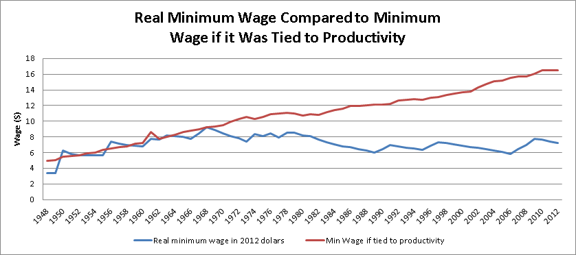
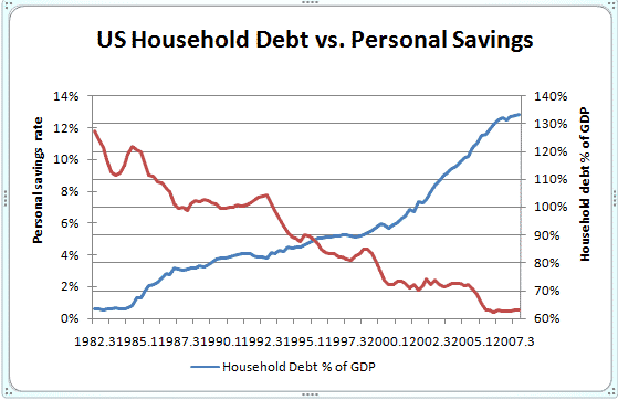
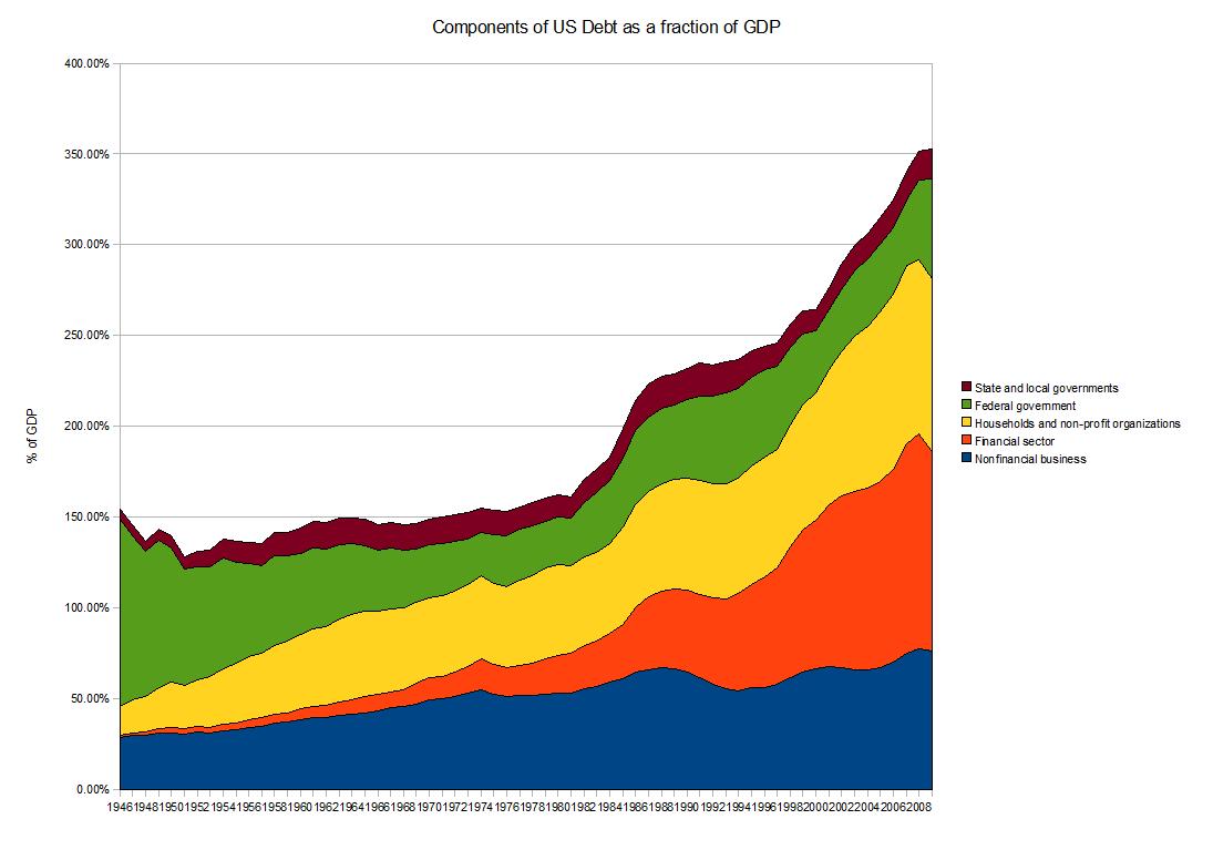
This is the BIG STINK. Or to be precise, it is the key structural deformity of the economy, the source of malfunction that has led to an economy over-reliant on debt creation. If the minimum wage since 1968 had been closely tracking inflation and productivity growth, it would be $22.81 not $7.25 per hour (see previous essay). Aggregate household debt remains high at 103.8% of aggregate income (see Christian Weller's snapshot for March 2014, point 12.) Consumers lack the income in an economy 70% driven by personal consumption. This is the major missing rung in the ladder of opportunity. What is wrong with our politics and media that they don't pick up on this more? Recently I read Meyerson's article on wage growth strategies at the American Prospect along with this article by Robert Kuttner who says that the median household income should be $80,000 not $50,000. Meyerson said research shows that the top-earning 10% had received ALL the economic growth over the past three decades. Lawrence Mishel at EPI shows that the top-earning 1% received 59.9% of economic gains. This Mishel article is the serious student's article on productivity and wage growth. Lending, borrowing and debt, the financial services, has exploded during these decades (see the colorful wikipedia graph below and note the growth in financial debt). We should seek to reverse that trend. Similarly, the Secular Stagnation concept that Krugman and L. Summers talk about is all about wage stagnation. I suggest a financial transaction tax on a large scale to be applied to fund a direct jobs program. I think it's politically palatable. (See this CPEG paper for a full description.)
Average Household Income -- $71,274 or $78,900?
-- Median
$51,017
Here is the BLS report on Consumer Expenditures, March 2014, page 2, showing the average household income of $65,596 for 2012. And similar data here from the Citizens for Tax Justice report, reporting average income for the lower 99% at $64,200 for 2014. When CTJ includes the top 1% the average "cash income" increases to $78,900 per household. The BLS does not track the top 1% accurately. And from EPI's State of Working America, average total income of $104,163 -- this is not "cash income" but total income which includes pension, social security and the value of health insurance compensation (about $30,000 non-cash income). This SWA average would yield $12.9 trillion total personal income for 2007 in 2011 dollars. The BEA.gov shows total income for 2011 was $13.0 trillion. So the SWA figure is close enough. I find the calculation for average household income very complex, you might agree. The Joint Committee on Taxation reported total income of $11.468 trillion for tax year 2012, page 28 of this report. Divide 120 million households into that last figure, equals almost $96,000 for all 120 million households in 2012. The median household income is around $51,000. Page 31 of this 2013 U.S. Census report shows household average income of $71,274 and median of $51,017 for 2012. The average is 40% higher than the median. Why don't the average and the median cluster together? They should be about the same. On page 31, look at the 1979 average and median incomes, the average was 15% higher, not 40% higher.
A Solution, one part of the fix
I would like to remember the National Jobs for All Coalition right now. They have led the fight for creating "jobs for all" for years, and their monthly labor report is important. Nancy Rose has an article there, "We Need a WPA for Our Time."
"The private sector won't create enough decent-paying JOBS FOR ALL. Nor will it meet the nation’s human and infrastructure needs. It’s up to us to pressure the government to do what the private sector can’t or won’t do."
And just as the median household income should cluster around the average of $75,100 (see here), so should the median household wealth or net worth cluster around the average of $690,000 per household.
The Unemployed, and the Poorly Paid -- 16.8% plus 4.8% = 21.6%
or 36 million Adult American Workers --- One in Five, almost One in Four
We have over 20 million adults out-of-work, out of 160 million, one in eight, 12.5% -- roughly. As of April 7, 2014, I calculated that 12.4% would be the unemployment rate if we substitute the Labor Force Participation Rate (LF/P) of January 2000 and keep today's number of employed. To this 12.4% add 4.4% who are involuntarily employed in part-time work (see here). That's a total rate of 16.8%, unemployed and involuntary part-time workers.
Another 18 million workers work full-time for wage income less than the poverty level for a four person (2 adults and 2 children) family. (See the National Jobs for All Coalition unemployment report that cites the USCensus report stating 18 million low-paid full-time year-round workers.) Using the same LF/P rate as 2000, yielding a total labor market of 166.0 million workers, not the official 155.421 million figure, this adds 10.8% to the 16.8% figure, or 27.6% of all workers, a total of 45.8 million -- either without work, not enough work, or not enough pay to lift them from poverty.
27.6% of all U.S. workers, or 45 million
Today's LF/P is lower than anytime since 1978, and that of course includes the recessions of the 1980s. The Unemployment rate (U3) would be 11.2% if we substituted the January 2007 LF/P. (See LF/P ratio at the St. Louis Fed graph, and calculate using data from these two BLS sources, one and two.) And if you wish, you can look up the employment to population ratio as well, and you'll see that in March, 1953, the E/P ratio was 58.1%, and last October, 2013, it was 58.2%. For 20 years, 1988 to 2008, it had averaged at 62.9%, 4.7% higher, which average would add instantly 11.6 million workers to today's 145.6 million workers. This would require about 2 million workers to re-enter the work force, and yield 0% unemployment.
As my recent essays show, only 6% of national income goes to half of the U.S. workers (77 million workers) in wage income. I added the wage income of 47% of U.S. workers who earn less than $25,000 a year, a collective total income of $740 billion, and divided by $13.7 trillion for 2012, the total personal income. Or see the Social Security report on wage income, and do the calculation yourself, comparing it with total personal income at the BEA.gov site which is over $14 trillion in 2014, or post-taxes $40,045 of income per human. The average wage income of the lower-earning half of U.S. workers is less than $10,000 a year, this 50% includes 12% voluntary part-time workers, 5% involuntary part-time, and 33% full-time workers. Yet the average income, after paying federal taxes, is over $40,045 per human being, which comes to over $81,000 per worker, and $116,000 per household. Maybe inequality is a problem, and improving on equality would help employ more people? And maybe it would almost be self-financing.
Public Job Creation
Back to Work, by professor Philip Harvey, makes a case that public job creation would be cheaper than we think. He claims, on page 11, the creation of 10 million jobs (71% public and 29% private) would entail a yearly expense of $202 billion, which is about $90 billion less than the expense of allowing the Bush Tax Cuts to continue. In other words, eliminate the Bush Tax Cuts, apply it to 7.1 million direct public jobs, which jobs would create another 2.9 million private jobs, and save $90 billion. When Clinton left office the federal budget took in 19.9% of GDP as tax revenue, in 2013 it took in 16.7%, after dropping to 14.6% for 2009 and 2010 (see here, page 29). Raising it from 16.7% to 19.9% would increase tax revenue by $550 billion. The top-earning millionaires, the 1%, took in 21.6% of personal income, about $3 trillion, of which they paid in taxes about $1 trillion. (See this report) Their average income was $1.6 million, after-taxes. If they had to pay $200 billion more, a total of $1.2 trillion in taxes instead of $1.0 trillion, reducing their average income to $1.45 million, the unemployment problem could be solved. The economy could function at close to full potential. The solution to the federal debt/deficit problem and the unemployment problem is not an impossible vision.
Half of all Income to 10% of Earners -- a New High

This article from the NYTimes, September 2013, shows the continuing trend of income. Note the period between 1945 and 1980. Also check Saez' article Striking It Richer which updates maybe yearly. Its graphs are more extensive, but mostly the same story. A colleague of Saez, Thomas Piketty, has written Capital in the 21st Century and it is receiving much press coverage, see here and here.
Wealth and Liquid Asset Poverty -- no Cash Reserves
Over 140 million citizens, 44% of the population, live in families that have liquid asset poverty (less than $6,000 in cash savings for a family of four) while the nation's official household net worth is about $690,000 per household as our total private savings exceeds $80 trillion(see Fed. Reserve's Flow of Funds report, page 2). See this Huffington Post article relating data from a soon-to-be-published book, Chasing the American Dream. Some 79% of the US population experience "significant economic insecurity at some point between the ages of 25 and 60."
Wealth Report for 2013
Or look at the Credit Suisse World Wealth Report for 2013, Databook, page 149, that shows the wealth Gini Coefficient (level of wealth inequality) for the U.S. is the highest except for one among 27 other nations. We have a level of 85.1, while that of France is 69.0, UK is 67.7, Italy 65.0, Australia 63.6, and the lowest being Japan's at 63.5. Even though the average wealth in Japan is 28% lower than the U.S. average, in Japan 9.1% of the adults have less than $10,000 in savings, in the U.S. 30.7%. The average savings in the U.S. per adult is $357,951, or about $700,000 per household, which corresponds to the Fed. Reserve figure of $690,000 quoted above. Yet 44% cannot pay an emergency $2,000 expense in 30 days -- see this NBER report -- of the 44%, 25% definitely couldn't pay it, and 19% would "do so by relying at least in part on pawning or selling possessions or taking payday loans".
People are hurting and it is taking a toll.
What is an economy for? The government of Bhutan thinks it is to create Gross National Happiness. Apparently we believe it is to be the slave of GDP growth, even if that impoverishes the poor and enriches the already rich? Apparently that is the outcome of our present arrangement. See how well we reduce poverty here, and read about it here. The last report from Columbia University states that 29% of the country's citizens are left in poverty from the market distribution of income, but government transfers reduce that rate to 16%. Some 7.4% of the population are poor elders who are lifted from poverty by Social Security pay-outs (which are true paid-for entitlements). See the international comparison of poverty rates here, a Stanford University report. And see another report here. There are obvious solutions. Happiness for most if not all, or growth for the richest at the expense of the majority? What a choice!

Relative poverty rate in the United States and selected OECD countries, late 2000s

Sources of Info
At the top of this article I compared two 32 year periods.
This is where I got my GDP/capita growth: measuringworth.com
For my Weekly Wage Growth: State of Working America, Table 4.3,
For Average Family Income: Table 2.1,
Figure 2A and 2C, shown below, also graphically show this disparity.
You can Google those sites to confirm. Bring your calculator. But this is pretty standard, well- known material.
Let me plug Too Much, a weekly newsletter, and a constant flow of ideas about inequality and solving the problem.
Real median family income, 1947–2010

Note: Data are for money income. Shaded areas denote recessions.
Average family income growth, by income group, 1947–2007

The war of ideas -- Who is right, the Tea Party that cuts taxes to the wealthiest and cuts government programs that support the poorest? Or the Obama plan that would restore finance driven capitalism? Or the progressive left with its new Better Off Budget? that would create public jobs which would lead to a tighter labor market which would lead to higher wage income for all workers? What caused the Great Recession? What to do? I am reading slowly Restoring Shared Prosperity, edited by Thomas Palley, and I find that it agrees with my analysis.
I find that comparing the recent 32 year period of wage stagnation with the previous 32 year period is a fountainhead explaining our miserable economy: the Great Recession, inequality, unemployment, an economy dominated by finance, excessive wealth in the hands of a few and a financial system that gains most of its profits from speculation, the culture of greed where bad ethics crowds out good ethics, and many poorly performing social statistics such as education and declining marriage rates. IT EXPLAINS PLENTY.
I need to make a Table of Contents for this blog, many important facts are hidden and a contents page would help. The Blog Contents at the right shows the most recent articles which explain a good deal.
Search the "Contents" drop-down file on the right.
The Wage Stagnation story can be found at the EPI.org site, the report by Lawrence Mishel describes much of this trend. A last graph:
Growth of hourly productivity, real average hourly compensation, and real median hourly compensation (overall and by gender), 1973–2011

Note: Compensation is for production/nonsupervisory workers in the private sector, and productivity is for the total economy.
Source: Author's analysis of unpublished total economy data from the Bureau of Labor Statistics, Labor Productivity and Costs program and Bureau of Economic Analysis, National Income and Product Accounts
_____________________________________________________
_____________________________________________________

______________________________________________________
The link above to the article by Lawrence Mishel has the fullest reasoning.
This last graph, check the link at the BEA.gov is the per capita after-tax disposable income from 1947 to 2011 from the BEA.gov site. --- This graph has disappeared --- It was Neat. Today per capita post-tax income is almost $39,000, or $155,950 after-tax income for every four-person family -- in our nation with massive poverty, food stamp usage, and hardship. Why did wage income for middle-earning workers stop to grow?
______________________________________________________
I would like to remember the National Jobs for All Coalition right now. They have led the fight for creating "jobs for all" for years, and their monthly labor report is important. Nancy Rose has an article there, "We Need a WPA for Our Time".
The Congressional Progressive Caucus over the past two years proposed a $700 billion direct jobs program for 3 years running, and this year they propose a $450 billion jobs program for the next three years. There's a link here, EPI has the best synopsis of it, here.
________________________________________________________
Credit Market Self-Destructs
Viewing the Federal Reserve's Flow of Funds report, Z.1, Table D.3, page 5, "Credit Market Debt Outstanding by Sector", I calculated that the "Domestic Financial Sector" debt between 1996 and 2008 increased by 162% while the GDP/capita increased by 25% (using this source for the GDP/cap rate). Financial debt over ten years increased 6 times faster than economic growth. Other sectors had much lower growth, notably the federal government debt grew by 26% in the same period.
Such an enormous run-up of debt spelled disaster.
Disaster was obvious. Magdoff and Foster in their book, The Great Financial Crisis, also report the same. Is the economy still vulnerable to collapse due to excessive debt? See the graphs at this article at the Business Insider. These graphs show steep increases especially 1996 to 2008. Here's the one for financial sector debt,
____________________________________________________________