The Need for a Large Government Stimulus
The essay is below, but first a sign and some quotes.

funny-sign-s.blogspot.com
Jimi Hendrix is attributed with this aphorism, as is Sri Chimnoy. Mohandes Gandhi also said: "
Meher Baba said, "If men were only to become conscious of the fact that peace and happiness are not to be fought for but to be sought for within oneself, they would abandon their fighting and be at peace with themselves and the world."
__________________________________________
My (unpublished) Op-Ed to the New York Times:
Robert Shiller published an essay in the NYTimes today, Nov. 26, 2011, on "The Fire Bell of Unemployment"
in which he states that, "First, there is a lack of scientific proof that government spending — fiscal stimulus — will do much to remedy unemployment."
I think it is critical to deal with that assertion to have any understanding of solutions at hand.
History of Stimulus Spending
Between 1933 and 1937 the unemployment rate dropped from 25% to 9.6% due to "government spending --- fiscal stimulus". There was the Civilian Conservation Corp, the WPA, and the PWA. Roosevelt won a landslide re-election because of his success.
I suppose that is as close to "scientific proof" as an economic answer can be. Human sciences are in fact mostly studies, not sciences, and establishing causation is literally impossible. I refer you to the essay by Marshall Auerback at New Deal 2.0, August 30, 2010, "The Real Lesson from the Great Depression: Fiscal Policy Works" where he cites the drop from 25% to 9.6%.
If that were not enough evidence we can look at the period 1939 through 1944 when "government spending --- fiscal stimulus" lowered unemployment from around 14% to 1.2% in 1944. "The total output of the economy in constant prices -- the real Gross National Product (GNP) -- increased from $319.8 billion (in 1972 dollars) in 1939, the last year unaffected by the war or the prospect of war, to a peak of $561.9 billion (in 1972 dollars) in 1944." This is an increase in GNP of 76% in 6 years which is a growth rate of 10% per annum compounded. These figures originate from the book American Economic Development Since 1945 by Samuel Rosenberg, page 20. Furthermore, "Between 1939 and 1944, total civilian employment rose from 45.8 million to 54.0 million." Combining employment in the military services, the civilian employment increased by an unheard of 42% over six years. Over half that increase were women entering into the paid work force. Clearly, "government spending -- fiscal stimulus" made an enormous difference, perhaps it made all the difference.
Ways to Raise Income at the Lower-Earner Level
Mr. Shiller cites a proposal from Edmund Phelps to "provide a subsidy of $4.50 an hour for the lowest-paid workers, with declining amounts until they earn more than $15 an hour." This is good, but I prefer a more generous proposal that comes from the University of Massachusetts/Amherst professors Jeannette Wicks-Lim and Jeffrey Thompson, "Combining Minimum Wage and Earned Income Tax Credit Policies to Guarantee a Decent Standard to All U.S. Workers". To quote from the report:
"Specifically, we begin by proposing a 70 percent increase in current minimum wage rates. This would raise the federal minimum from today’s rate of $7.25 to $12.30 per hour. We also propose two expansions of the EITC [Earned income Tax Credit], the federal program that provides tax relief and cash benefits for low-income working families. These include raising the maximum EITC benefits by 80 percent and the income eligibility threshold to three times the federal poverty line. The maximum EITC benefit would rise from $5,028 to $9,040 and households with incomes up to $57,000 could receive benefits.”
How Low is Low Income?
The average income for the top one percent of U.S. households was $1,370,662 in 2011 according to this report from The National Priorities Project. Half of all U.S. workers, or 75 million workers, received less than $26,362 in 2010, according to the Social Security Administration.
In contrast, the Tax Policy Center shows that 28.2% of all U.S. personal income is the portion received by the lower-earning 80% of households deriving from wages and salaries. Approximately 80% of the nation's workers are non-supervisory workers (or employees). In other words, the main income of 80% of the work force is wage and salary income and their share is 28.2% of all income.
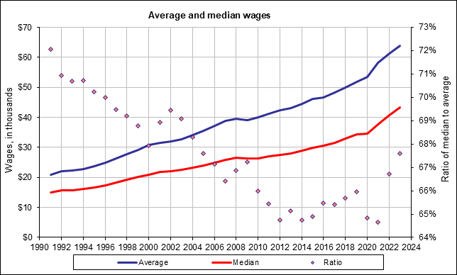
To re-enforce this idea, note that the Social Security Administration released figures for wage and salary income for 2010, and they showed that the median income was $26,362 for the 150 million workers who had payroll income. About 1 in 6 workers, or approximately 25 million workers, received 0 to $5,000 a year, another 1 in 6 received between $5,000 and $15,000 a year, and another 1 in 6 workers received income of between $15,000 and $26,362. This chart from the SSA. Note the drop in the median/average "Ratio" from 1989 to 2010. That's growing inequality. This data does not include income from capital gains and proprietary income which, combined, equal 17% of all personal income, and if included would show even greater inequality of income.
The average contribution to economic output is $109,000 per worker per year according to the San Francisco Federal Reserve Bank, and our GDP per capita is almost $46,000 per year. The lower-earning 80% receive only 40% of all the personal income our economy generates, while the top 20% of households receives 60.3%, according to the Tax Policy Center. Clearly there is room for raising the incomes of lower paid employees, as a measure of economic justice. And in doing so we would stimulate the economy and create employment.
The Federal Deficit -- Rebalance plan
Occasionally left-wing economists state, counter-intuitively, that the government has to spend in order to reduce the deficit. The private sector is knocked out, only government spending can rekindle hiring -- that's a basic Keynesian argument. Since the economy has a shortage of purchasing demand, or aggregate demand, only "government spending -- fiscal stimulus" targeted at low-income households will revive purchasing demand, which amounts to about 70% of the economic activity.
Dean Baker summarizes well the lag in performance in his article of December 9, 2011: "In short, we have lost more than $1.2 trillion in annual demand. The stimulus package came to around $300 billion per year for two years. Guess what, $1.2 trillion is much more than $300 billion.
The long and short is that the economy is operating way below its potential because there is nothing to replace the gap in demand created by the collapse of the housing bubble. The lack of demand means a shortage of jobs and high unemployment. There is nothing mysterious about this picture, it is about as simple and straightforward as it gets."
But, in contrast to the deficits-must-increase argument, there are potentially $824 billion in annual federal program cuts (such as in the military budget) and tax increases (such as higher rates to the high-earners) we could make and not spend-up the deficit, according to the Institute for Policy Studies report released this month, "America Is Not Broke". Their $824 billion annual spending cut is 7 times greater than the amount the Super Committee was charged with finding. Freeing up $824 billion annually and applying $290 billion to unemployed and underpaid workers would generate the missing purchasing demand that causes our economy's present lackluster performance.
A Plethora of Progressive Proposals
The Chicago Political Economic Group also proposes spending over $900 billion a year from new taxes and cuts in this report, A Permanent Jobs Program for the United States.
A net $824 billion of budget balancing (program cuts and tax hikes) would reduce the deficit from 37% to 13%. In other words the federal government spent $3.46 trillion, collected $2.16 trillion, and had a deficit of $1.30 trillion in 2010, and this deficit would be reduced to $476 billion if we had installed the plan's $824 billion in program cuts and tax hikes. But, as noted in earlier essays, about $300 billion is needed, and maybe more, for a public jobs program. $824 billion amounts to 5.5% of the U.S. GDP in 2011. The federal government collected in revenues 14.4% of GDP, spent 25.3% of GDP, and had a deficit of 10.9% of GDP in 2011, according to the Table S-5 of the OMB, the President's Budget.
The economists at University of Massachusetts, Amherst, PERI, released a plan, December 2011, to create 19 million jobs, which reduces unemployment to 5%, by 2014. The Institute for Policy Studies also released a proposal to save the economy: Jobs, A Main Street Fix for Wall Street's Failure, that revives our stricken economy. I recommend all these plans.
Nouriel Roubini, aka Dr. Doom because of his prescient prediction of the 2008 recession, released a plan, The Way Forward, at the New America Foundation. This plan has three constructive proposals, called pillars, 1) "a substantial five-to-seven year public investment program that repairs the nation's crumbling public infrastructure, 2) "a debt restructuring program that is truly national in scope, addressing the (intimately related) banking and real estate and financial asset price bubbles" and 3) " global reforms that can begin the process of restoring balance to the world economy". Without a trade balancing remedy, all reforms are futile.
Jack Rasmus gets the award for most foresighted thinking. At jackrasmus.com and at kyklosproductions.com you can read his proposals. Almost three years ago, in March 2009, he presented a detailed list of initiatives that would rekindle economic activity, see this article at Z Magazine.
The core problem is inequality
We will have to discover a healthy proportionality of income distribution if we wish to have a viable and healthy economy. From 1942 to 1982 the top 10% never received more than 35% of total income, now they receive about 50%. That's the core problem of our economy, in my opinion. Most all of the gains went to the top one percent. This is neo-feudalism.
Our economic problem is not a federal deficit problem, spending too much or a taxing too little, our core problem is distribution of income and wealth. We have the most unequal distribution of annual income among developed nations. The recent CBO report shows (page 8) that the top one percent of households have a post-tax and post-transfer income greater than the income 44% of the nation's households (both groups receive about 17% of all income, post-tax and post-transfer). The highest one percent of households in the wealth scale own more than 225 times the median household net worth, an all time high. The one percent also received 64% of the economic gains 2001 to 2007, and over 50% of the nation's gains over the past 30 years, according to U. C. Berkeley professor Emmanuel Saez. The marginal income tax rate on the very top incomes over $379,000 a year is nominally 35%, but as a group they pay 30.8% in overall and effective taxes (overall means to all government agencies, and effective means as a portion of their income.) See the report by Citizens for Tax Justice for confirmation, "All Americans Pay Taxes". The average overall effective rate for the lower 99% averages to 28.2%. Households with incomes around $40,000 pay 25.3% per year.
On November 29, 2011, the Democrats introduced a bill to extend the Social Security Payroll tax cut. The extension would be paid by a higher tax on very high income earners. See this article. In my opinion, good, but only a temporary fix.
The Economic Policy Institute has an article with many graphs that illustrate the title:
"Occupy Wall Streeters are right about skewed economic rewards in the United States", October 26, 2011, by Josh Bivens and Lawrence Mishel. The graph agrees with another report that shows from 2007 - 2009 the top 20% of households increased the size of their wealth pie from 85% to 87.2%. (See Sylvia Allegretto's report State of Working America's Wealth, page 5) Here's a graph from the EPI article showing the growth and drop-off of wealth for the top 1% and the bottom 90% of households over 1983 - 2009 -- but note that if we could extend the graph to 2011, the wealth of the lower 90% that is mostly housing price wealth would still be below 1983 levels, while the wealth of the top 1% would be restored to around 80% on this chart, because corporate stock prices have recovered, see the stock graph here:

In the coming year we will all be playing the amateur economist. I want the NYTimes to present divergent views.
I recommend the University of Mass/Amherst professors who run PERI, James Boyce, Robert Pollin, Thomas Palley, and others.
I don't have any credentials at all. I don't expect publication. But I have convinced myself, if no one else, that economists are a sad lot, and quite often have less understanding than the average Joe. See my blog, http://benL8.blogspot.com where I present a plethora, a raft, a compendium of data on inequality. --- I can provide reference citations for the figures in this short essay.
Thanks, Ben Leet
________________________________
And now, December 9, 2011, President Obama finally gets his message straight.
I wonder why he took so long. This quote comes from a Robert Reich article.
President Obama:
This kind of inequality – a level we haven’t seen since the Great Depression – hurts us all. When middle-class families can no longer afford to buy the goods and services that businesses are selling, it drags down the entire economy, from top to bottom. . . .
Inequality also distorts our democracy. It gives an outsized voice to the few who can afford high-priced lobbyists and unlimited campaign contributions, and runs the risk of selling out our democracy to the highest bidder. . . .
More fundamentally, this kind of gaping inequality gives lie to the promise at the very heart of America: that this is the place where you can make it if you try. . . .
It’s heartbreaking enough that there are millions of working families in this country who are now forced to take their children to food banks for a decent meal. But the idea that those children might not have a chance to climb out of that situation and back into the middle class, no matter how hard they work? That’s inexcusable. It’s wrong. It flies in the face of everything we stand for.


")


